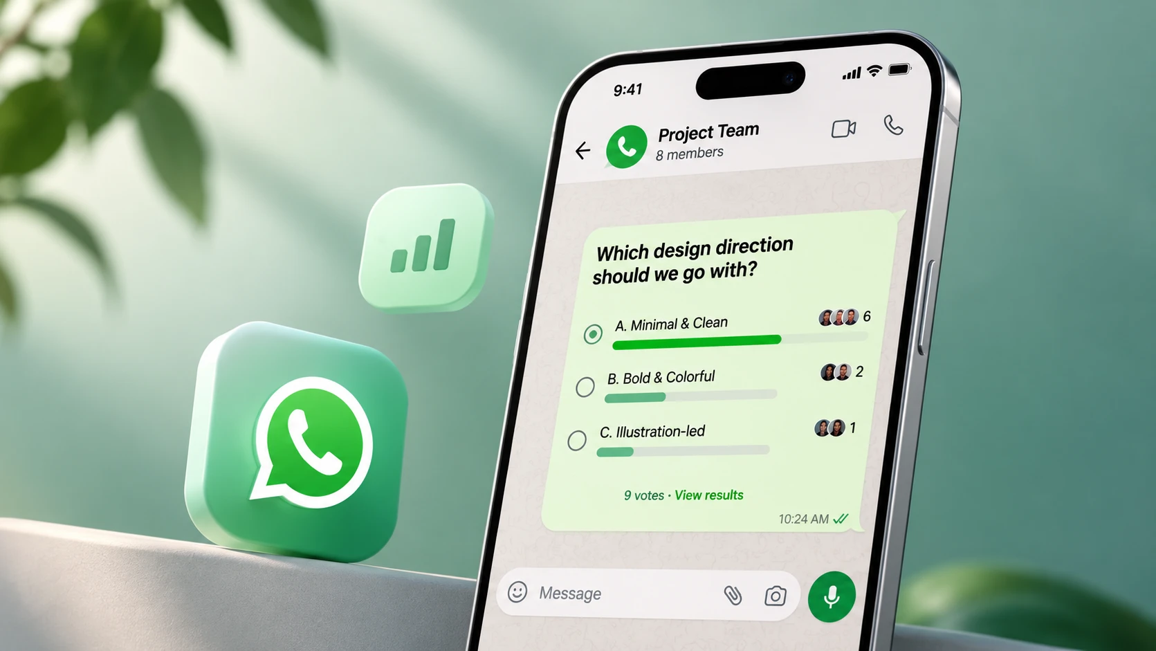
The challengeDeciding anything in a WhatsApp group is hard. Answers get buried, people mute the group, and businesses have no simple way to learn what customers like.
What I didI studied polls in 5 leading products, interviewed 17 users, and designed polls that live inside WhatsApp's existing patterns, for groups, status and business accounts.
What happenedIn usability tests with 4 users, 16 of 20 task attempts succeeded. Finding the second way to post a poll was the weakest point, at 2 of 4.

1. Understand
The problem
It's difficult to finalise anything in a WhatsApp group: the date for an outing, the next holiday spot, a birthday present. In larger groups it is harder to organise people, and irrelevant messages make people put the group on silent, so they miss the question entirely. New messages push it out of sight.
Businesses have a version of the same problem: identifying what a group of people likes and dislikes about their brand.
How might we help a group reach a decision without leaving the chat?
This is a self-initiated concept, not work for WhatsApp.
Learning the product
I followed IDEO's Human-Centered Design Thinking process: learn the product, focused research, ideation and wireframing, design and prototype, then usability testing.
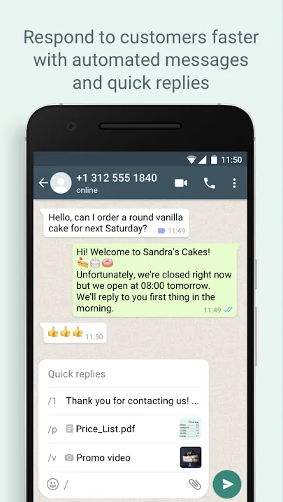
WhatsApp Business mattered from the start. It already lets companies connect with customers through catalogues, automated messages and quick replies, so a poll could become a useful tool for them too.
How others do polls
I compared polling in five top products across six areas: poll options, themes, frame colour, business polls, voting privacy and advanced settings.







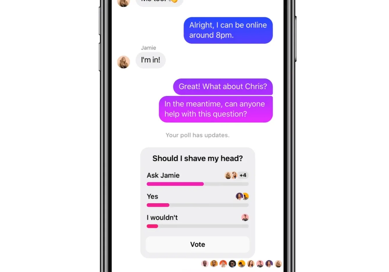
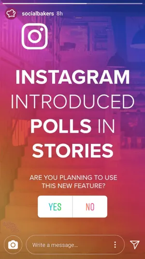
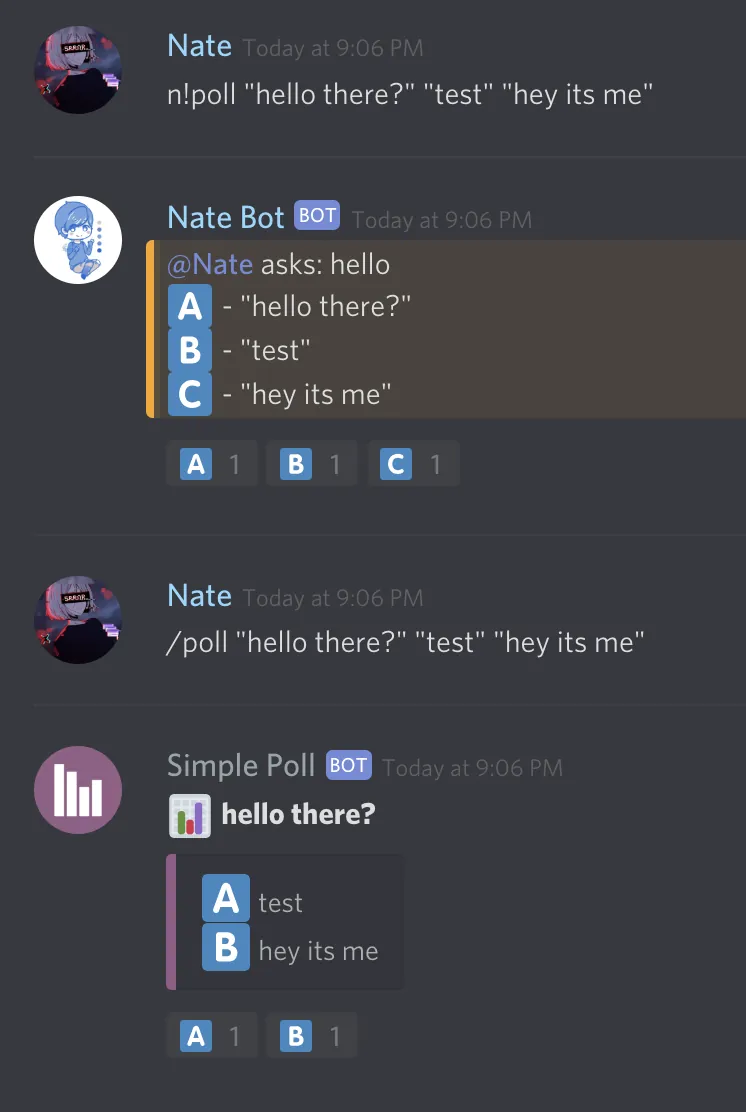
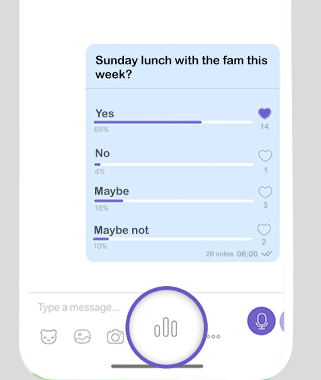
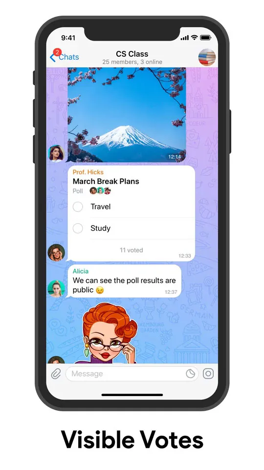
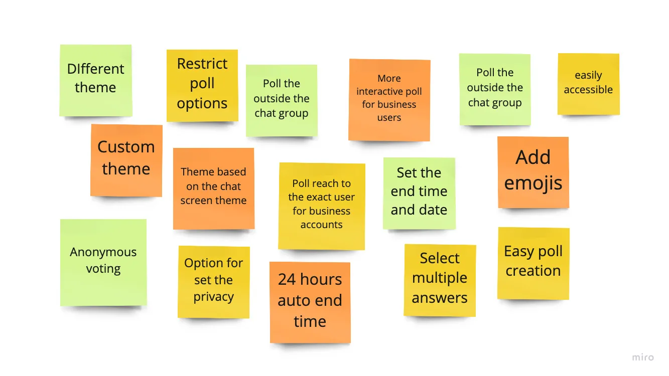
What we learned: Polls elsewhere share a common shape, and the differences are in themes, privacy controls and end dates.
What it changed: WhatsApp's poll should feel familiar, and needed options for privacy, a deadline and a theme.
What people told me
I interviewed 4 WhatsApp Business users and 13 private users through voice calls.
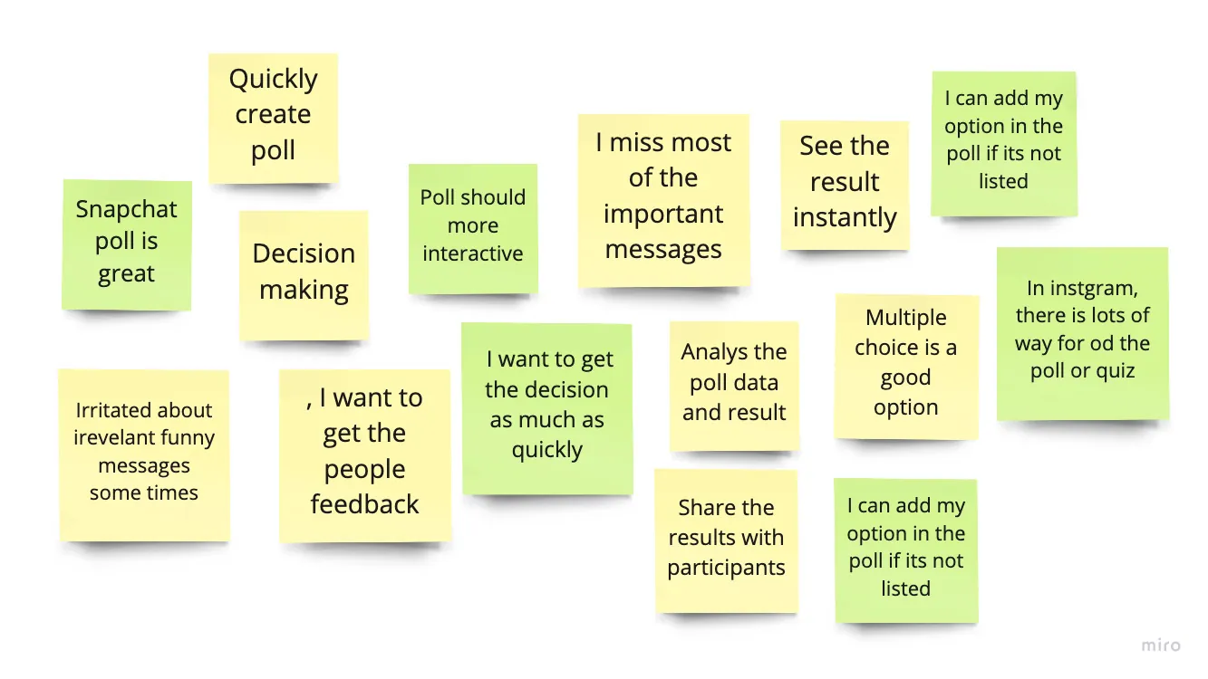
What the interview notes clustered into
Representative notes shown; synthesised from the interview board.
- "It's difficult to me for identify which cake people most liked"
- "Planning a trip was painful"
- "I'm wondering why WhatsApp still not providing poll function"
- "I struggle most of the times to get a decision in the group of people, they located in different places"
2. Define
Three roles, not one user
The biggest shift came from looking at psychology instead of account type. In any poll, people play one of three roles, each needing something different.
| Role | Who they are | What they need |
|---|---|---|
| Creator | Business or private user who creates the poll | Manage the poll, instant notifications, view results and analytics, use them to decide |
| Responder | Private user who views and votes | A one-time notification, the instant result once voted, the final result |
| Viewer | Private user who sees the poll but doesn't respond | A one-time notification, and the final result |
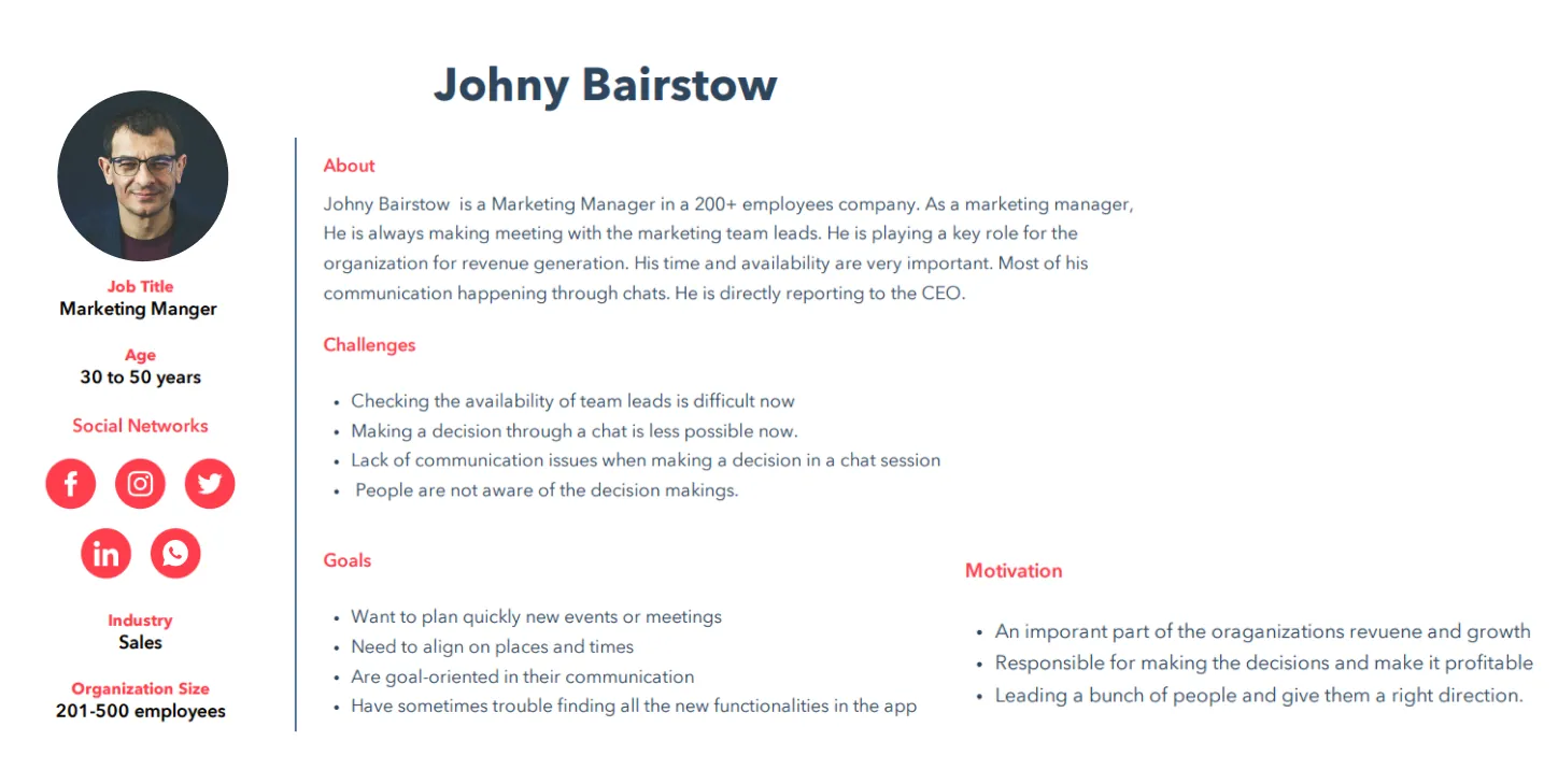
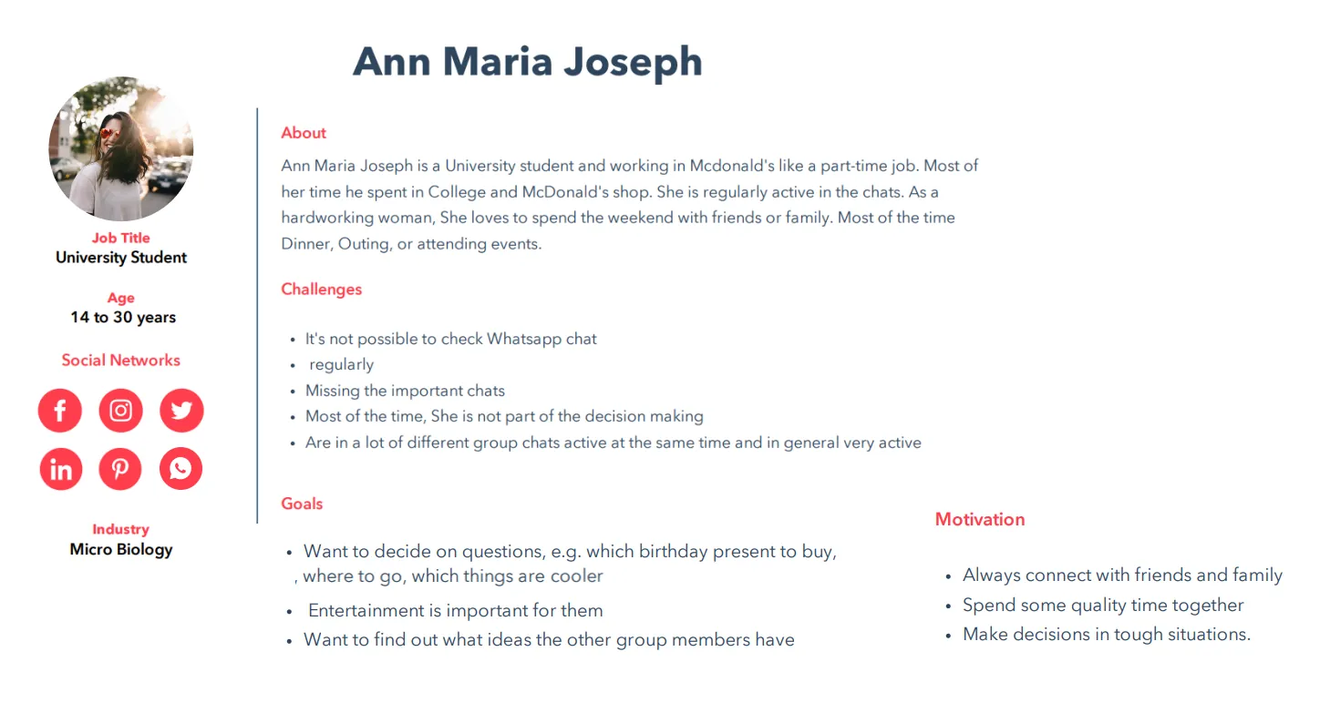
I also created provisional personas based on research and on people I knew who use WhatsApp.
Where a poll could fit
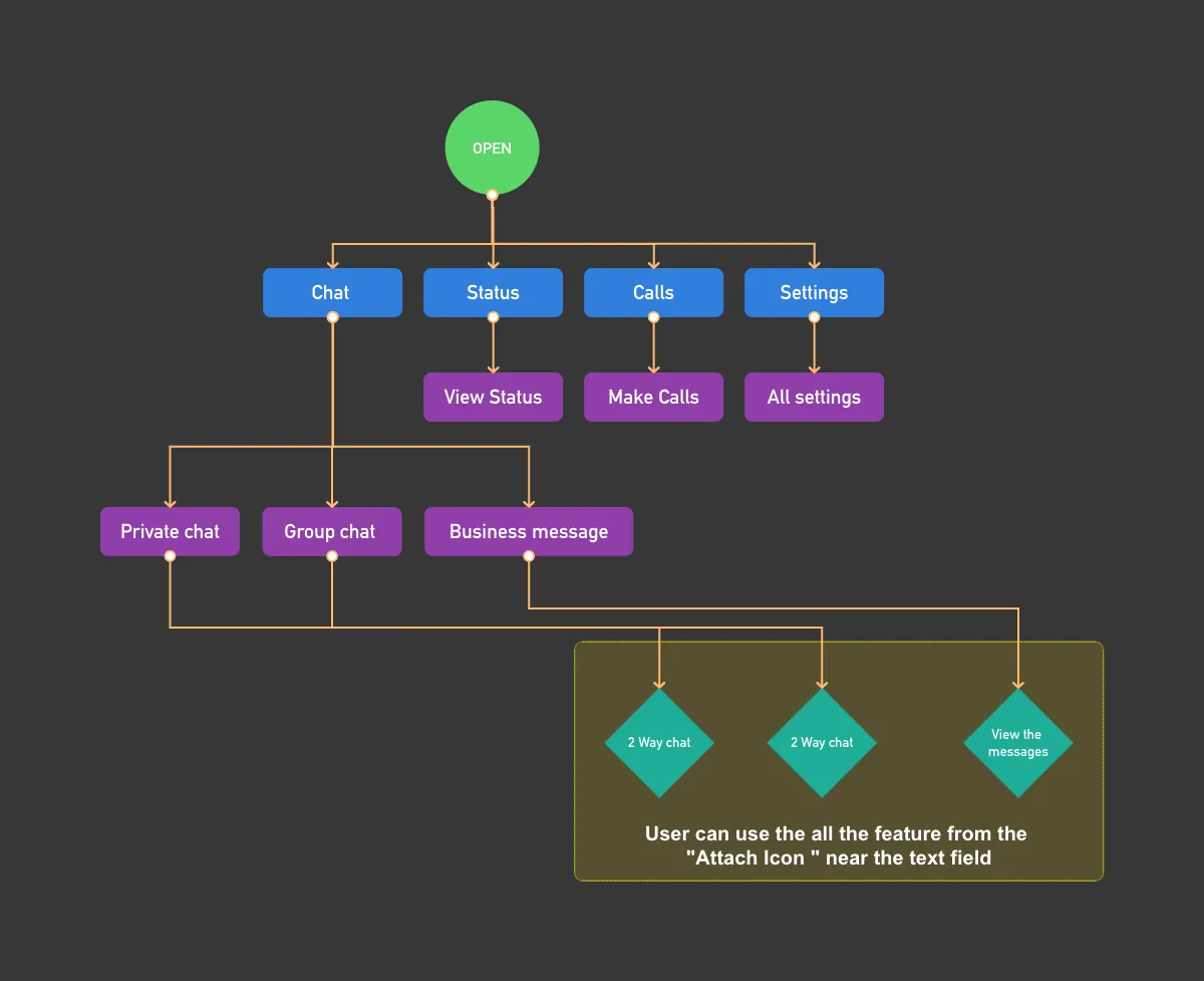
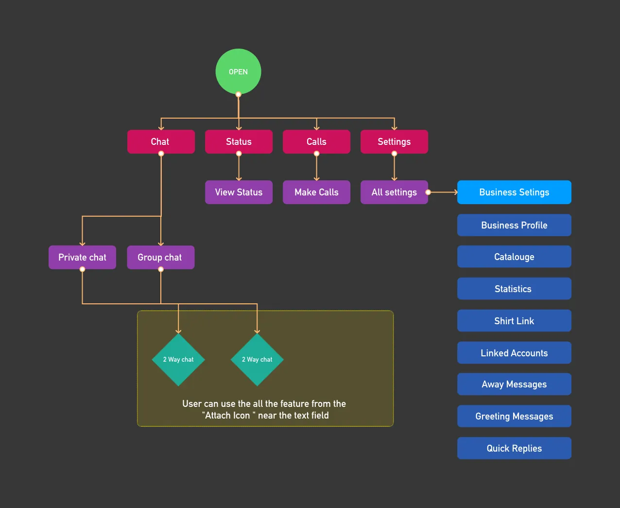
I mapped the existing flows for normal and business users to see where a poll could go.
3. Ideate
Framing with 4W
- Why? Easy decision making.
- What do users expect? To decide as easily and quickly as possible.
- When? In between chatting in groups, and in business chat discussions.
- Who? Business, group and private users, who already know WhatsApp. That's an advantage: there's nothing to teach from the bottom up.
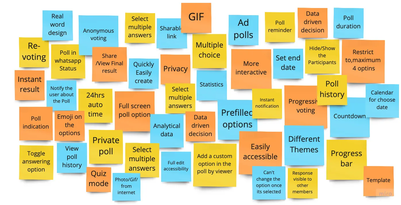
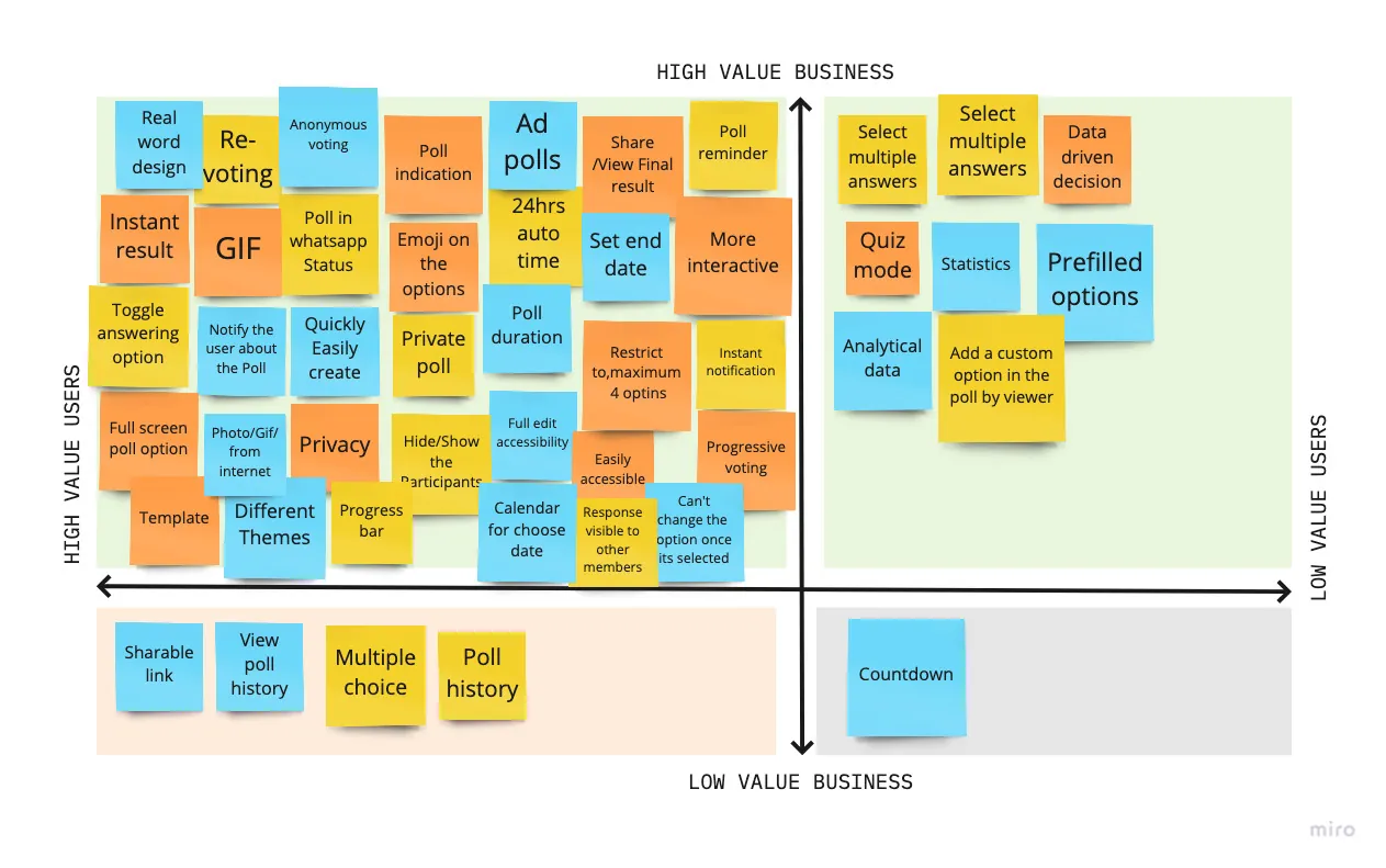
I generated many ideas, then used a 2x2 matrix to check what really matters for users and the business.
What the 2x2 put first
A selection rebuilt from the 2x2 matrix below. Poll History ranked low here, but I later designed it for business users, so its value still needs testing.
Testing the idea against the journey
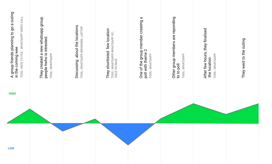
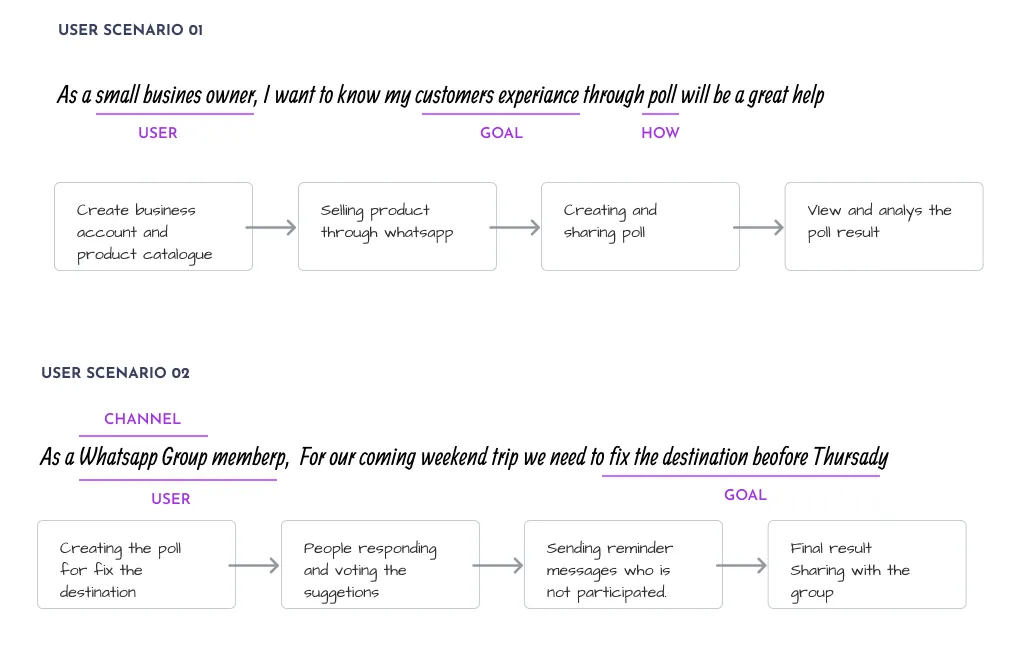
I mapped the emotional experience of a typical journey with the solution in place, then wrote task flows from user scenarios before drawing anything.
Friends planning an outing, with polls
Rebuilt from the mood map. Creating the poll is the low point, so it must take as little effort as possible.
Designing with psychology
I based decisions on established behaviour. People use WhatsApp status largely to get attention, express feeling and share, which suggested status could be a natural place for polls. Curiosity and a sense of belonging are also strong motivators, so seeing who has voted could encourage others to join.
The new flow
I redrew the flows with polls added: a Poll Option in chats for everyone, and Poll in Status and Poll History for business users.
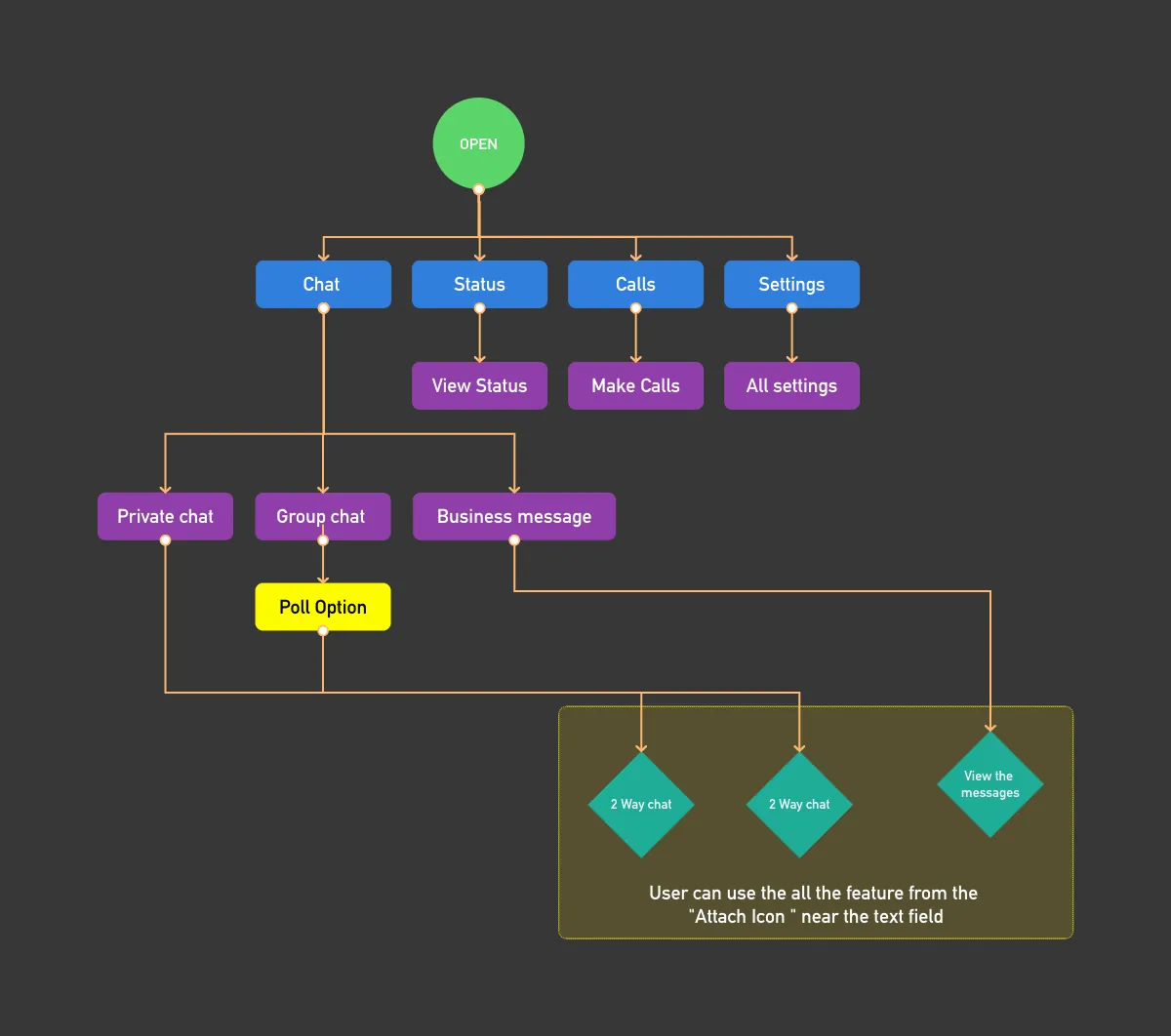
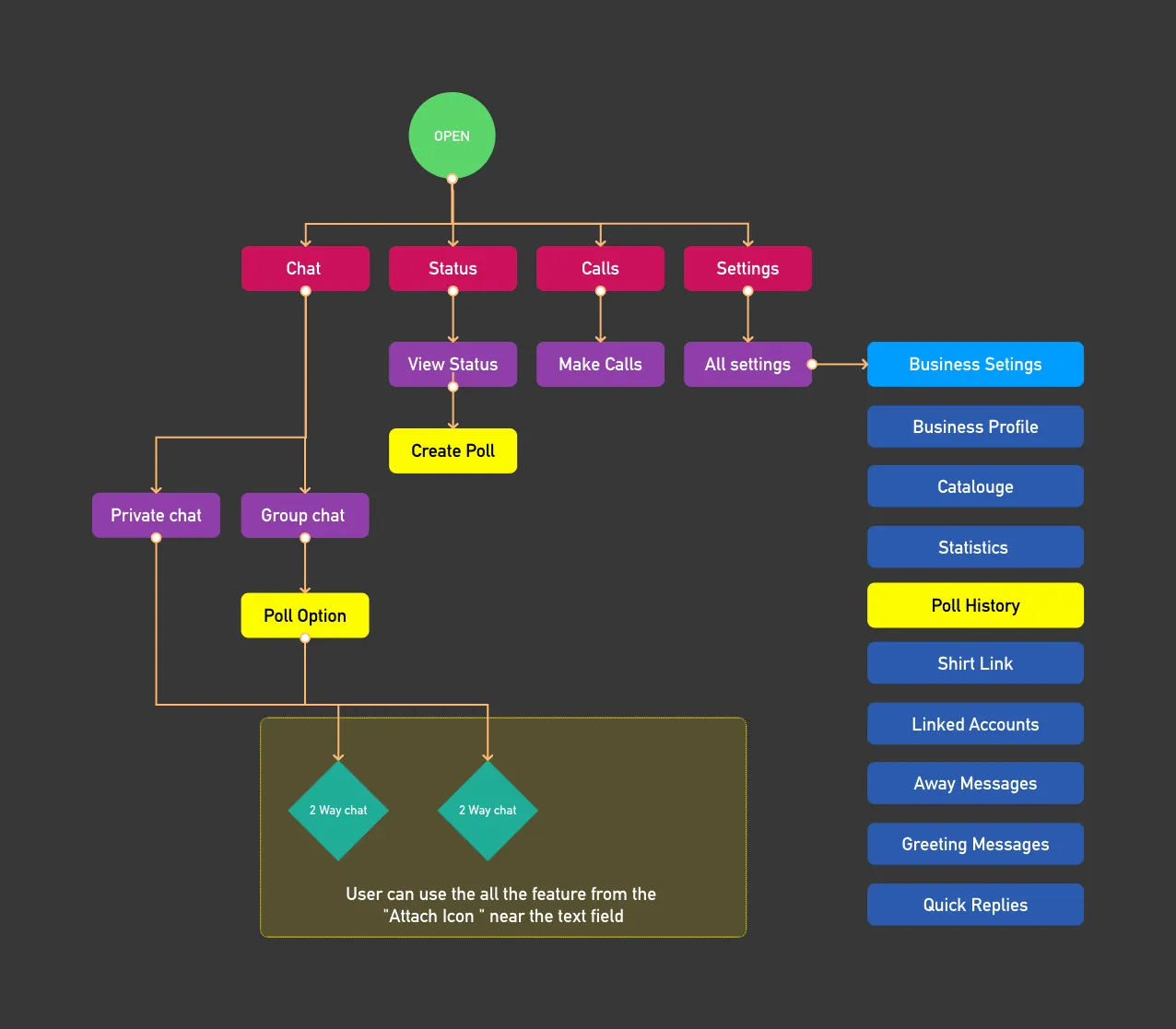
Where polls live in WhatsApp
- Poll indicator in the list
- Attach menu: Poll
- Create poll
- Missed poll bar
- Vote
- See result and count
- Undo
- Bookmark
- Business users only
- Create poll in status
- Viewers vote in status
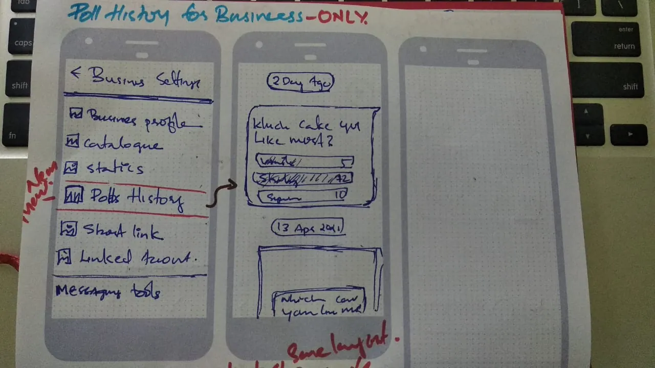
- Poll History
- Long-term decisions
- Delete if needed
Mapped from the updated user flows and final screens.
Wireframes
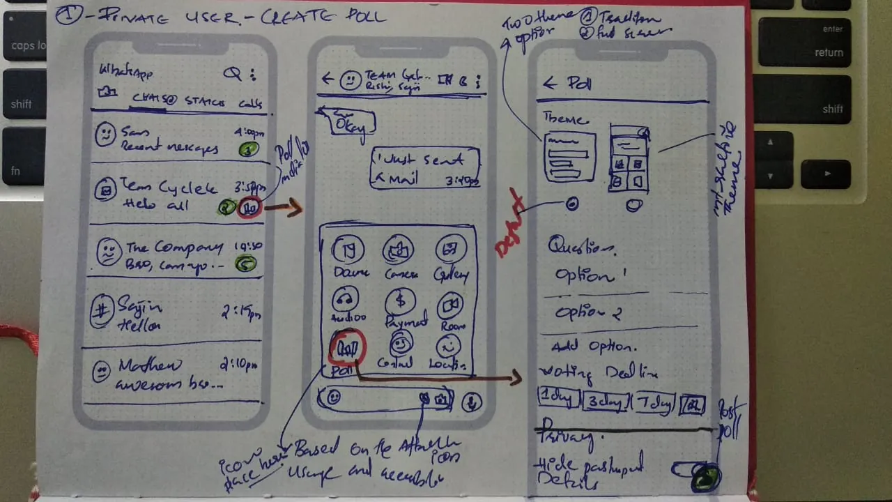
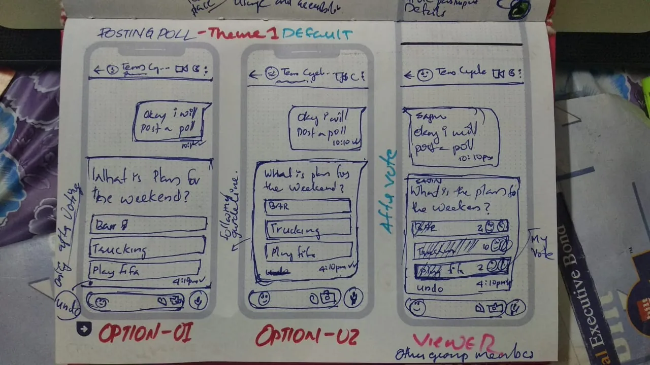
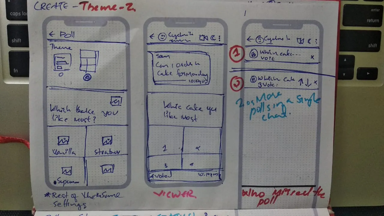
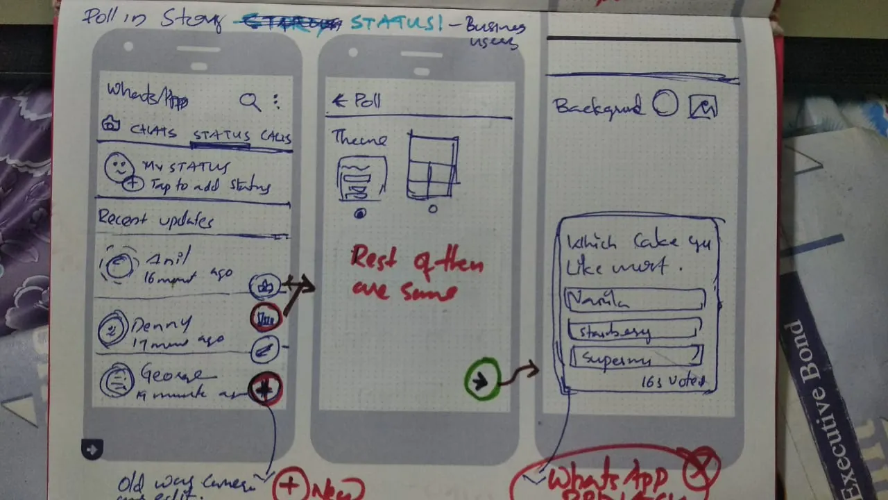
Paper let me work through each part quickly: entry points, creation, two themes, status and history.
4. Design
Staying inside WhatsApp
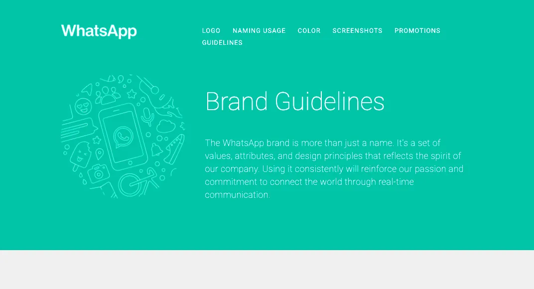
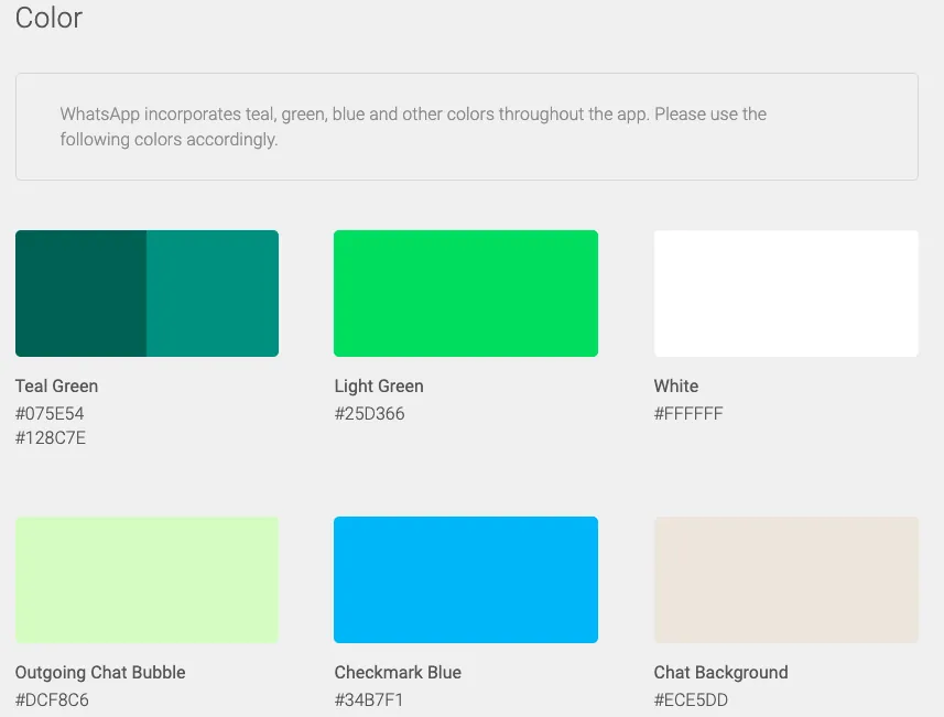
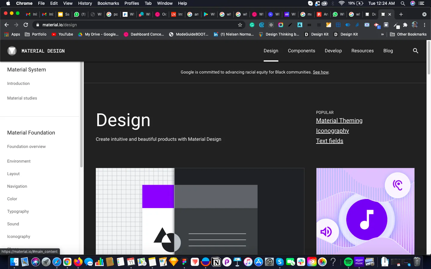
The poll had to look like it always belonged. WhatsApp uses Material Design with some customisations, so I followed both for iconography, font, spacing and interaction. The visual style is deliberately not trend-led.
A poll's lifecycle
Rules taken from my design notes for each screen.
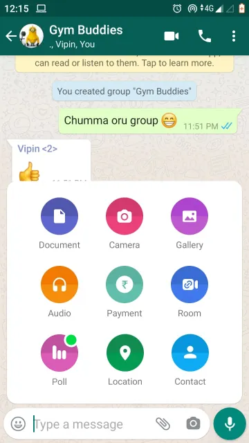
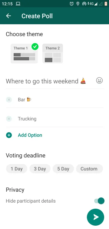
Creating a poll
Biometric login → group chat → attach icon → create poll → post in the group. View the clickable prototype
The poll sits with the other attachments, because everything in that menu makes communication easier. It uses a widely recognised poll icon (Jakob's Law) and a new colour that matches the strength of the others. A green dot signals something new. The text and interaction match the rest of the group, following the Law of Similarity.
Post is only enabled after a question and at least 2 options. Users can also set a voting deadline and hide participant details.
Viewing a poll: two concepts
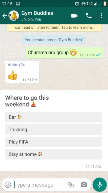
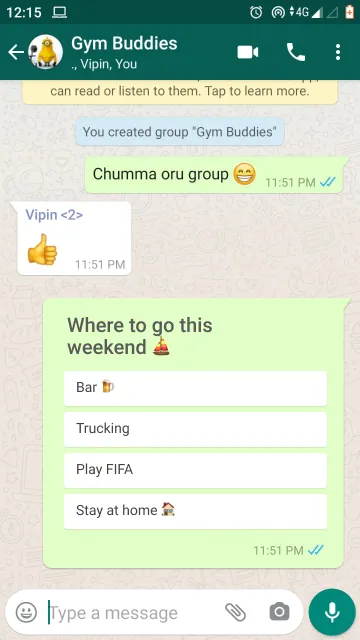
I created two concepts for how the creator sees the poll. I personally liked concept 1, but chose concept 2 because it's more aligned with WhatsApp's guidelines. Later, both should be A/B tested.
Not missing it
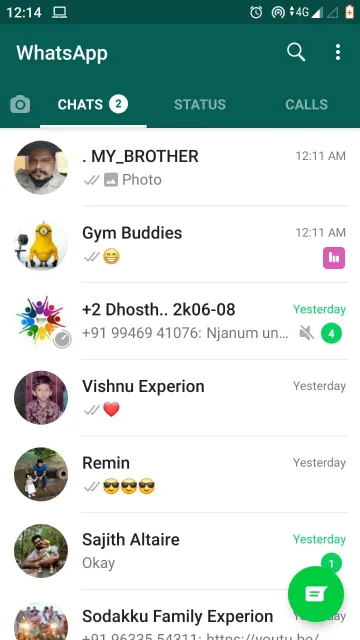
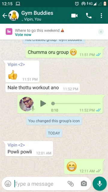
This solves the problem from the research. An indicator in the chat list shows a poll is active and disappears once the chat is opened, like a normal message notification. If the poll has been buried, a bar at the top lets the user view or close it, and auto-scrolls to the poll.
View the participation prototype
Voting
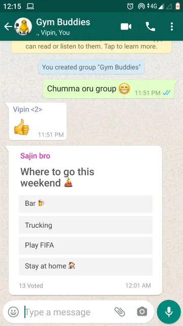
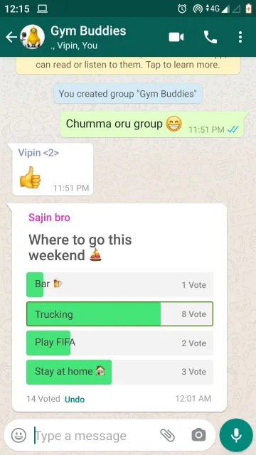
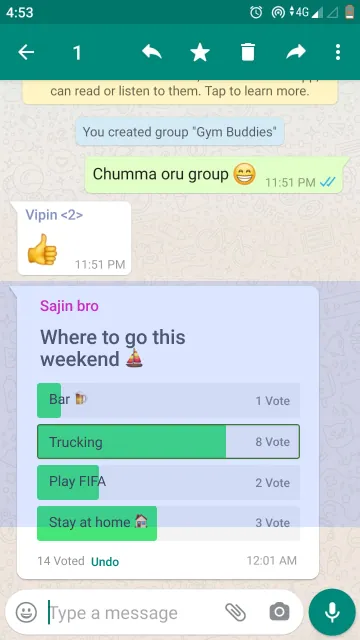
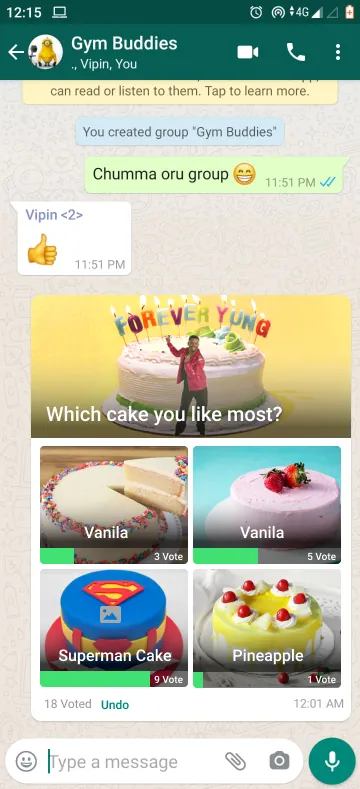
People see the question and options, and who has voted, which may inspire them to join. On voting, the result appears instantly with the count and progress. The green matches WhatsApp and works with black text for colour-blind users. Undo covers accidental votes and changed minds. Bookmarking uses an existing WhatsApp feature, so a poll stays easy to find after lots of messages.
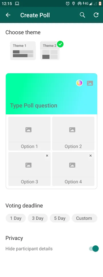
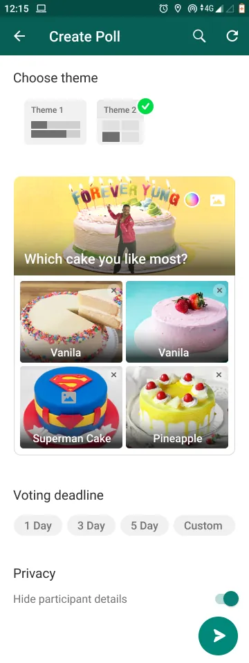
A richer theme for business
Theme 2 is more interactive and business-focused, with a live preview, editable gradients, and images or GIFs. I didn't have WhatsApp Business screenshots, so it uses the private user's colour theme for now. View the theme 2 prototype
Polls in status
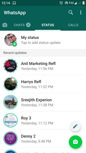
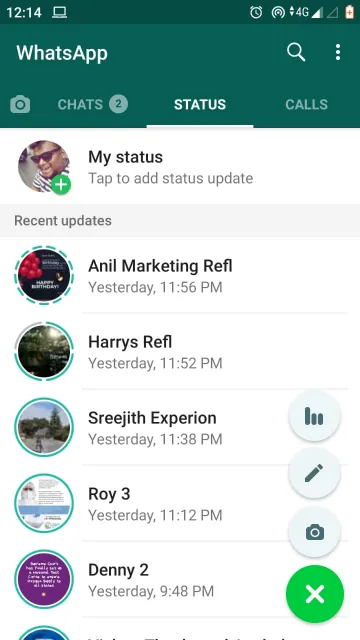
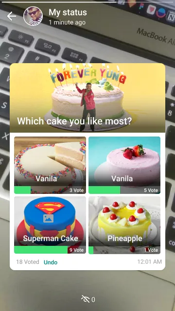
Only for business users, this reaches more customers and gets more feedback. Private users only see it if they saved the business number. People usually post status from the camera, so the camera stays in the most reachable spot, with Poll at the top of the expanded buttons. More participation here is an assumption still to be tested. View the status prototype
Poll history
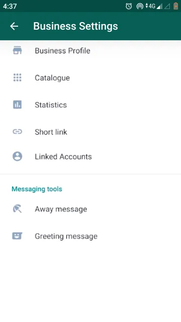
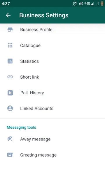
A new Poll History item helps business users make decisions over the long term. Its icon looks similar to Statistics, so that needs more work. View the history prototype
5. Validate
I ran remote and in-house guerrilla usability tests with 4 users.
Results by task and user
| Task | U1 | U2 | U3 | U4 |
|---|---|---|---|---|
| Find the poll function | ✓ | ✓ | ✓ | ✓ |
| Find the other way to post a poll | ✕ | ✓ | ✓ | ✕ |
| Create a poll with pictures | ✓ | ✓ | ✓ | ✕ |
| Remove your vote | ✓ | ✓ | ✕ | ✓ |
| Add and remove a poll option | ✓ | ✓ | ✓ | ✓ |
16 of 20 attempts succeeded. The main flow worked; failures were about discovering secondary features.
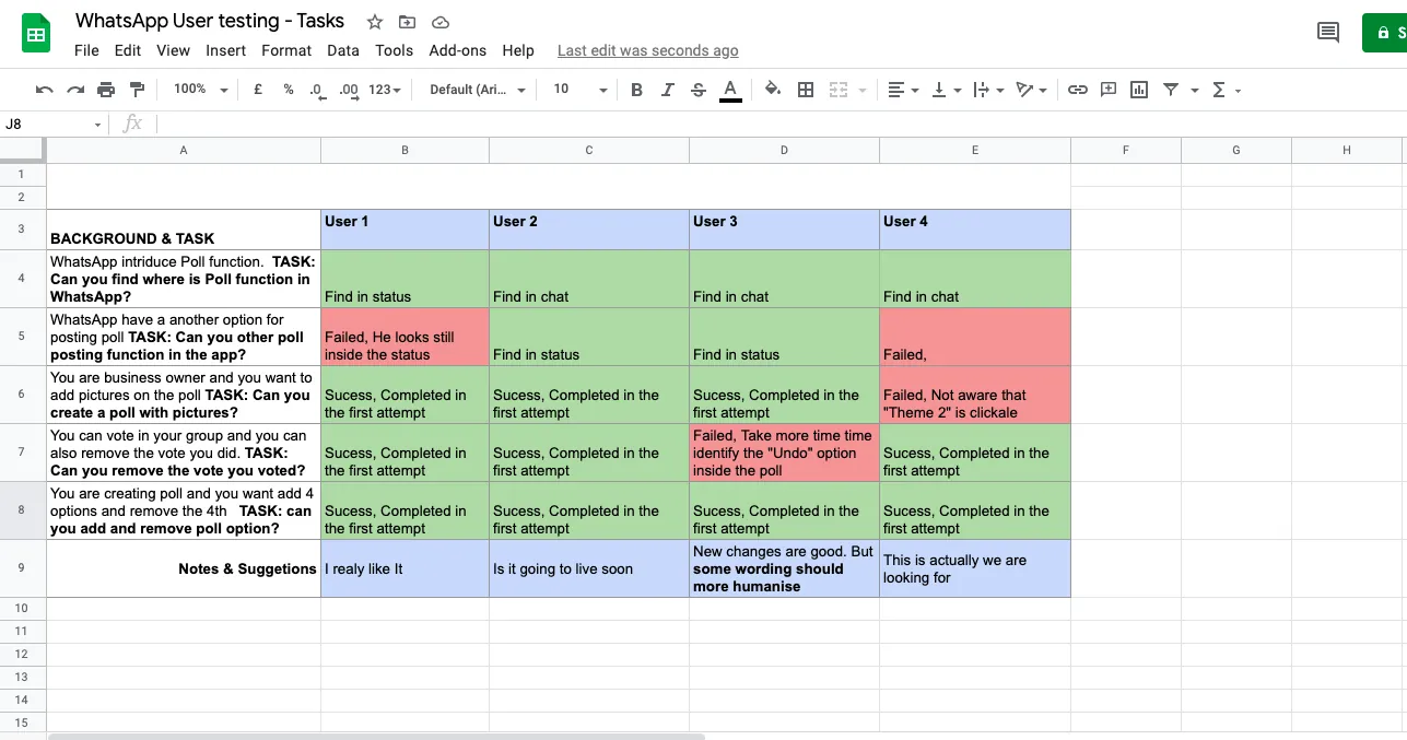
What we learned: The main flow worked. The failures came from discoverability: one person didn't realise Theme 2 was clickable, one took longer to find Undo, and status was hard to find as a second route.
What it changed: Theme 2 needs a clearer selection state, and Undo needs more prominence. One tester also asked for more humanised wording.
6. Outcome
This is a concept, so the outcome is what I learned and what I chose to ship first.
What I left out, and why
I had many more ideas, including multiple answers, shareable links, analytics, reminders, countdowns and templates. Tesler's Law says some complexity can't be removed, only moved. So release one stays simple: test it, learn, then add what's relevant.
What I'd do next
Fix the two discoverability issues and retest with more users, A/B test the two poll views, and validate the assumption that status polls increase participation.