The challengeSpocket's retailers couldn't easily track orders, narrow down searches or orders, or contact support when something went wrong.
What I didI walked the whole product, ran a heuristic evaluation, mapped the journey, interviewed 5 users, compared 4 layouts, and redesigned filters, tracking and support.
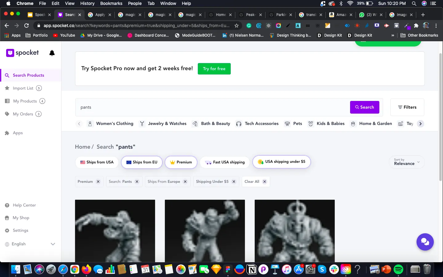
What happenedUsers completed 20 of 25 task attempts, and the project reported monthly revenue improved by 17% above. Bulk checkout remained the weakest task.

1. Understand
Four problems, one retailer
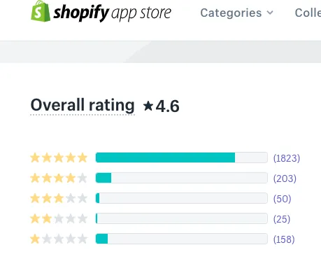
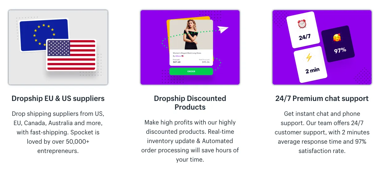
Spocket is a dropshipping app that connects to Shopify and WooCommerce. Unlike competitors focused on AliExpress, its suppliers are mostly in the United States, Europe and Australia, which keeps shipping times shorter.
The team identified four problems on the Order and Search pages:
- There is no clear way for customers to track their packages and orders on the orders page.
- It's difficult for retailers to narrow down searches.
- It's difficult for retailers to narrow down their orders.
- It's difficult for retailers to contact Spocket about order issues.
How might we help retailers find the right product and trust what happens after they order?
How I worked
Learn the product, problem-focused research, ideation, design and prototype, then solution and testing.
The market
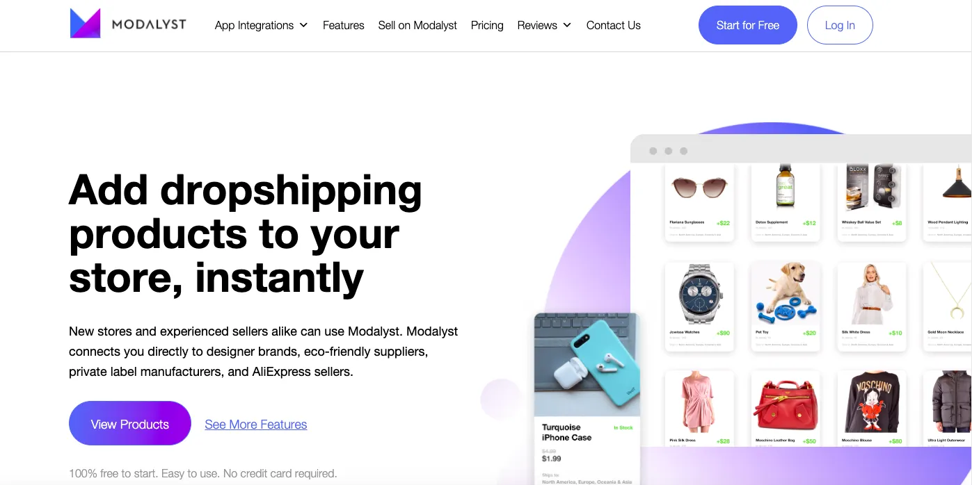
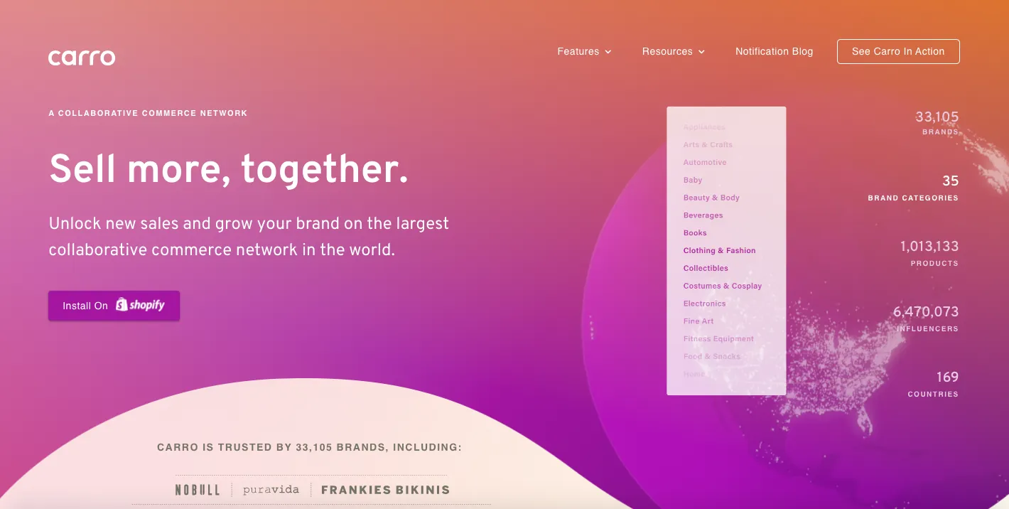
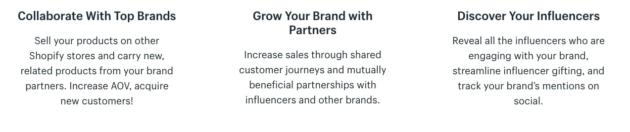
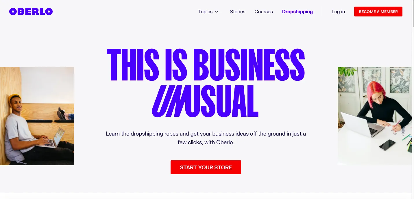
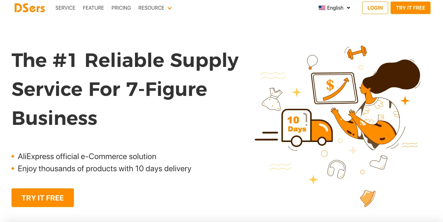
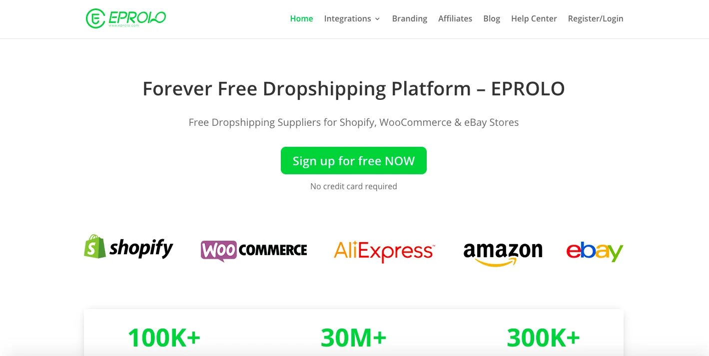
I studied how competitors present their value, and watched competitor reviews on YouTube. Most make similar promises: fast delivery, better suppliers and easy store integration.





Walking the whole journey
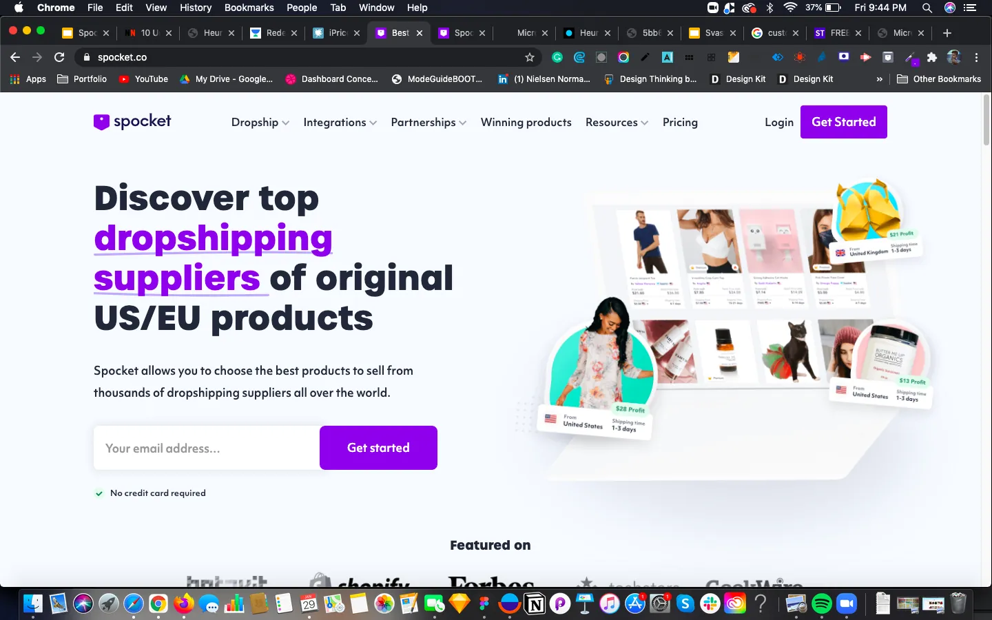
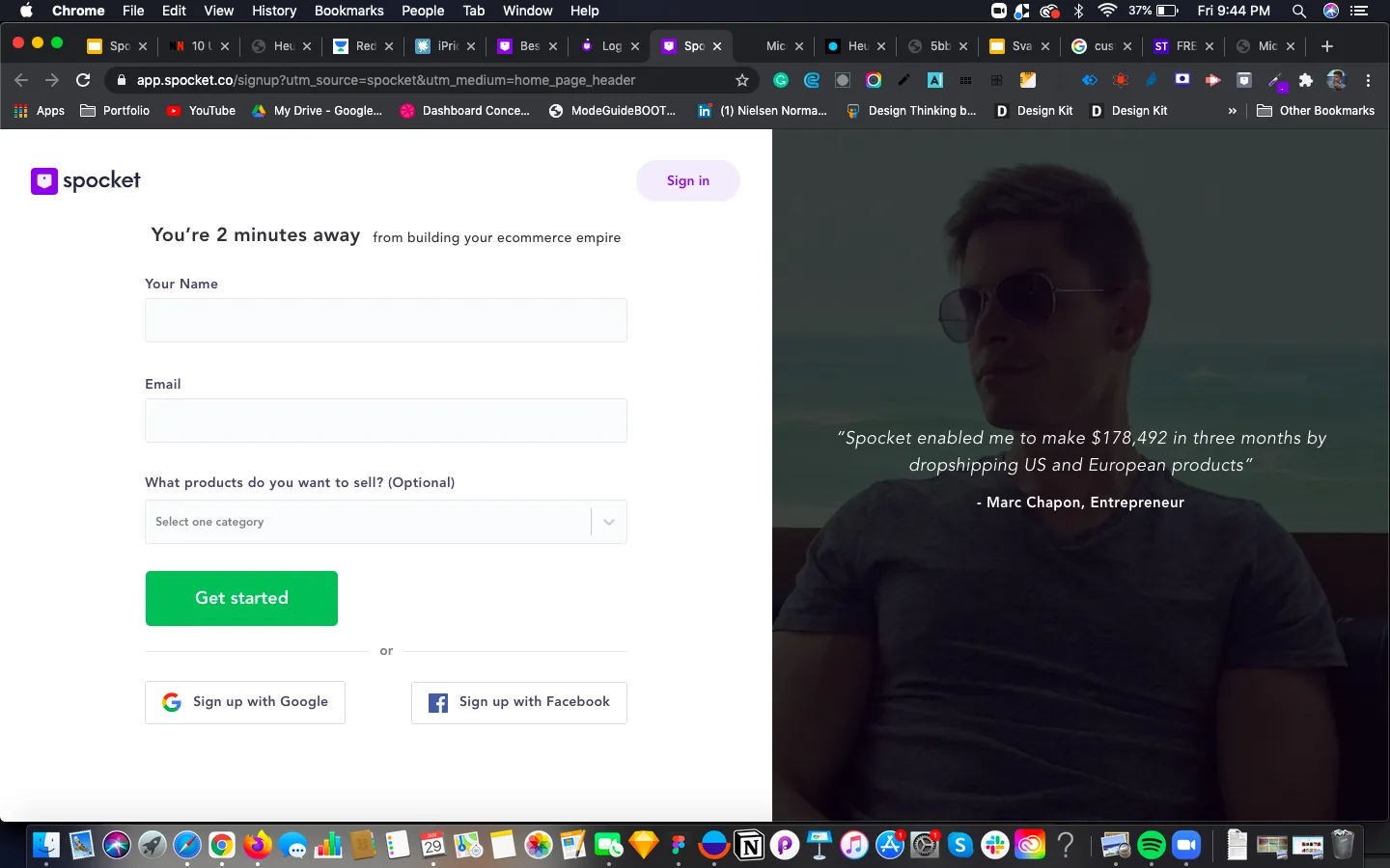
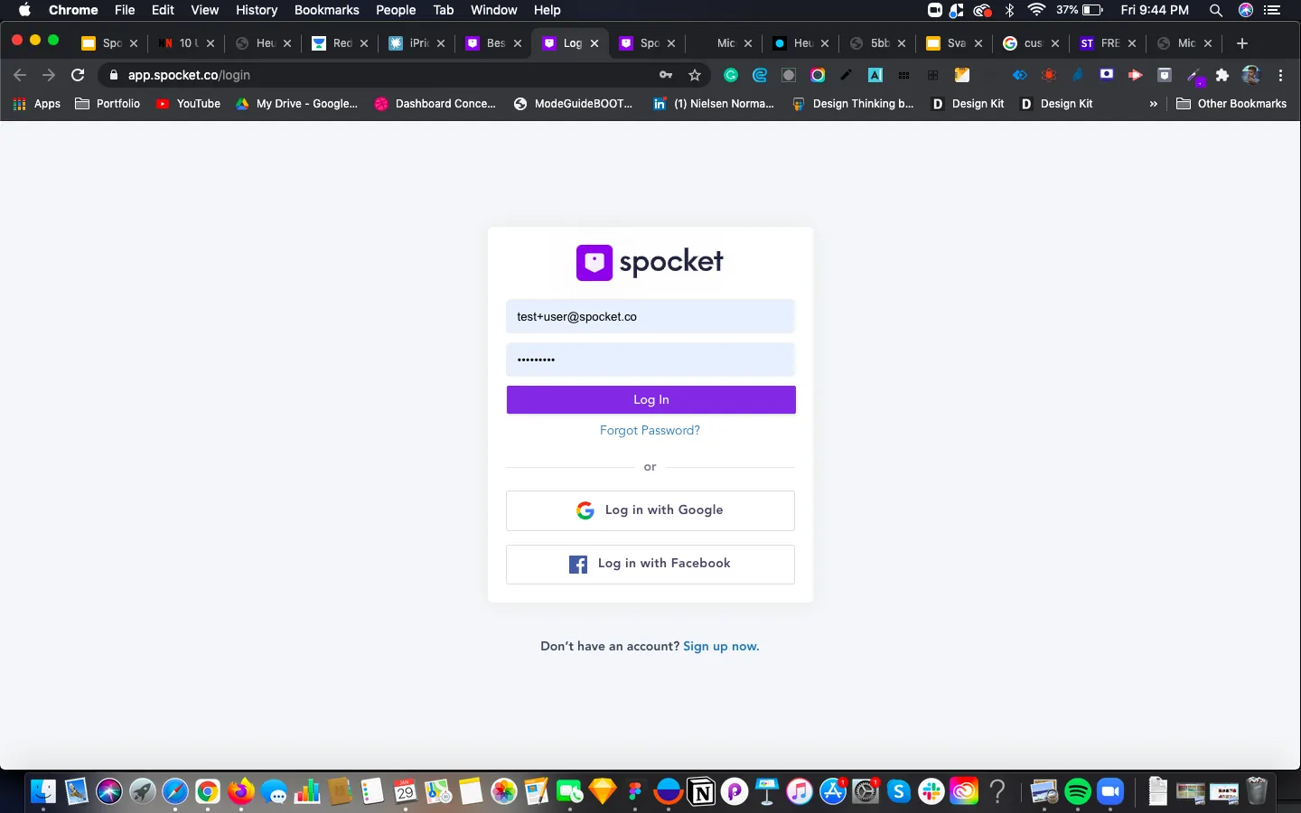
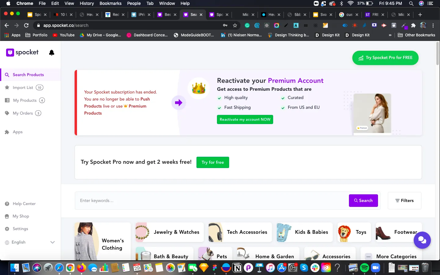
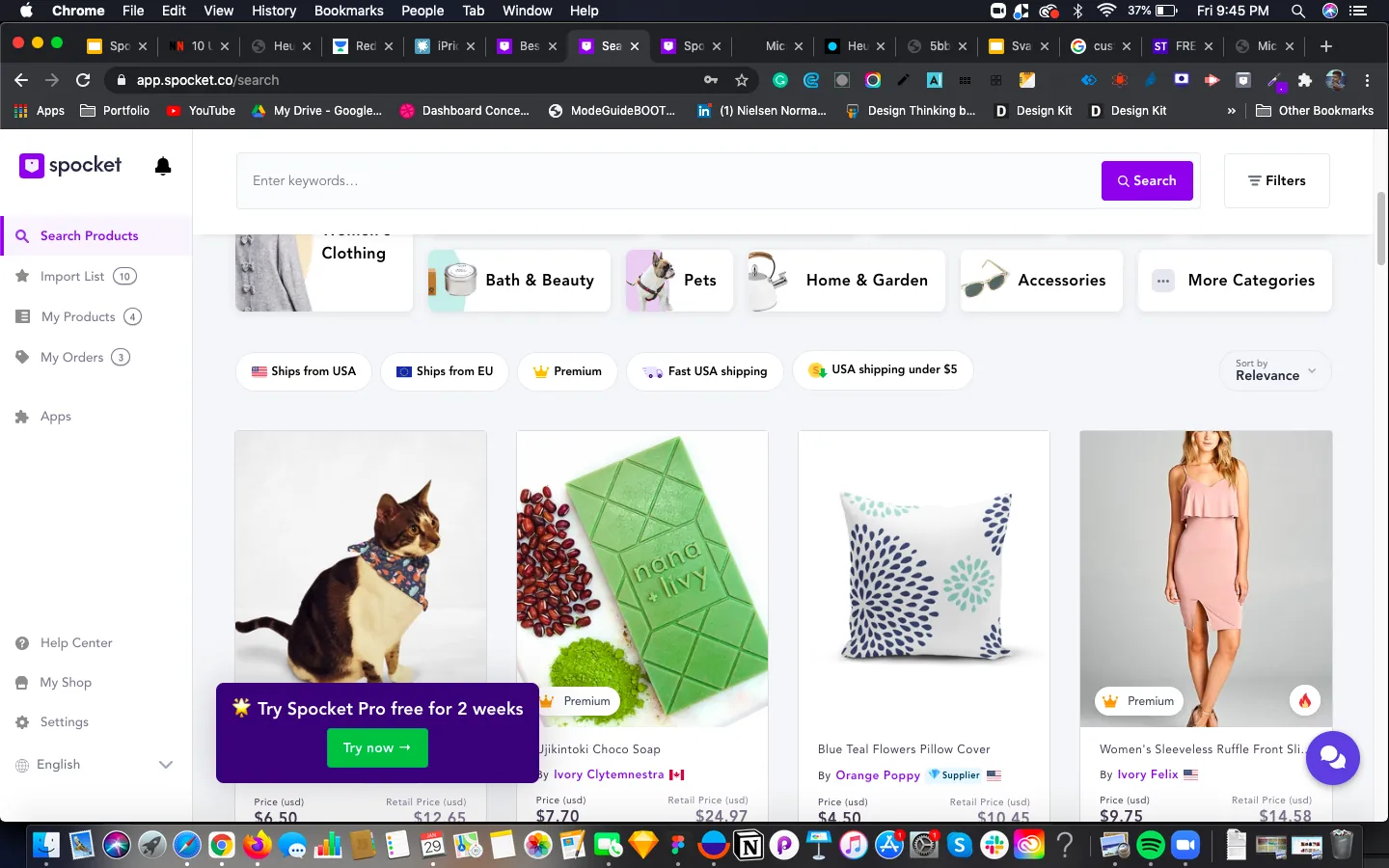
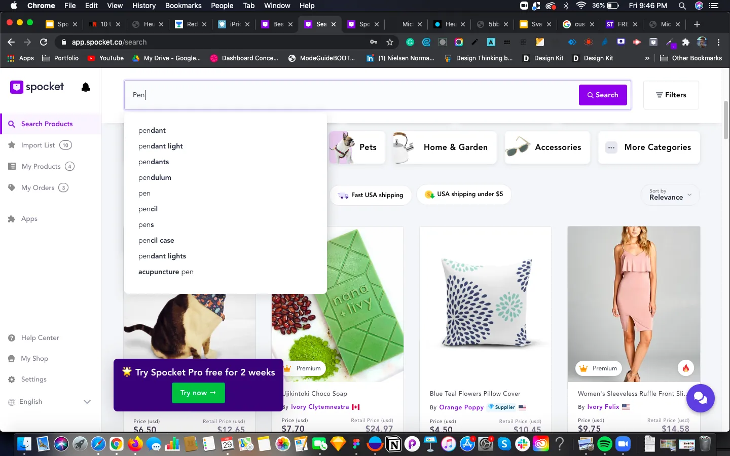
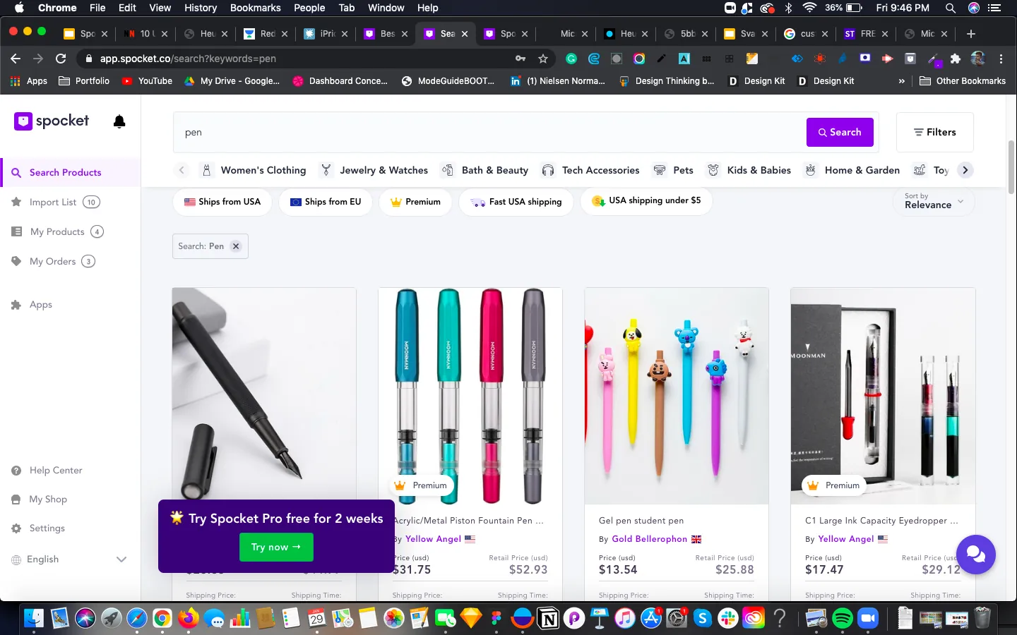
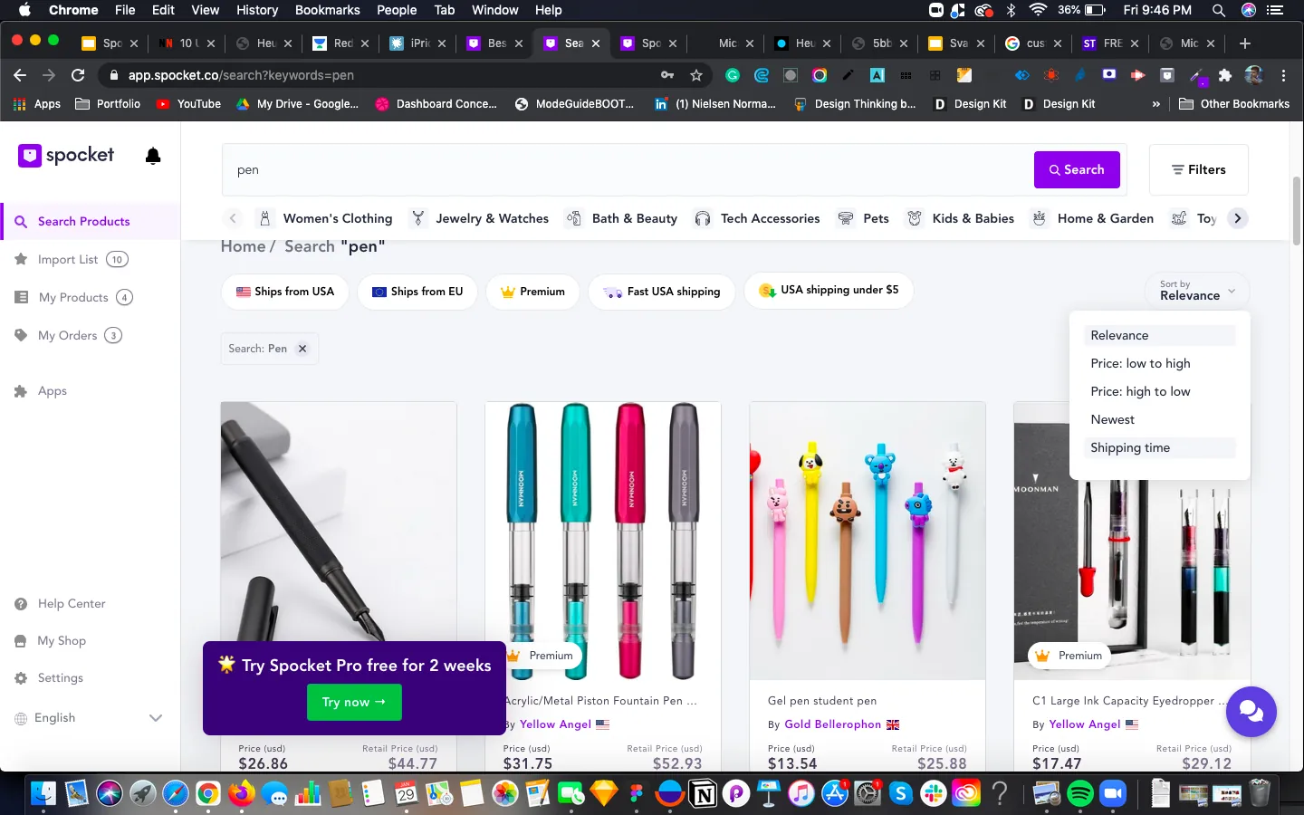
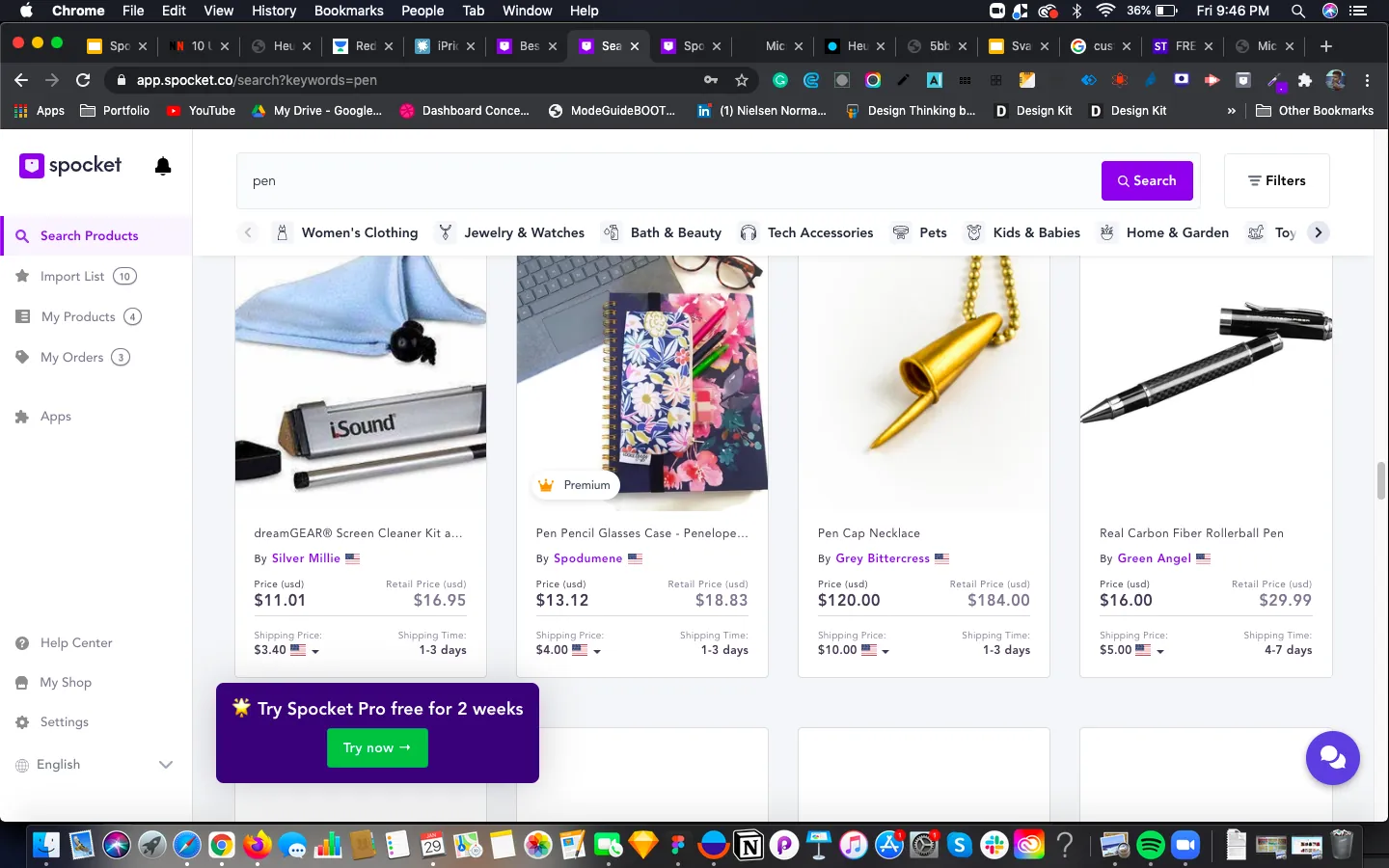
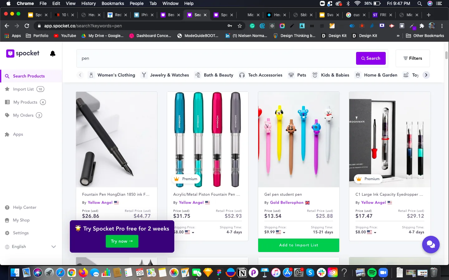
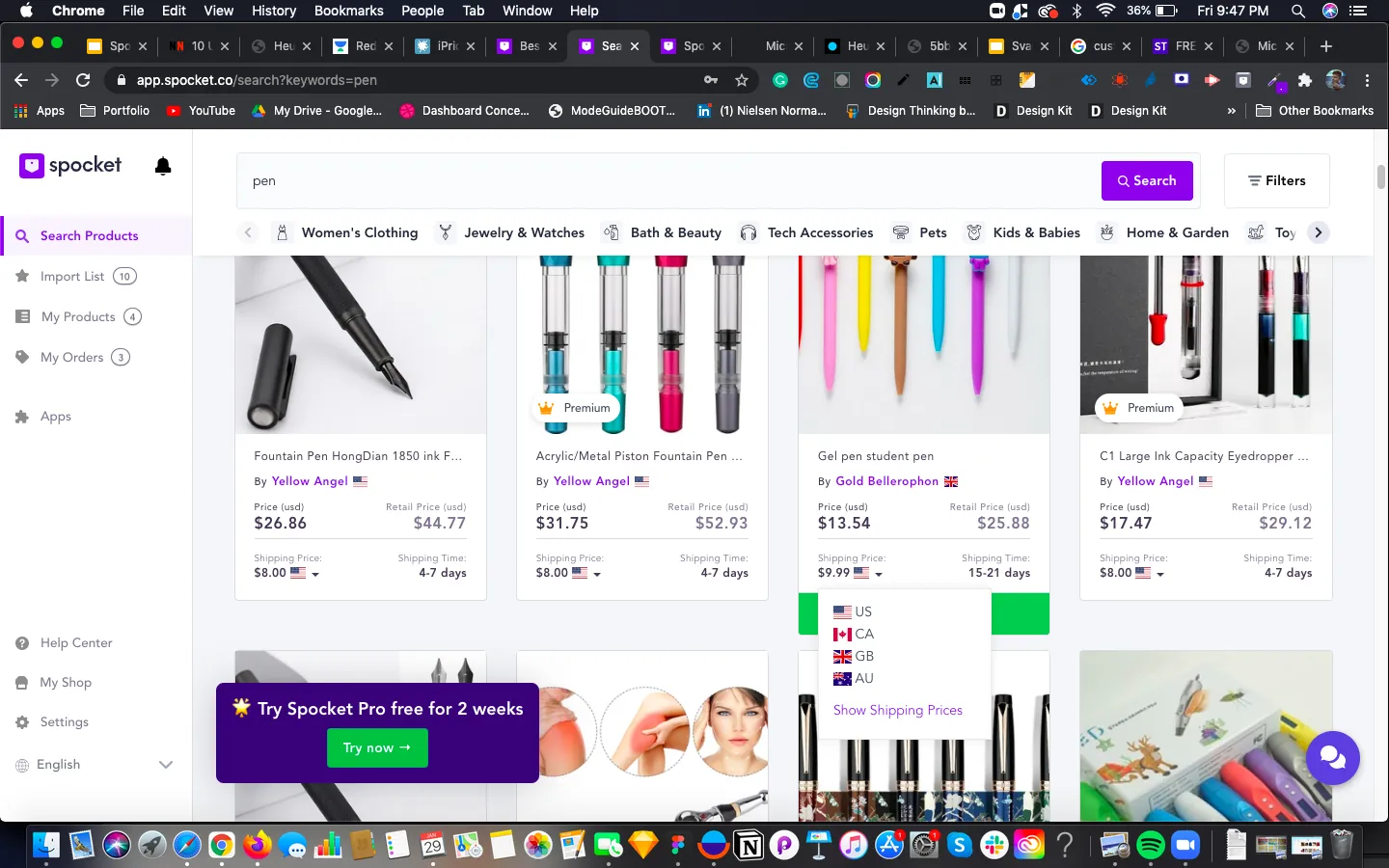
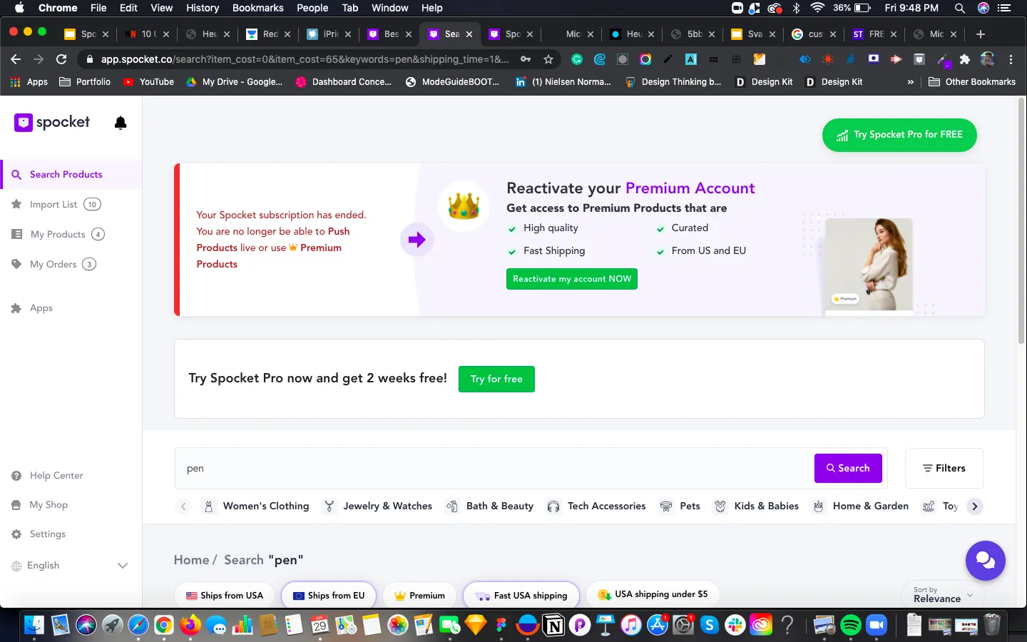
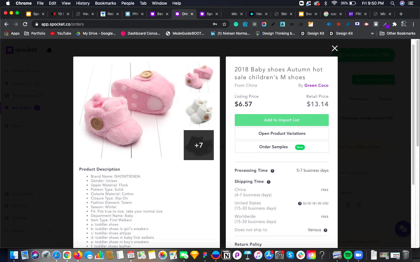
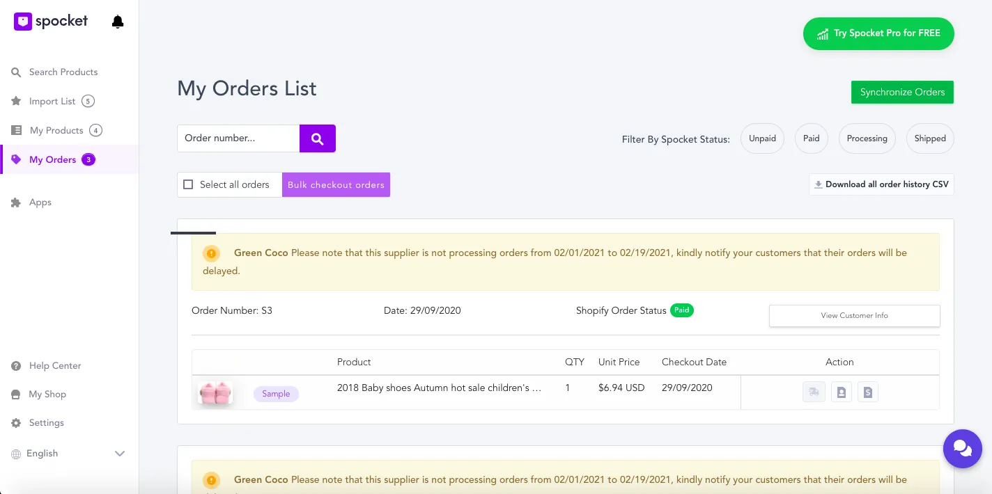
I went through the product as a retailer, in 19 steps from the landing page to the orders screen.
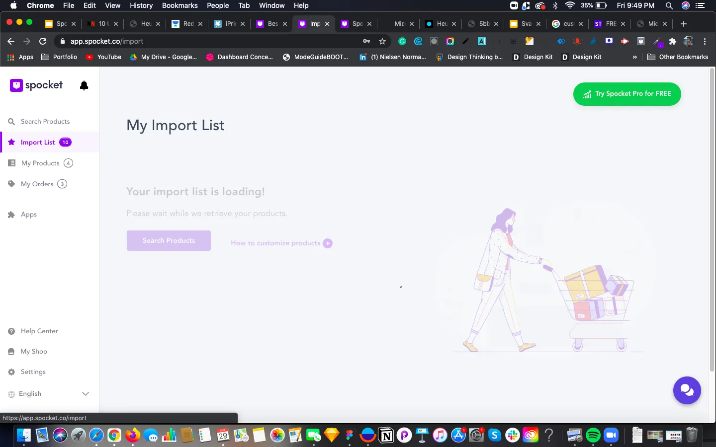
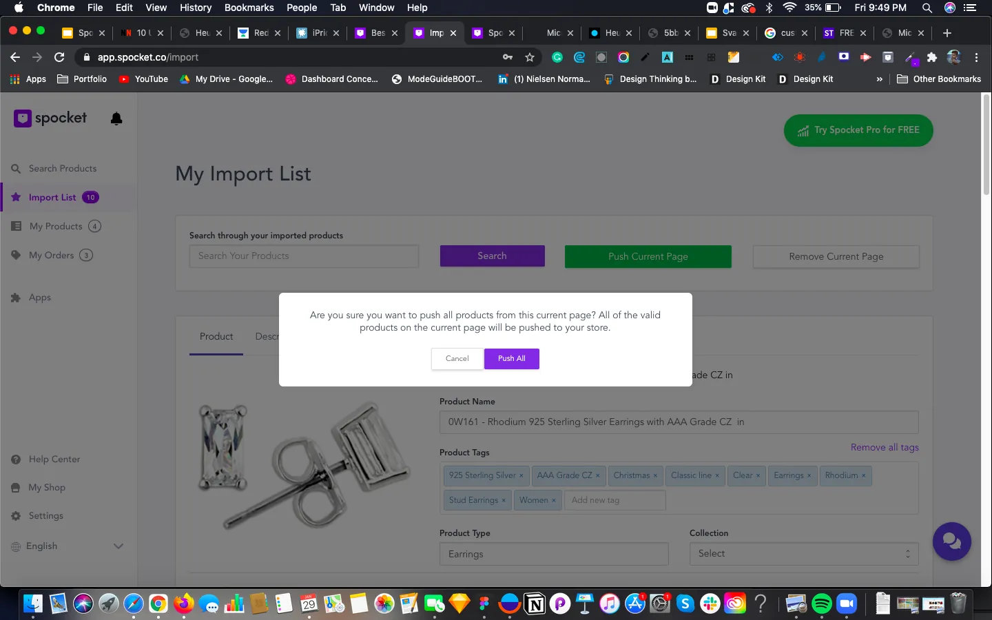
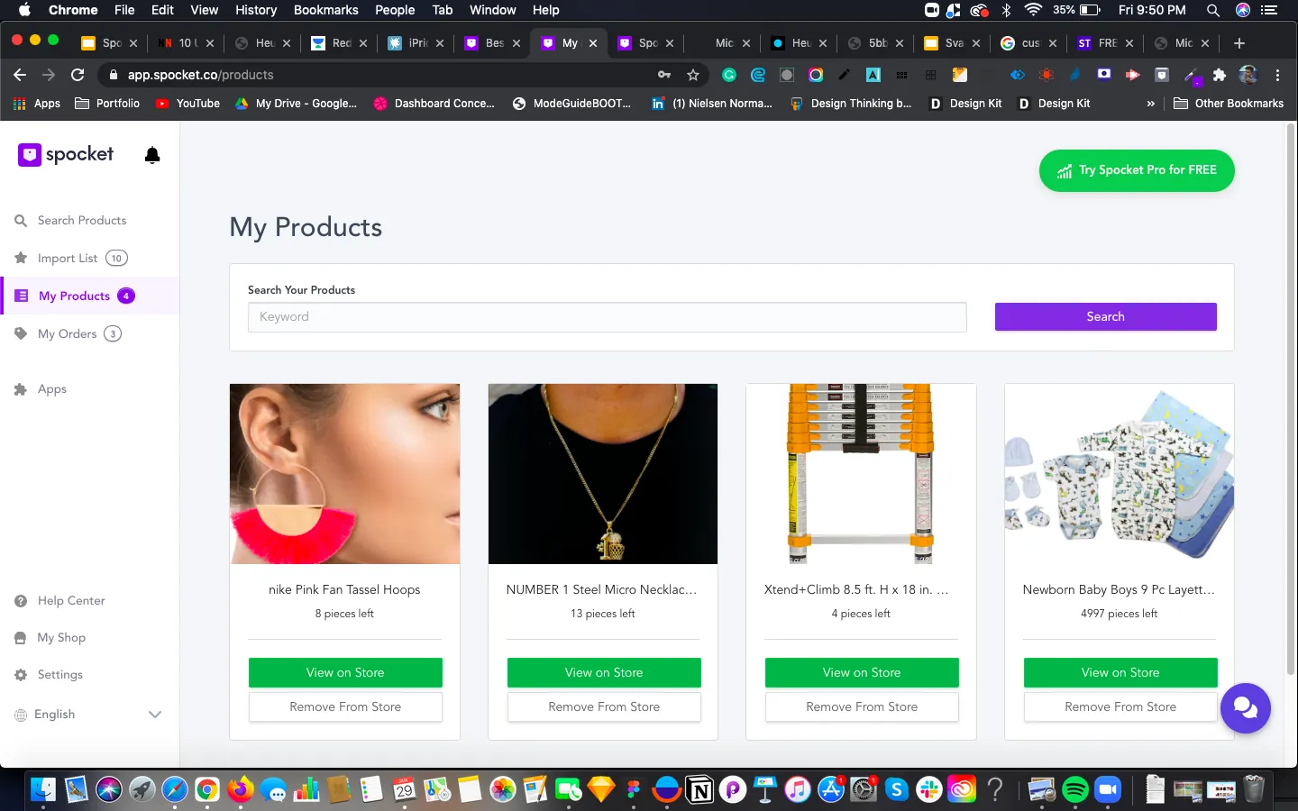
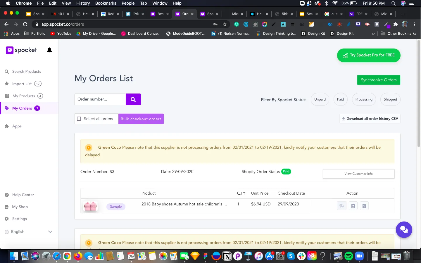
Two kinds of retailer
A retailer sells directly to customers for profit, and cares about their consumer base, personal connection, brand identity, and price and margin.
New and existing retailers need different things
- Understand the product
- Register and find the product
- Instant recovery from errors
- Has already decided
- Direct link to the dashboard
- Knows where to get help
- 67% sell the same product again and again
What we learned: Most existing users sell the same product again, and many decide what to sell before they arrive.
What it changed: This pointed to a Buy Again path in orders, not just better discovery.
Heuristic evaluation
I evaluated the product against Jakob Nielsen's 10 heuristics and ranked violations from 1 (cosmetic) to 4 (very high). I also recorded what was working, so the redesign wouldn't lose it.
How serious were the issues
Which heuristics broke most often
| Heuristic | Issue slides affected | |
|---|---|---|
| Consistency and standards | 7 | |
| Recognition rather than recall | 7 | |
| User control and freedom | 6 | |
| Aesthetic and minimalist design | 5 | |
| Visibility of system status | 4 | |
| Match with the real world | 3 | |
| Error prevention | 3 | |
| Help and documentation | 3 | |
| Flexibility and efficiency | 2 | |
| Recover from errors | 2 |
Counted from the 14 issue slides in my evaluation. Each slide could cite several heuristics.
What we learned: Consistency and recognition failed most. People had to remember things, and the same action looked different across pages.
What it changed: Filters had to be visible, and search and order pages needed to behave the same way.
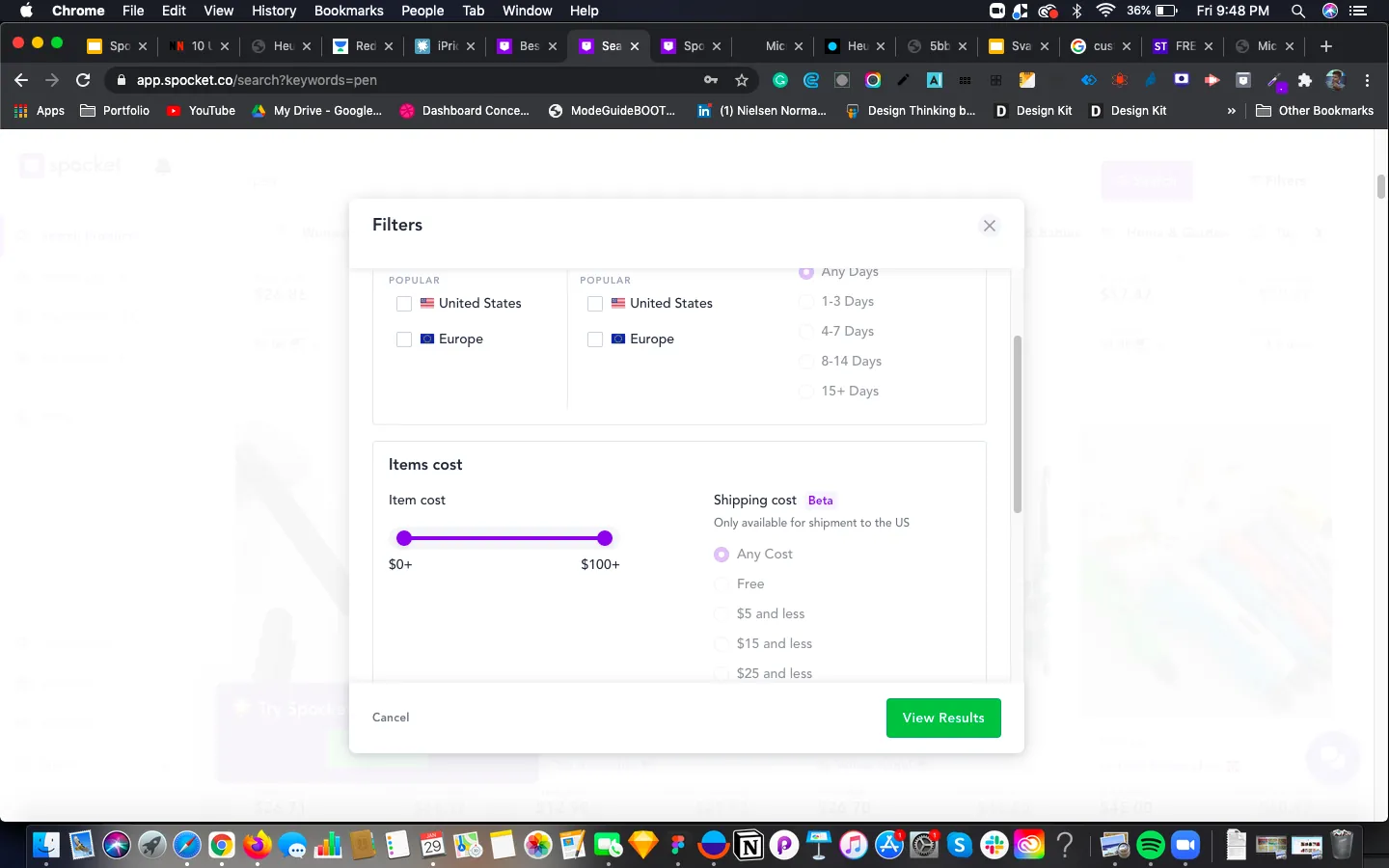
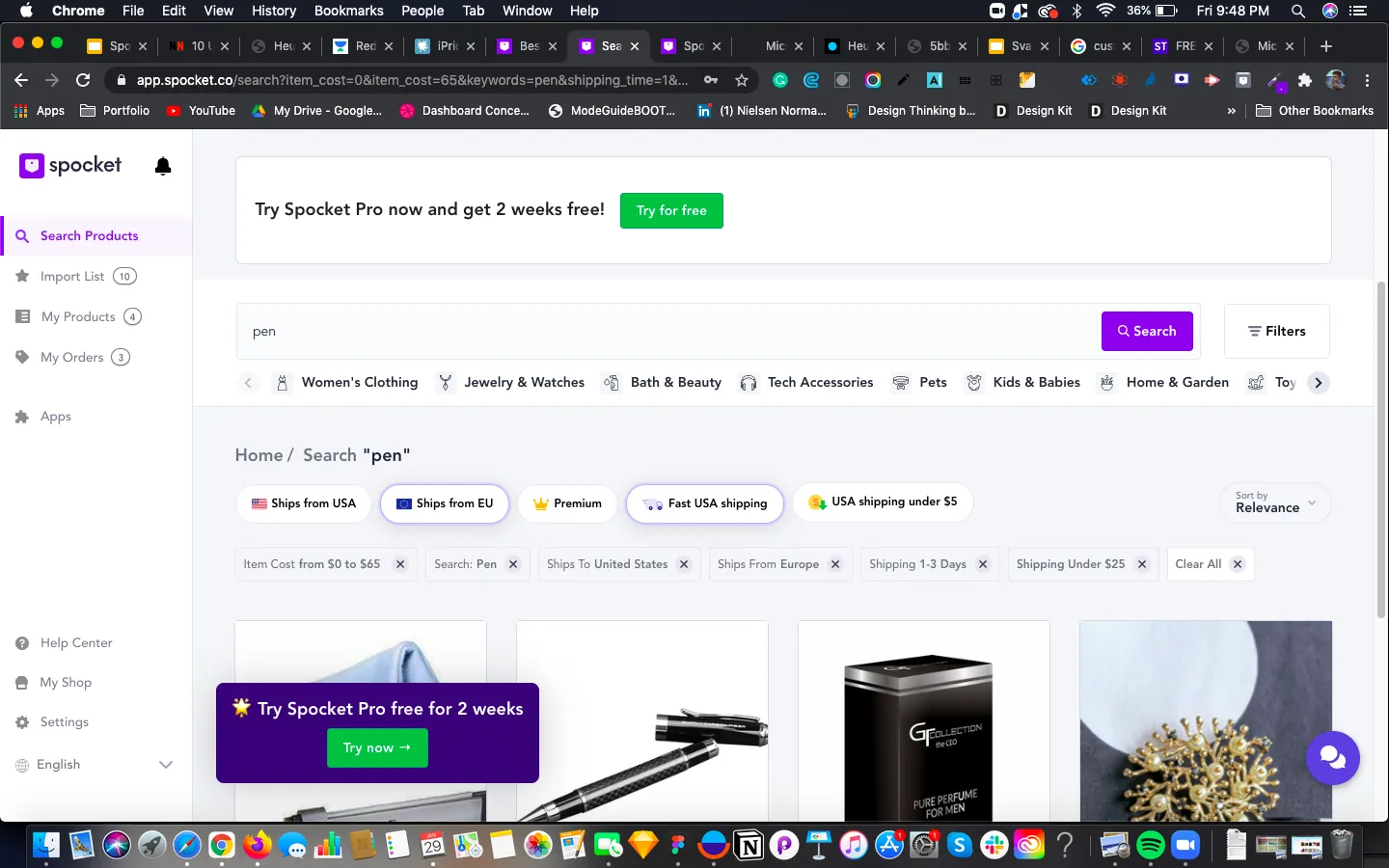
Search task: use the available options to narrow the results to the right product.
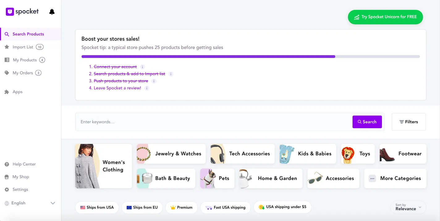
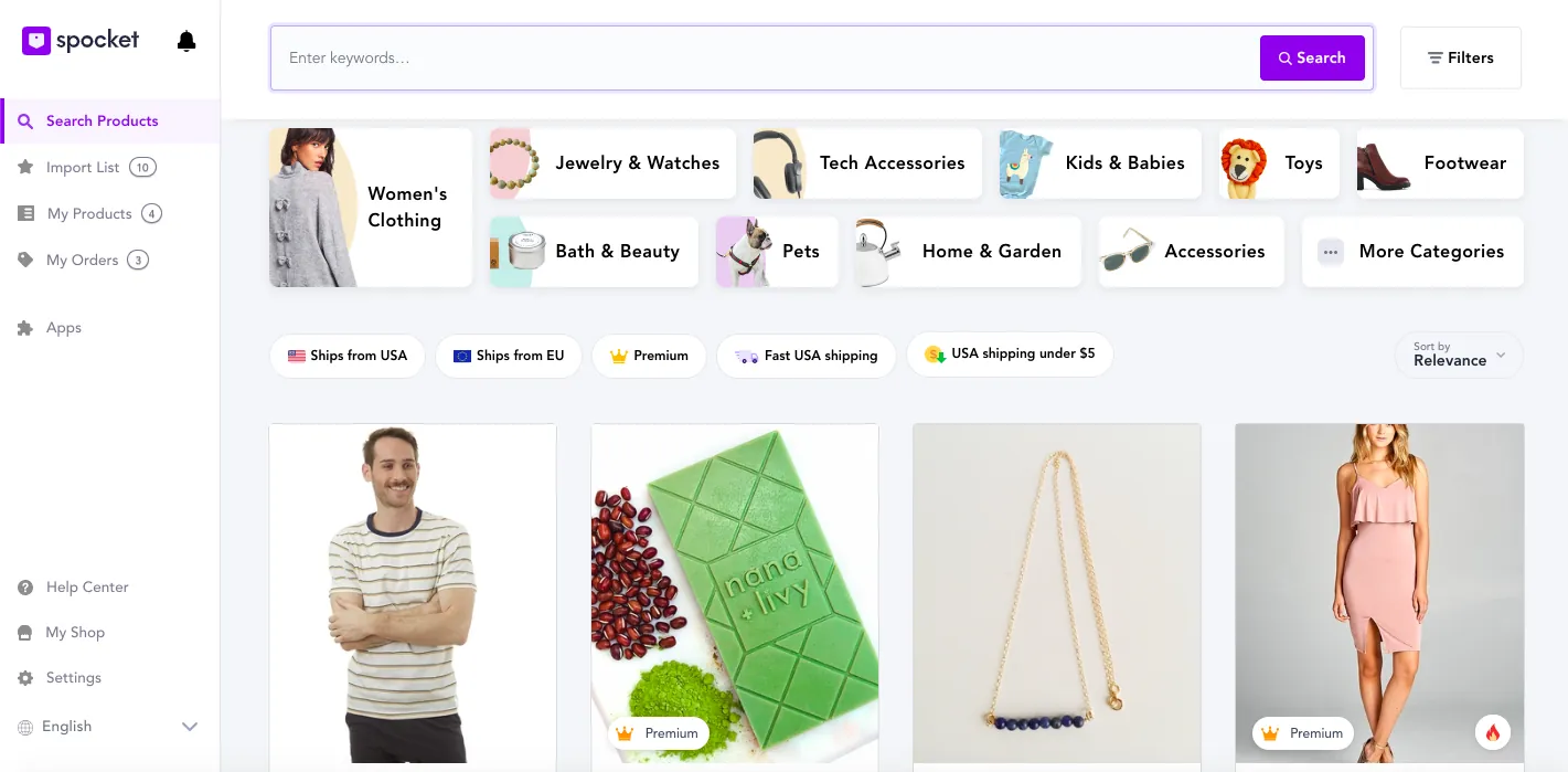
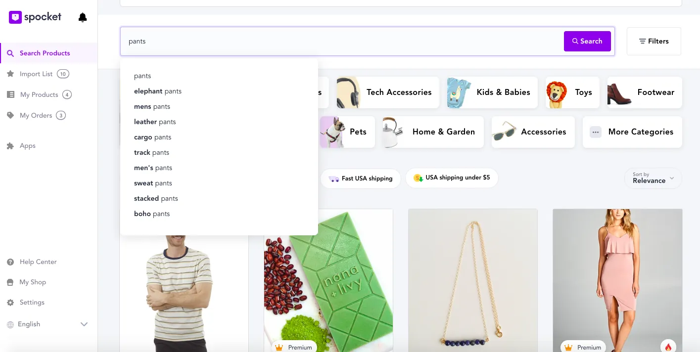
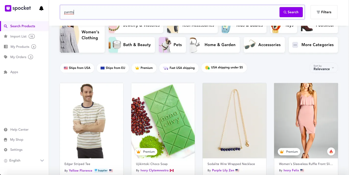
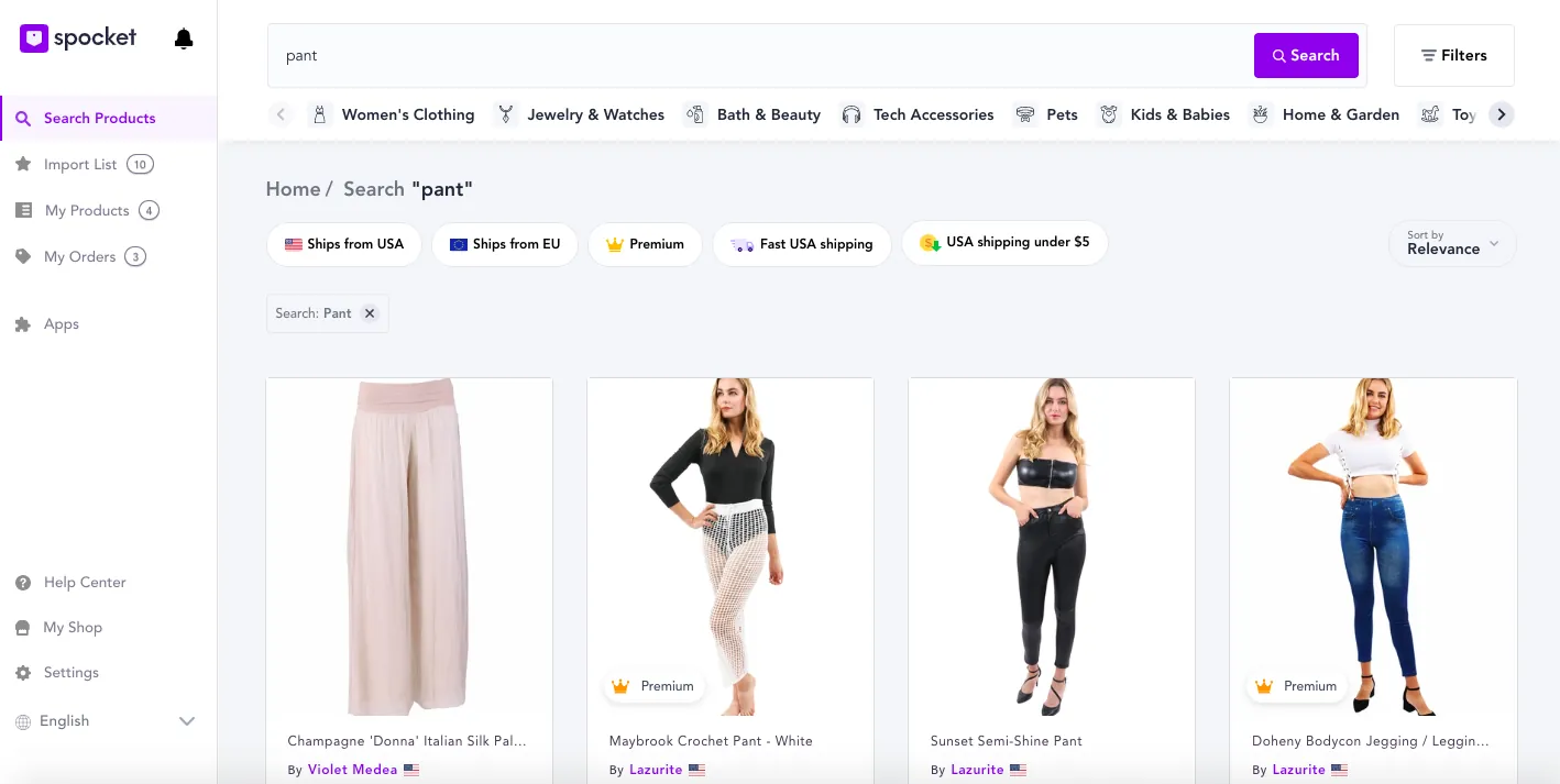
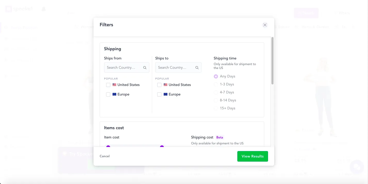
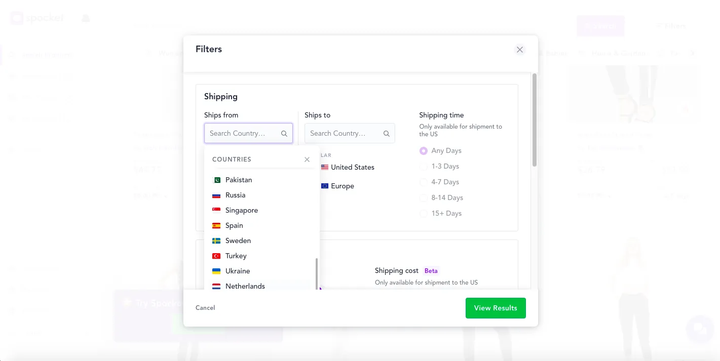
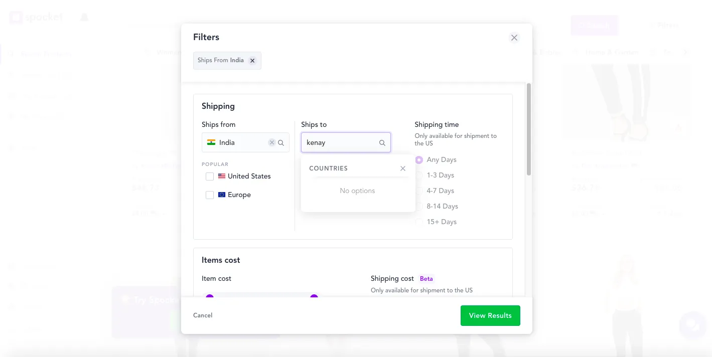
Working well: the page title is clear, category icons match the real world, and the active search field gives feedback.
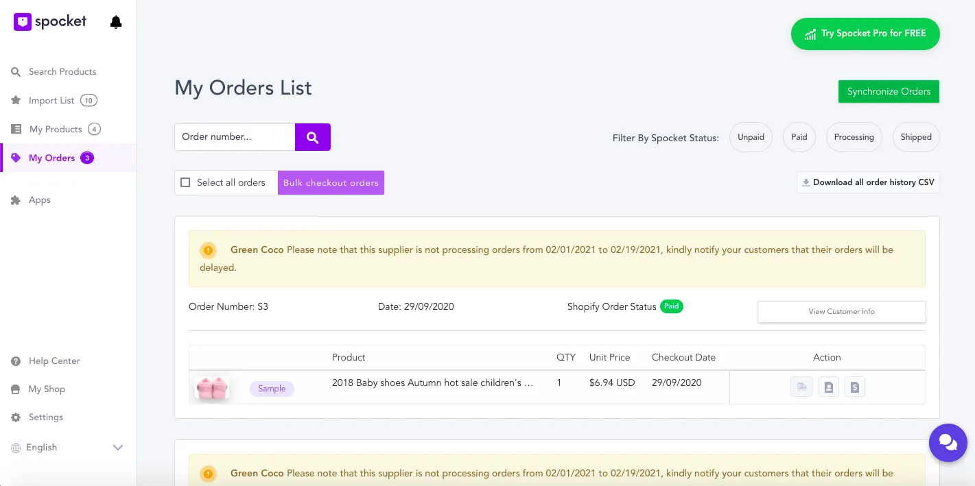
Order task: track your orders on the orders page.
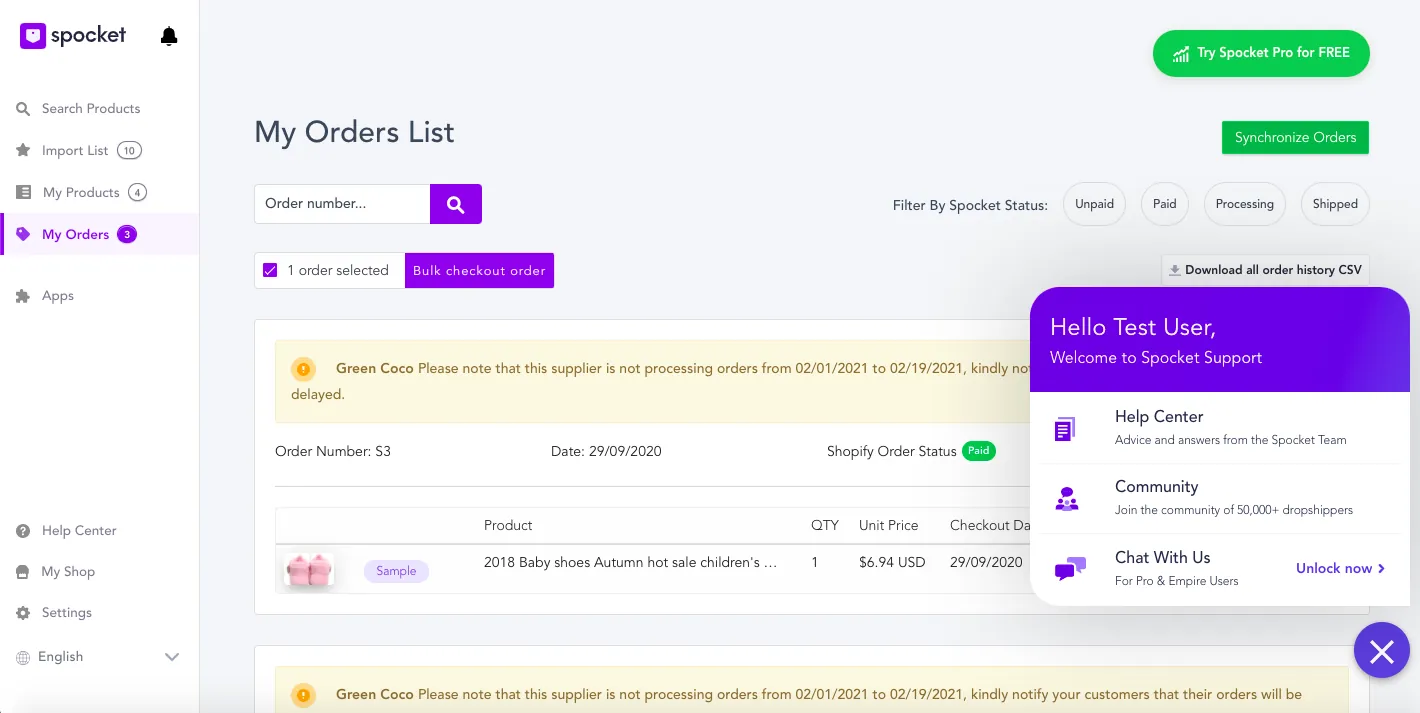
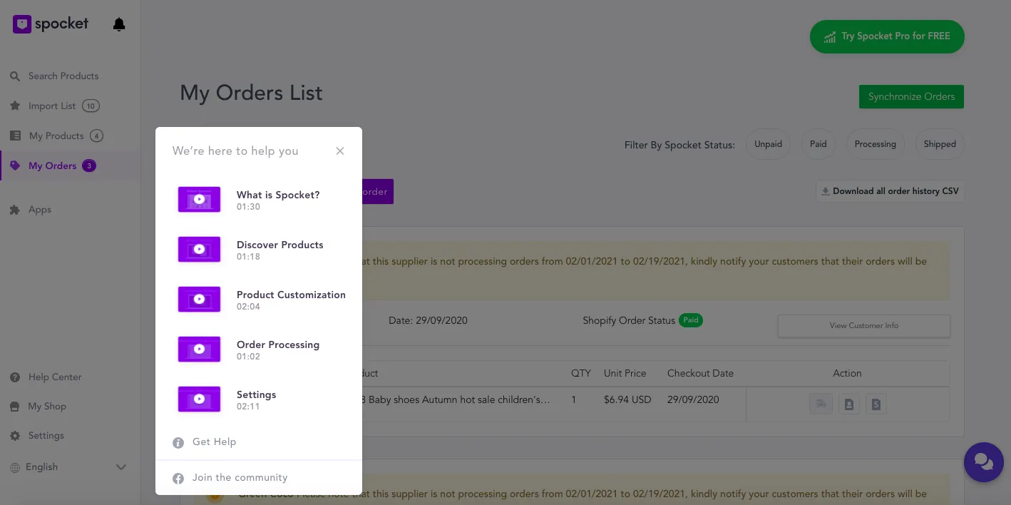
Support task: contact the Spocket team about an order issue.
2. Define
When do people use these screens?
I created a journey map for buying a product, then interviewed 5 users.
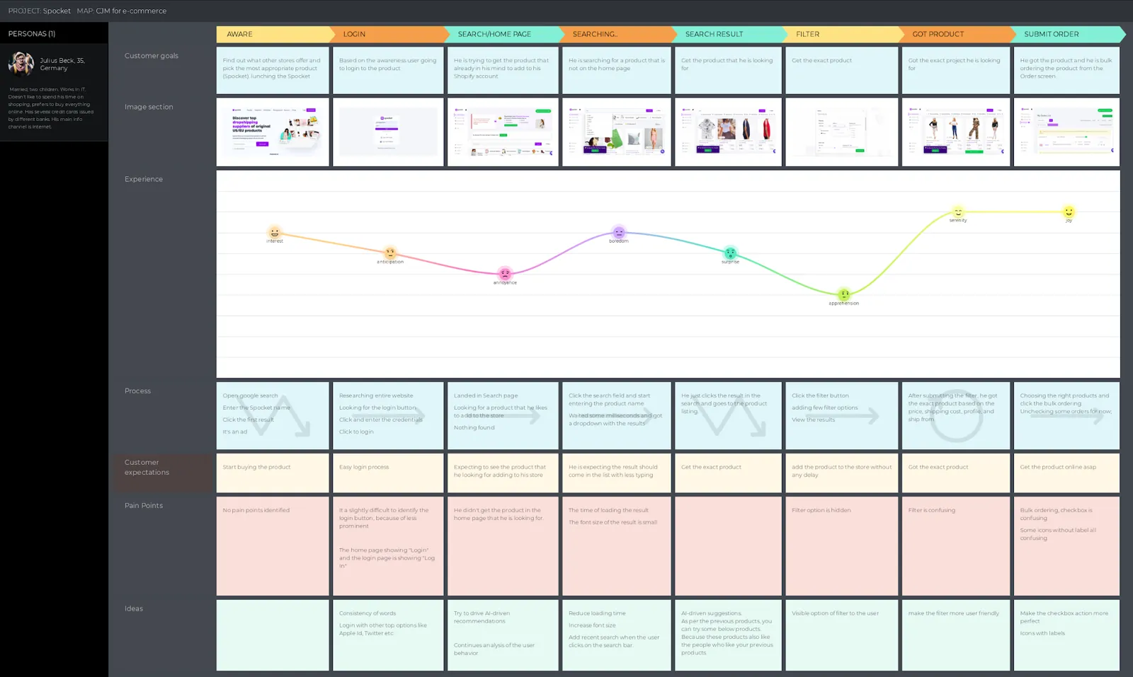
Julius's journey and where it hurts
| Stage | Feeling | Pain |
|---|---|---|
| Login | Anticipation | Hard to identify the login button; “Login” and “Log in” both appear |
| Search and home | Annoyance | The product he is looking for isn't on the home page |
| Searching | Boredom | Slow results and small text |
| Filter | Apprehension | The filter option is hidden |
| Got product | Serenity | The filter is confusing |
| Submit order | Joy | Bulk ordering checkbox and unlabelled icons are confusing |
Rebuilt from my customer journey map for Julius Beck, 35, Germany. The low point is the filter.
View the CJM in more readable size
3. Ideate
What the design should appeal to
Commerce is emotional. I considered triggers including urgency, belonging, curiosity and trust.
Why, when and how people filter
- Why? They can't find the exact product they're looking for.
- When? After finding the product.
- How? Through the filter button and a pop-up.
Filtering is a recovery step, so it should be close to the results and not interrupt them.
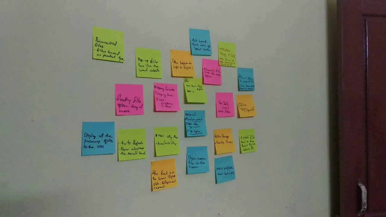
New filter structure
- From and to
- From UK to US
- From US to US
- Item cost range
- Shipping cost: any, free, less than $5
- Premier products
- Best sellers
- Top deals
- Trending items
- Better retail price
- Free shipping
- 20% offer
- Search field
- Top suppliers
Rebuilt from my brainstormed filter options. Shipping cost only becomes active once the user chooses the US as the shipping location.
Two new ideas
Magic Filter is a button on the product listing, for users who have ordered at least once. Based on behaviour, previous orders and store type, it applies filters the user can then customise. The Peak-End Rule suggests this could be the experience's peak. It's only a seed-stage concept.
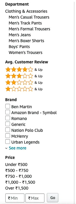
The detailed product filter borrows a familiar pattern from B2C sites such as Amazon and Alibaba, but personalised.
Comparing four layouts
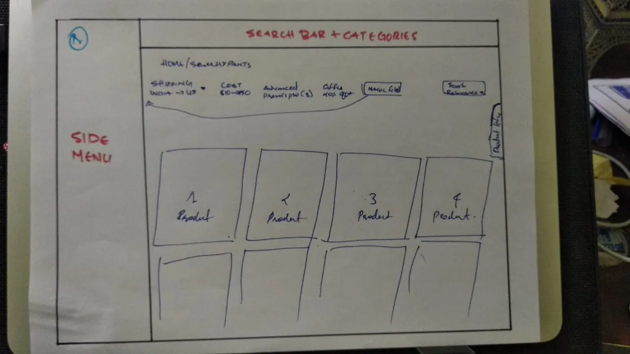
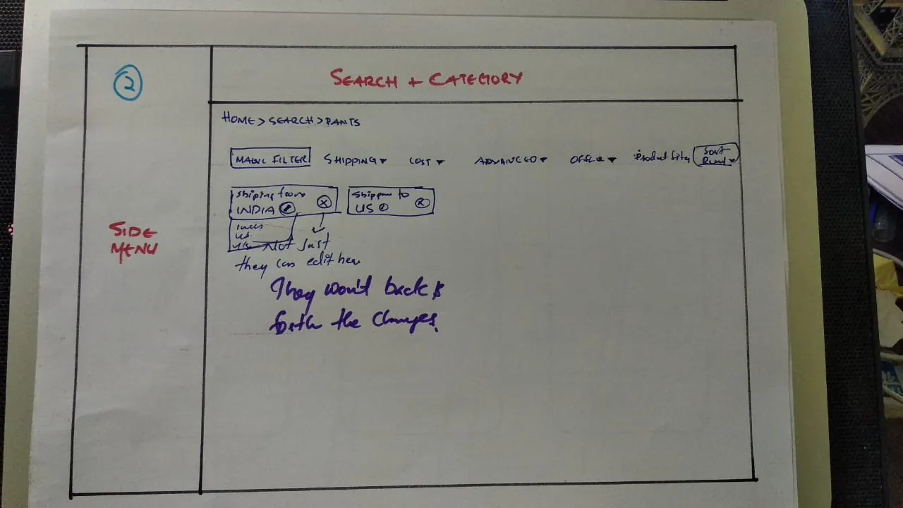
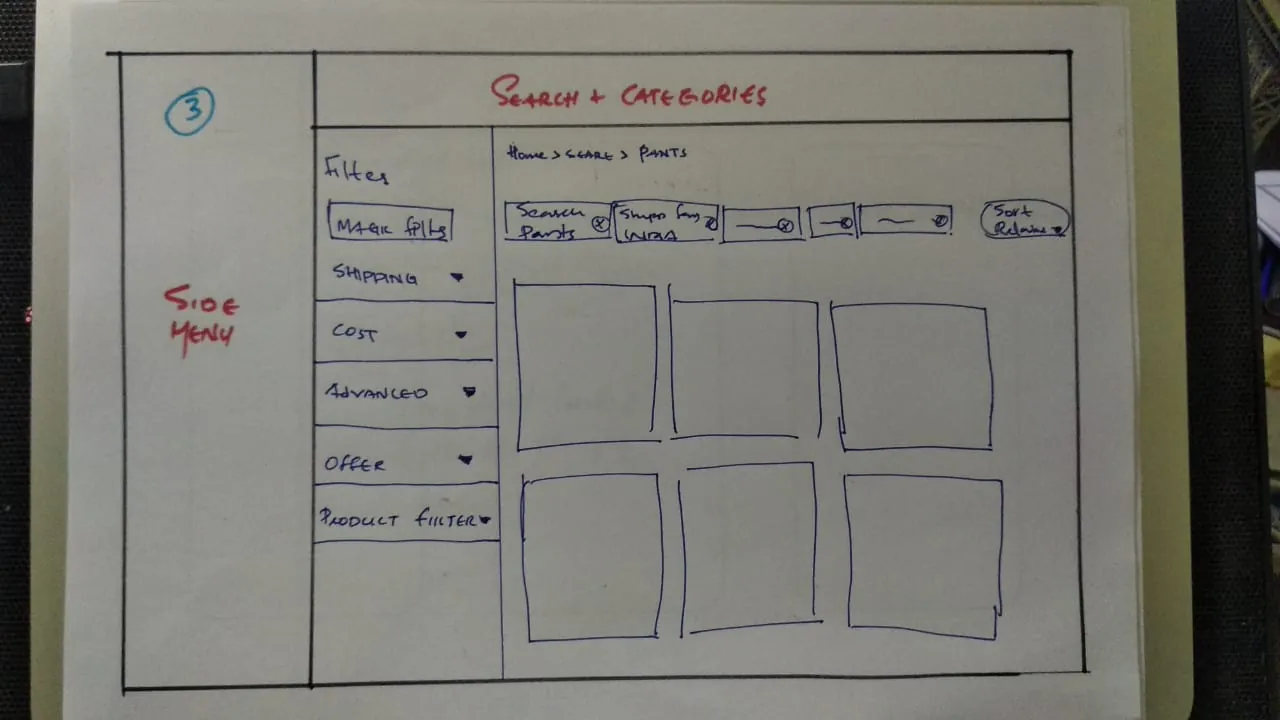
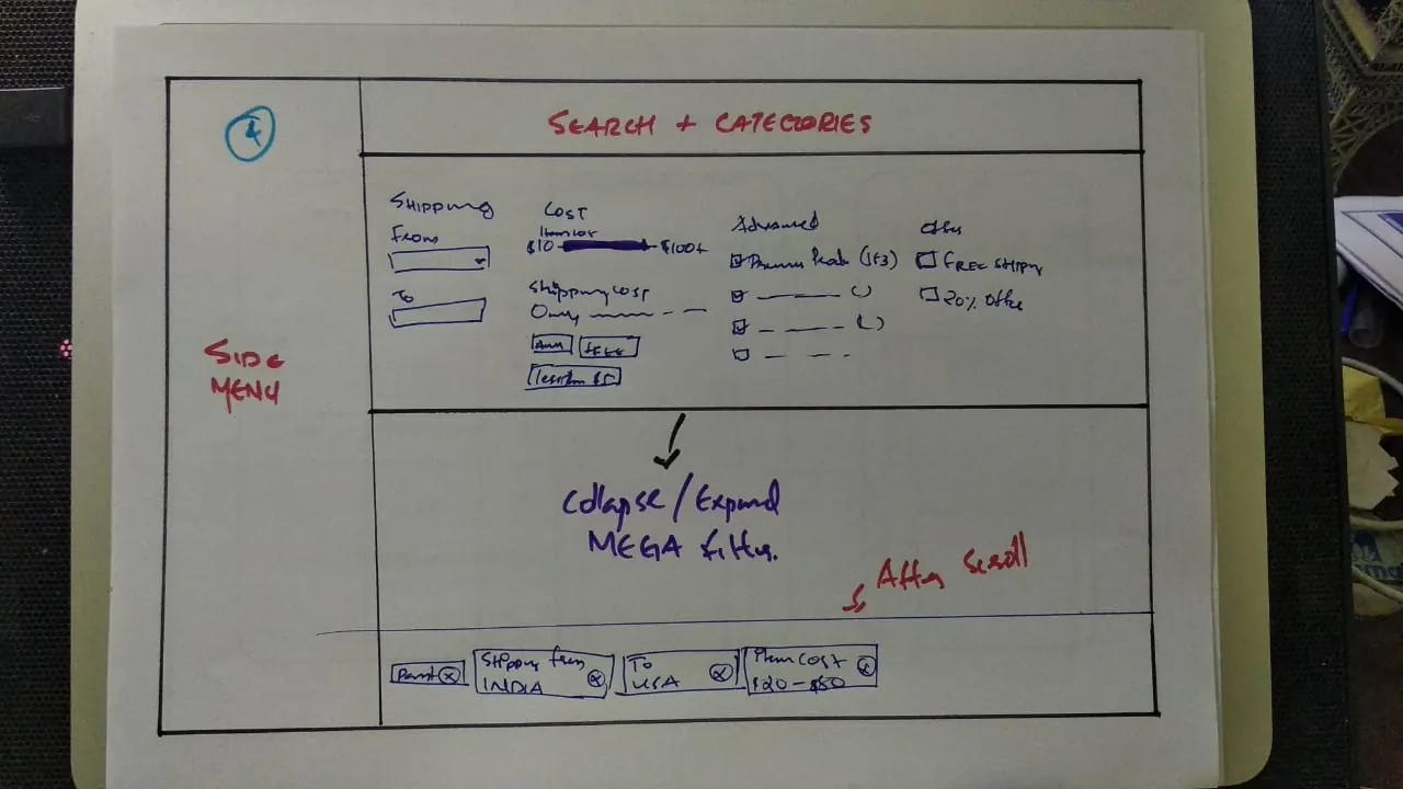
Comparing four layouts
| Option | Pros | Cons | Main reason |
|---|---|---|---|
| 01 | 3 | 3 | Easy access, but more clicks and unclear selections |
| 02 | 1 | 4 | Edit in place, but takes space and adds clicks |
| 03 | 2 | 5 | Visible, but listing falls to 3 items a row |
| 04 | 7 | 1 | Detailed, visible, fewer clicks, compact on scroll |
Pros and cons counted from my option slides.
Option 4 won for now.
I used dot voting, checked the option against the research problems, and planned to test the prototype.
4. Design
Filters
Using Spocket's design system, the primary filters are now on the page, selected filters are visible, and the Magic Filter sits beside the results.
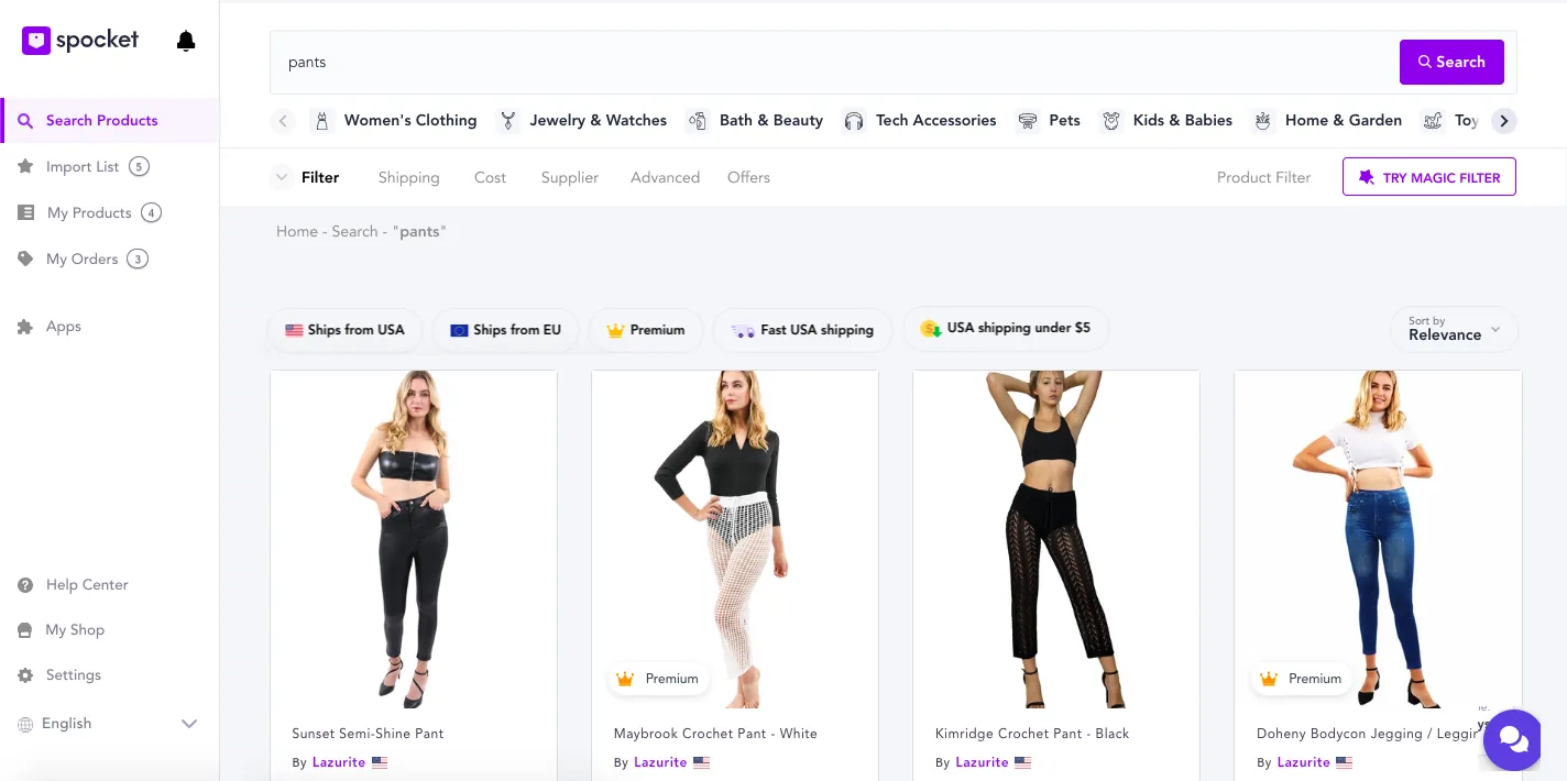
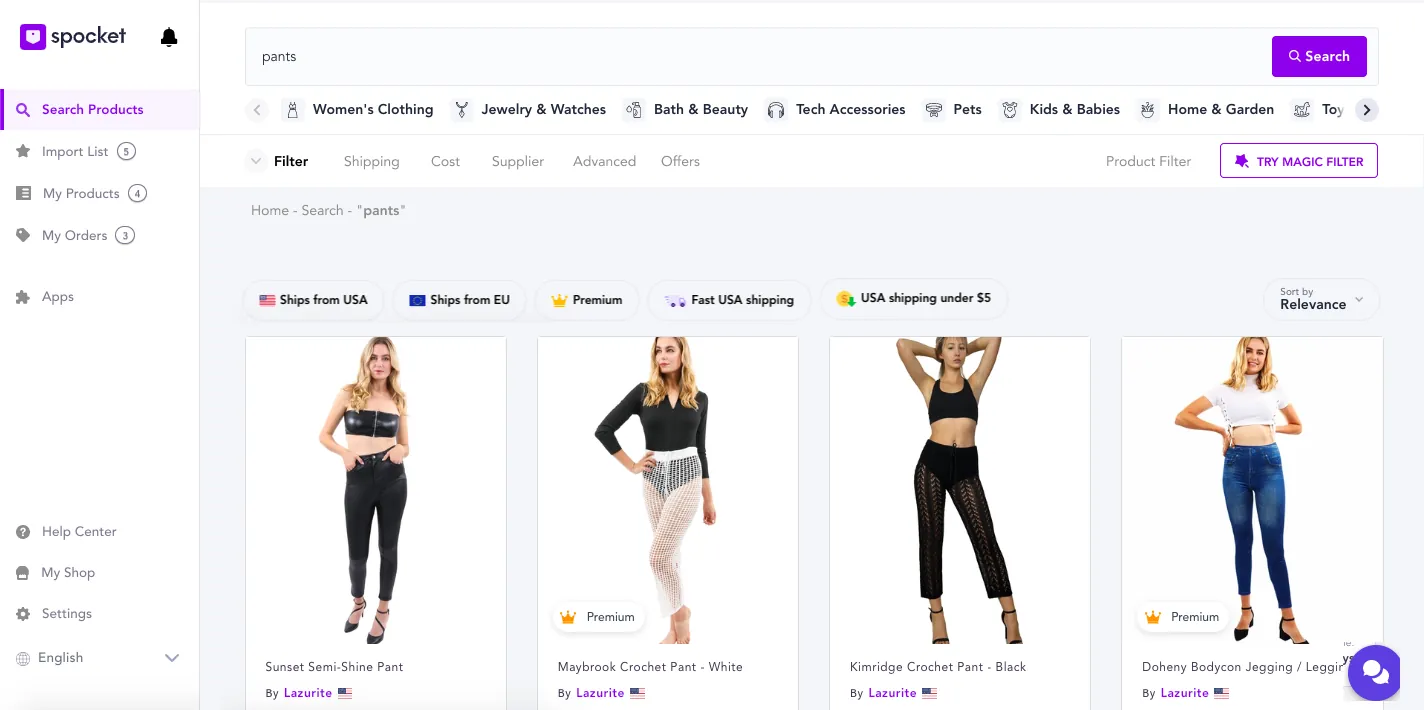
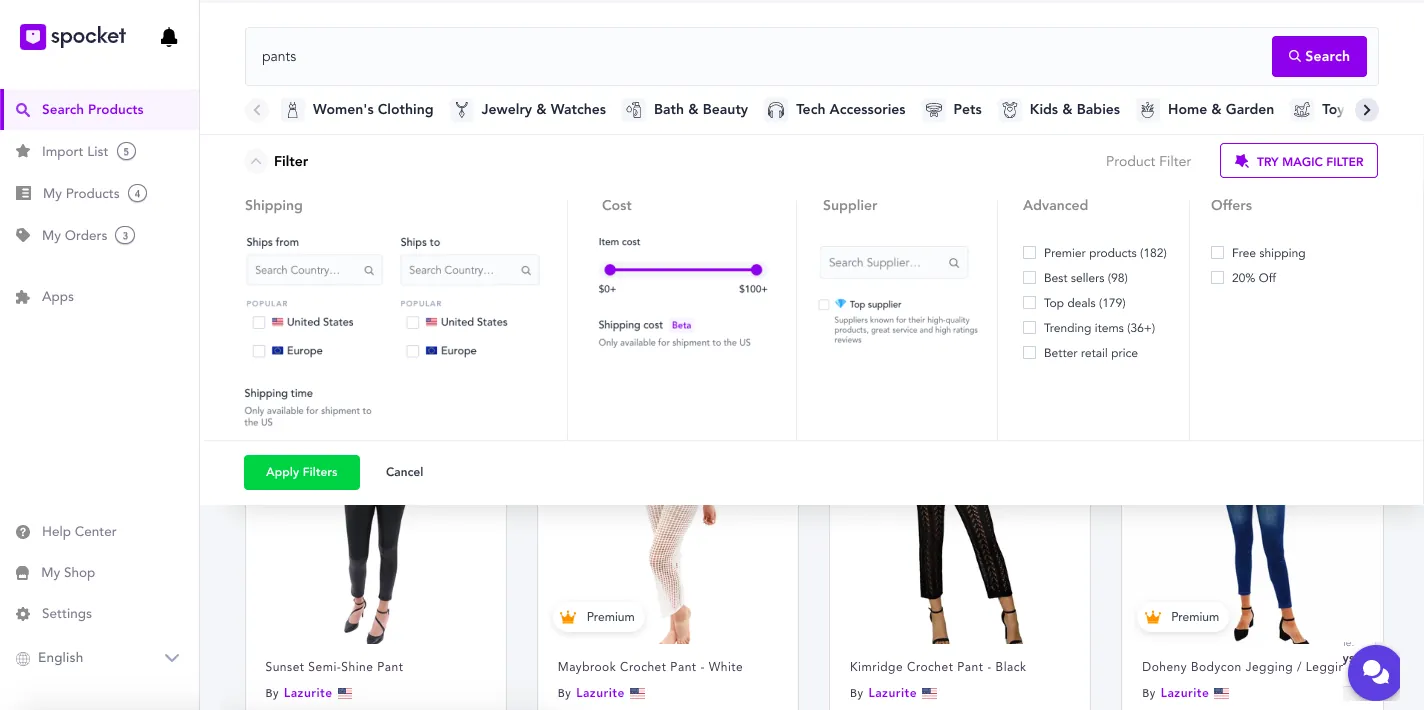
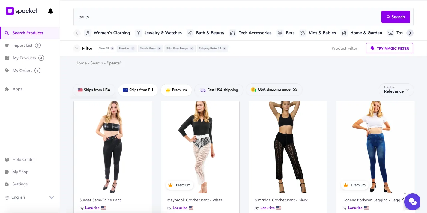
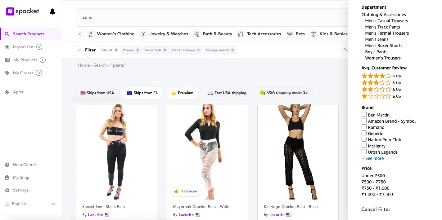
Filter clickable prototype · Filter prototype video
Order tracking
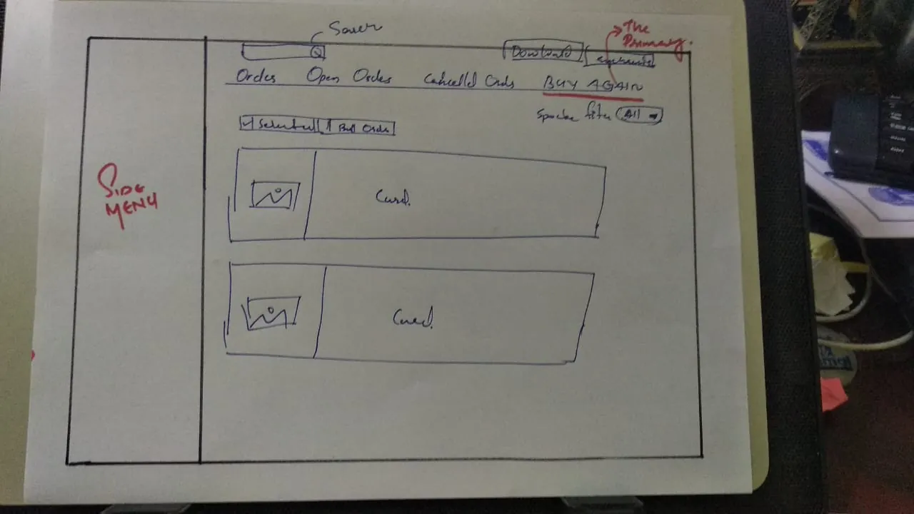
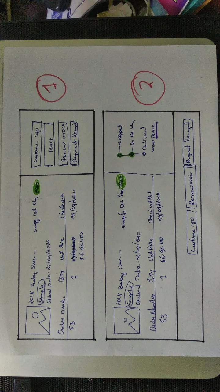
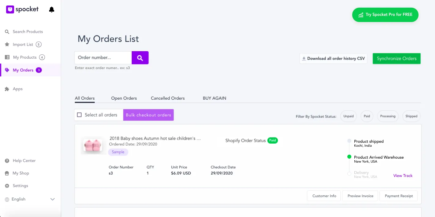
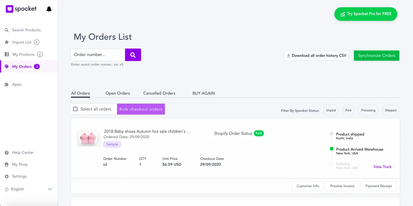
After a few iterations, I moved orders from dense tables to simple cards with tabs for All, Open, Cancelled and Buy Again. Each card shows where the product is. The trade-off is too many actions on one screen.
Contact us
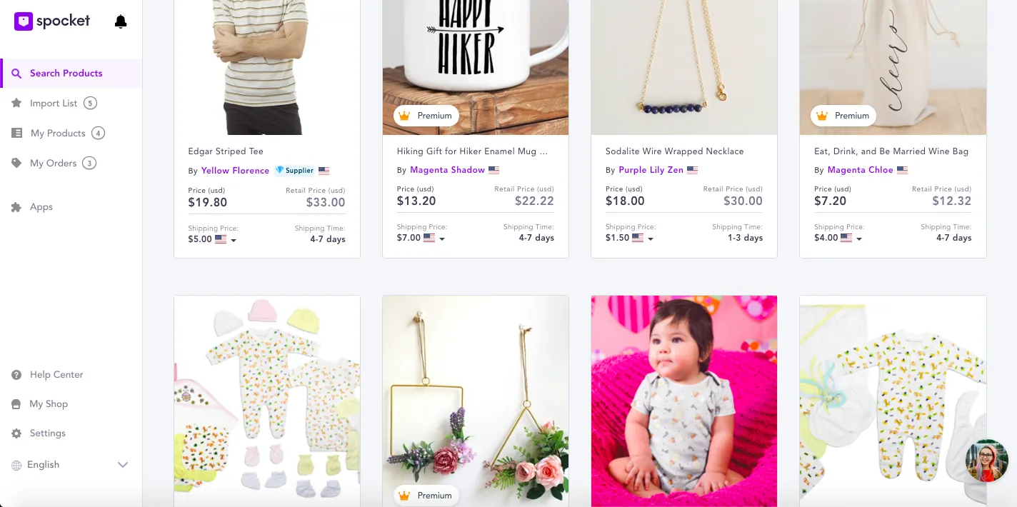
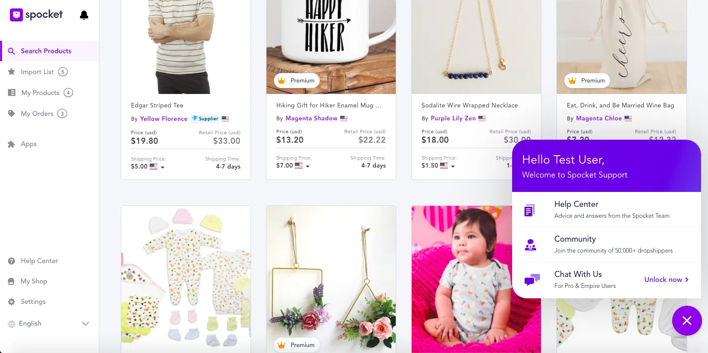
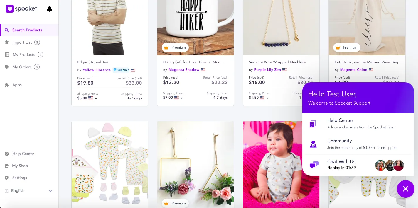
I replaced the chat icon with a human face. The menu shows auto-changing faces of people who look online, with a timer that says how soon someone can reply.
5. Validate
I ran a remote guerrilla usability test with 5 users.
Results by task and user
| Task | U1 | U2 | U3 | U4 | U5 |
|---|---|---|---|---|---|
| Find and track your order | ✓ | ✓ | ✓ | ✓ | ✓ |
| Find and use the detailed filter | ✓ | ✕ | ✓ | ✓ | ✓ |
| Start a chat with a support person | ✓ | ✓ | ✓ | ✕ | ✓ |
| Re-order the same product | ✓ | ✓ | ✓ | ✕ | ✓ |
| Start the bulk checkout | ✓ | ✕ | ✕ | ✓ | ✓ |
20 of 25 attempts succeeded. Order tracking, the first problem we set out to solve, worked for everyone.
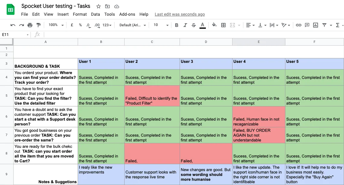
One user couldn't identify the Product Filter, one didn't recognise the human face as support, and one didn't understand Buy Order Again. Two failed at bulk checkout, and one asked for more humanised wording.
The clearest positive feedback: "I love it! It will help me to do my business most easily. Especially the 'Buy Again' button".
From problem to solution to evidence
| Problem | Solution | Tested |
|---|---|---|
| 1. Tracking orders | Order cards with tracking status | 5 of 5 |
| 2. Narrowing searches | Visible filters plus a detailed product filter | 4 of 5 |
| 3. Narrowing orders | Order tabs and a Buy Again filter | 4 of 5 |
| 4. Contacting support | Human faces and a response timer | 4 of 5 |
6. Outcome
What I learned
Counting the evaluation changed how I saw the product. The problems looked like many small issues, but most came down to consistency and recognition.
What I'd do next
Fix bulk checkout, make the human face and Buy Again label clearer, and keep researching Magic Filter.