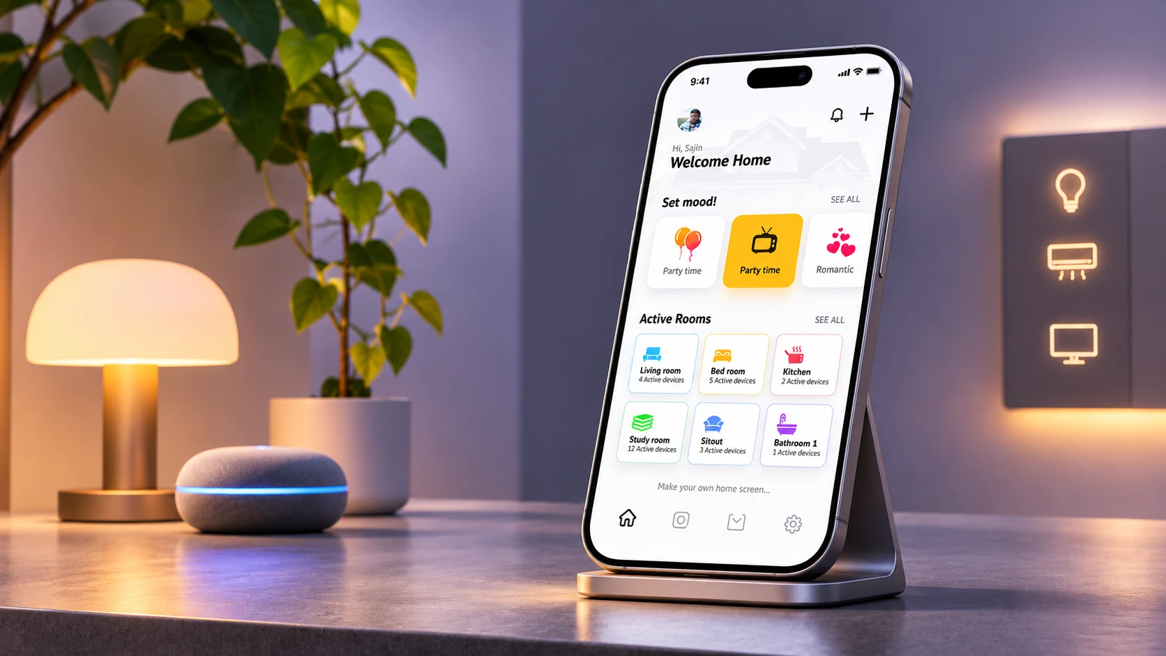
The challengeSmart home buyers face too many apps and devices, and in developing countries many people still lack the knowledge and awareness to get started.
What I didI analysed reviews of leading apps, defined two first-time personas, mapped a full day at home, and designed one app around moods and rooms, not individual devices.
What happenedA prototype covering device connection, suggestions and a personalised home, in light and dark. This project has no usability results yet.
1. Understand
The problem
The goal was to bring safety and control into the home at the lowest cost, so people have more control over their energy spending.
But with so many apps and devices, people get confused about which is right for the entire home. Developing countries are further away still, because of lower knowledge, awareness and understanding of the benefits.
How might we help a first-time owner control their whole home simply, without needing to understand the technology?
Learning from real reviews
I started with customer feedback on the top products in the Play Store and App Store.
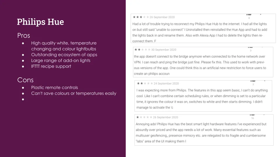
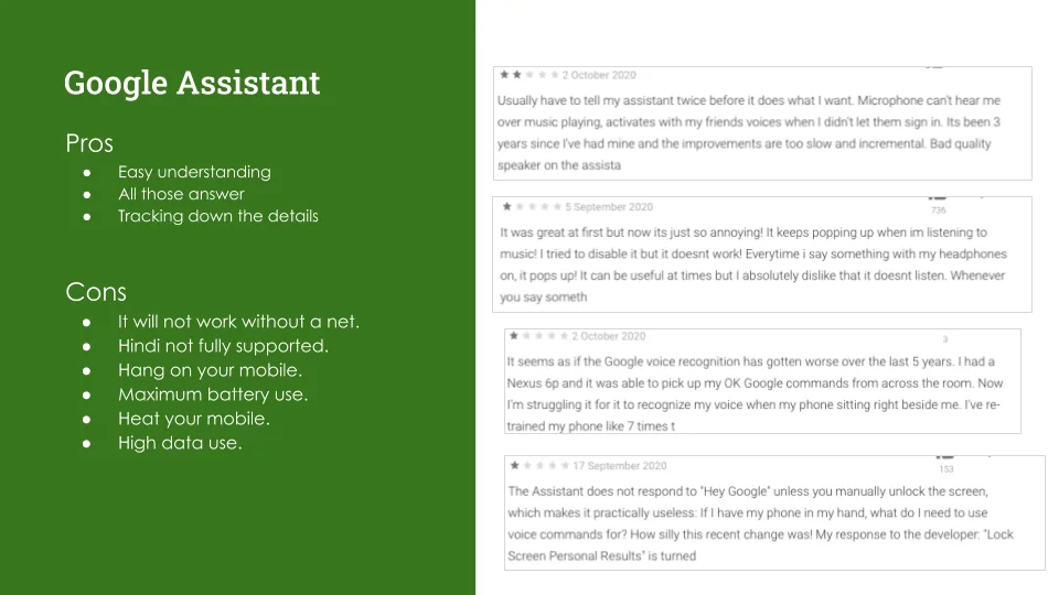

- "The instructions that come with the lights and their YouTube videos don't match what the app shows"
- "Alexa no longer recognizes commands like 'Alexa, set thermostat to heat.'"
- "This app is a HUGE pain to install."
- "The app is NOT user friendly. The help center is a joke."
- "Won't start without access to my contacts and possibility to making calls"
What the complaints were really about
Synthesised from reviews and my pros and cons slides.
What we learned: People's anger was rarely about smart home features. It was about setup, help, reliability and trust.
What it changed: Connecting a device became one of the three flows to prototype first.
Comparing the leaders

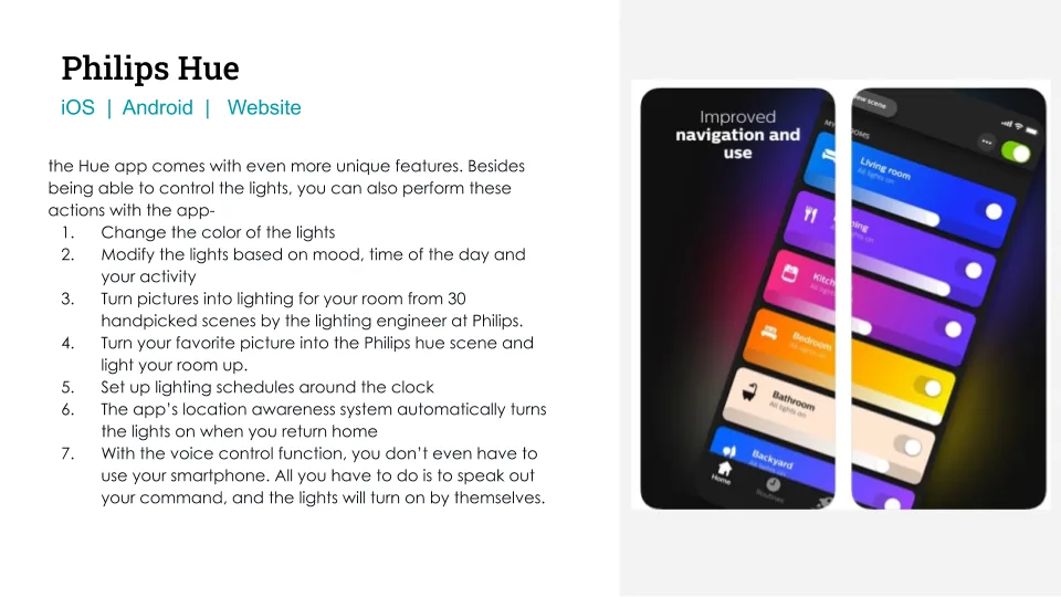
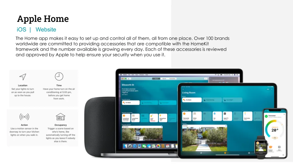
What each product taught me
| Product | Strength | Weakness | What I took from it |
|---|---|---|---|
| Google Assistant | Easy understanding, tracks details | Needs the net, drains battery, uses data | Be useful without demanding attention |
| Philips Hue | Quality lights, big ecosystem, add-on apps | Can't easily save colours or temperatures | Saved scenes are valuable: make them moods |
| Apple Home | One place for many accessories | Tied to the HomeKit framework | Control the whole home from one app |
2. Define
Who I designed for
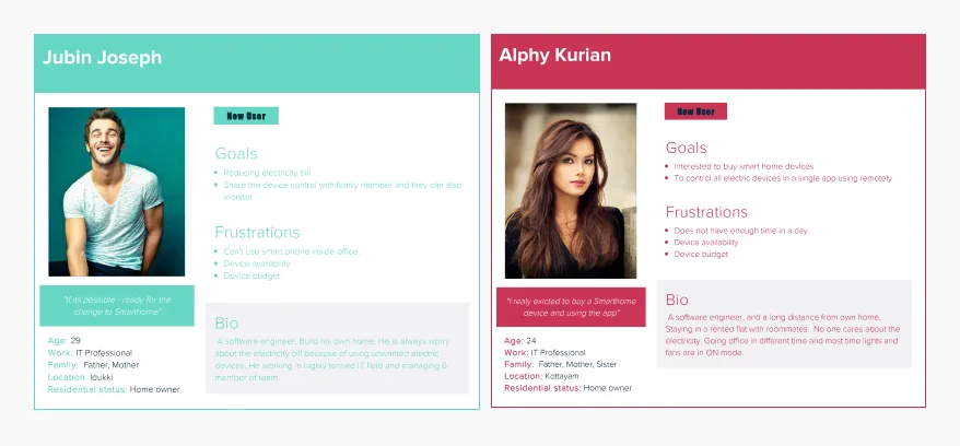
I defined two new users, both IT professionals who are excited about a smart home and share the same frustrations: device availability and budget.
- Jubin, 29, home owner: wants to reduce the electricity bill, and to share device control with family.
- Alphy, 24: shares a flat with roommates, where lights and fans often stay on. Wants to control all electric devices remotely, from a single app.
A day at home
I mapped Persona 1's whole day, from morning alarm to sleep. This showed that the need isn't remote control. It's being free of small worries and waits.
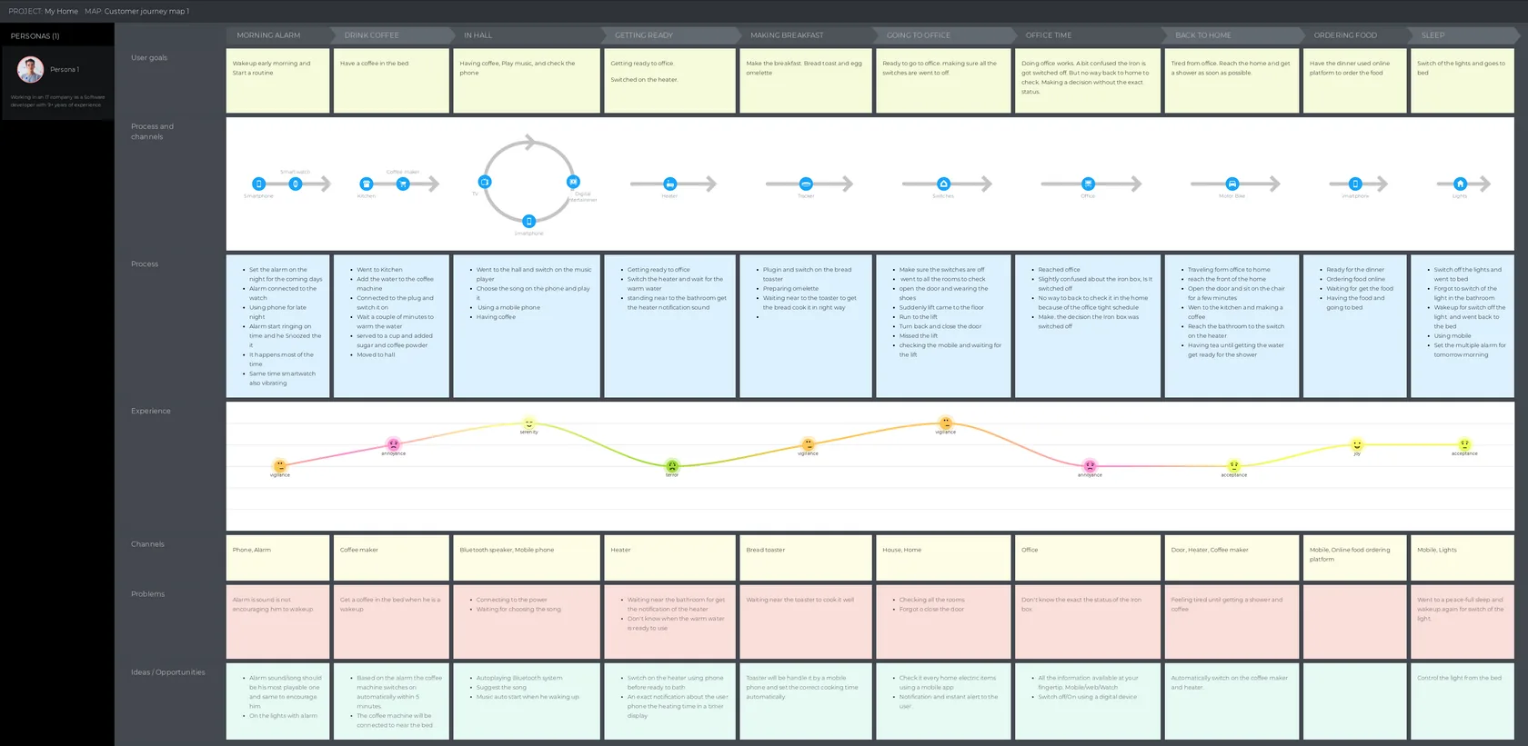
A day at home, and where technology could help
| Moment | Problem | Opportunity |
|---|---|---|
| Morning alarm | Alarm isn't encouraging | Lights on with the alarm |
| Getting ready | Waiting by the bathroom for the heater | Start the heater from the phone, with an exact time |
| Making breakfast | Waiting near the toaster | Handle it from a phone, with the correct time |
| Going to the office | Checking all rooms, forgetting the door | Check every device from the app, with alerts |
| Office time | Unsure about the iron box status | See status and switch off from anywhere |
| Back home | Tired, waiting for shower and coffee | Automatically switch on coffee maker and heater |
| Sleep | Waking up again to switch off the light | Control lights from bed |
Rebuilt from the user journey map below.
What we learned: The sharpest moment wasn't at home. It was at the office, unsure whether the iron box was off.
What it changed: Status had to be visible at a glance, from anywhere.
3. Ideate
Structuring the product
A home app has to hold a lot. Designing the structure early kept that complexity away from the home screen.
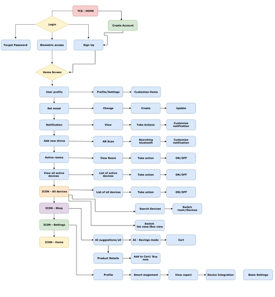
Information architecture
- User profile
- Set mood: change, create, update
- Notifications
- Add device: AR scan, Bluetooth
- Active rooms and devices
- List and box views
- Search devices
- Switch room
- On and off
- AI suggestions
- AI savings mode
- Product details
- Cart
- Profile
- Smart management
- View report
- Device integration
Rebuilt from the site map below.
Starting from a story
I storyboarded a full use case before drawing screens, then tested the idea on paper.
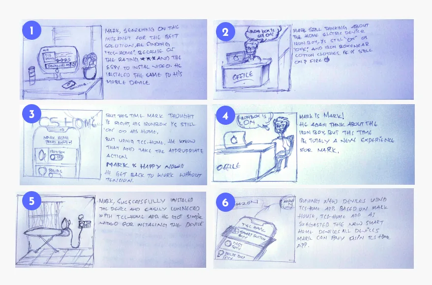
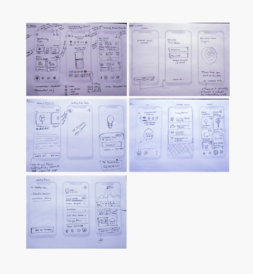
View the Paper Prototype here...
From insight to design
| Insight | Design decision |
|---|---|
| Setup is the biggest complaint | Add a device through AR scan or Bluetooth search |
| Good products group by moments and places | Home opens with moods, then active rooms |
| Worry comes from not knowing device status | Active rooms show how many devices are on |
| People want to reduce bills | AI savings mode and reports |
| Families share a home | Personas call for shared control; still to be designed |
4. Design
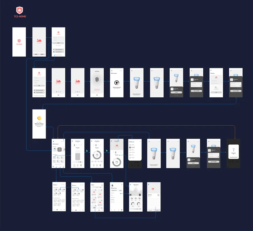
Three flows that matter most
The wireframe prototype focused on an easy way to connect a device, data-driven and AI-based suggestions, and a personalised home page.
Moods first, rooms second
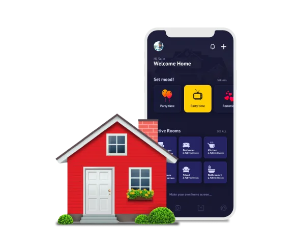
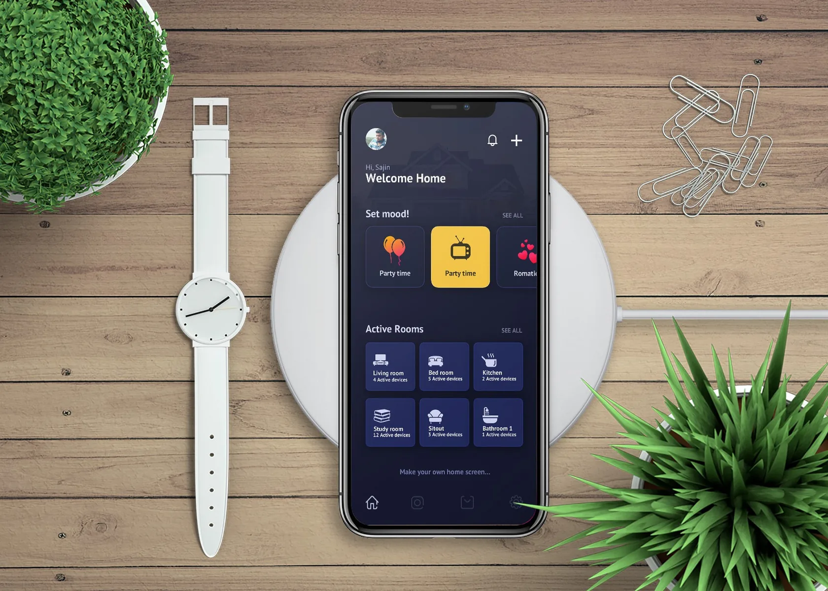
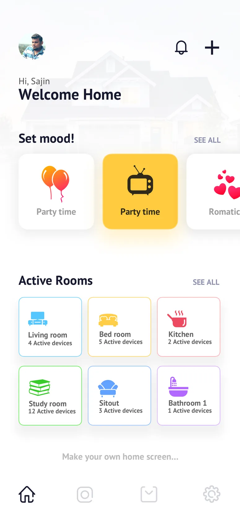
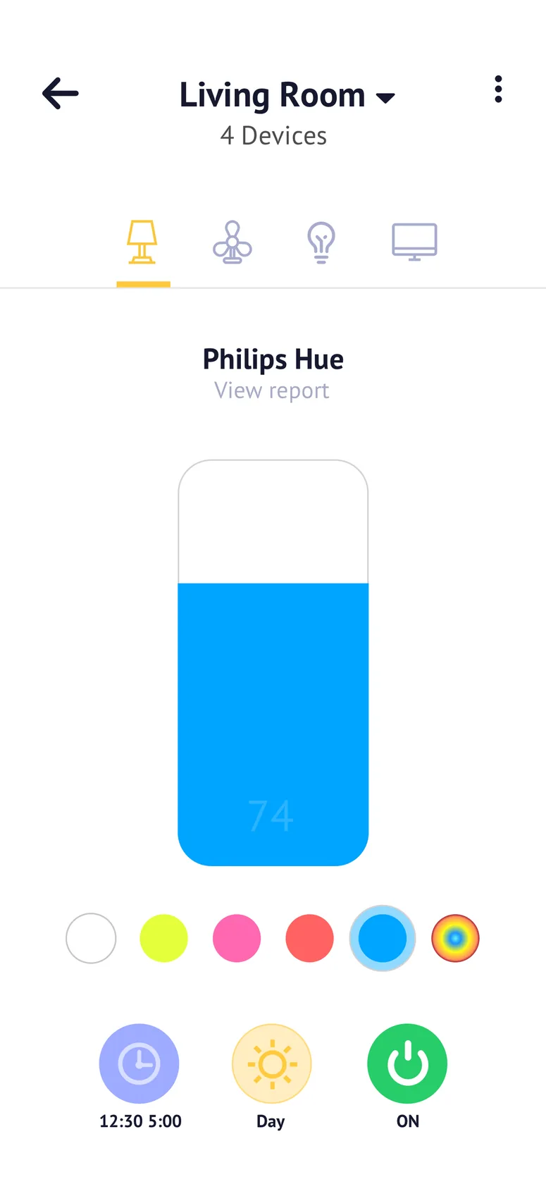
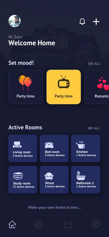
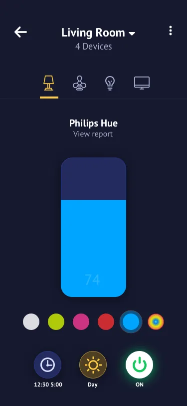
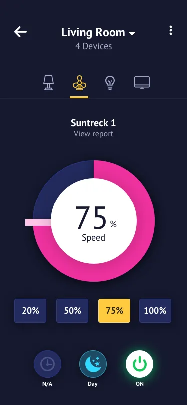
The home screen opens with "Set mood" and then Active Rooms. A person can think "party time" or "bedroom" instead of hunting for a device. Inside a room, each device gets one large control with schedule and power within reach.
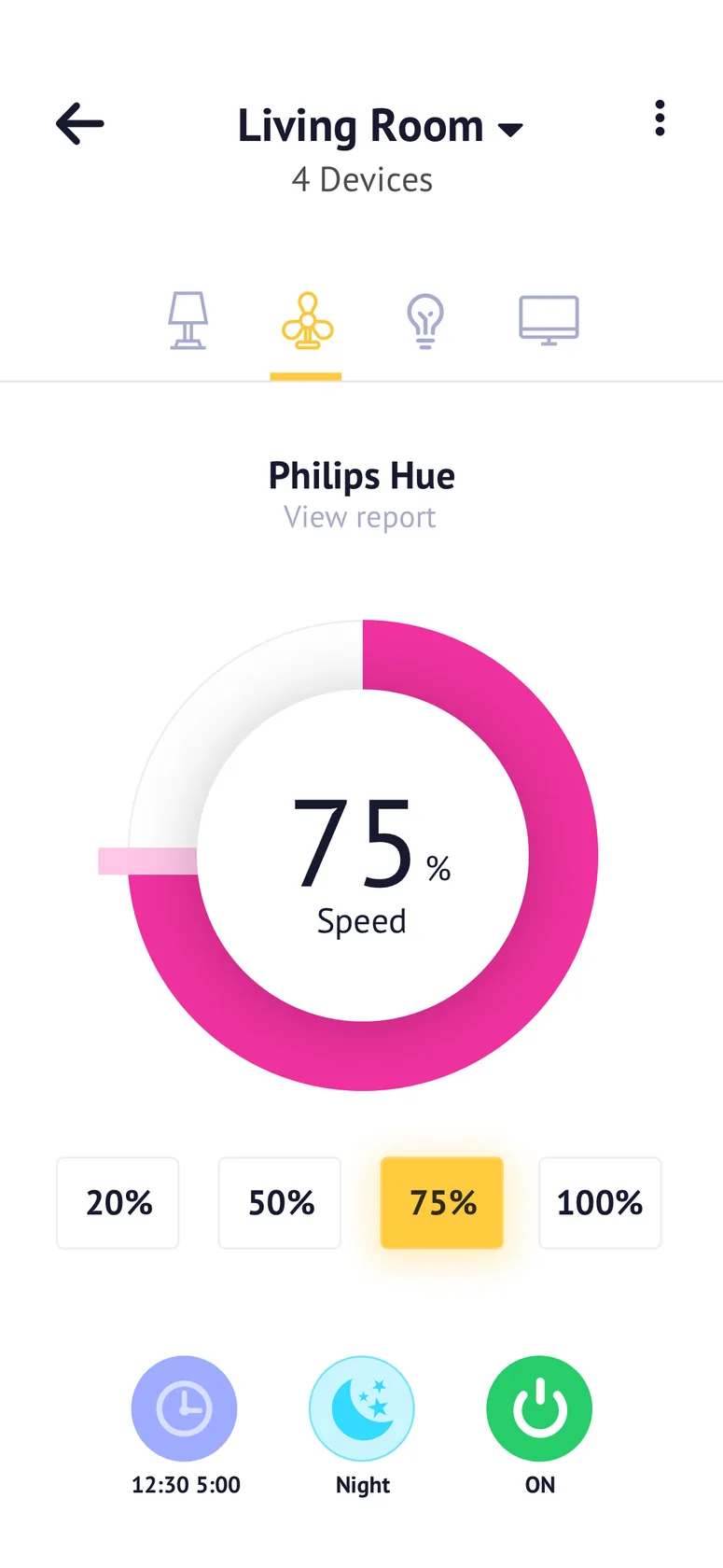
Light and dark
A home app gets used at night as well as in daylight, so I designed both modes.
5. Validate
This is the gap in this project. The design is complete up to high-fidelity UI, but there are no usability results to show yet. This is how I'd test it.
Proposed usability test
| Question | Task | Measure |
|---|---|---|
| Is setup really easy? | Connect a new device | Task success and time |
| Are moods understood? | Set up the home for a party | First-click success |
| Does it reduce worry? | Check whether anything is still on at home | Time and confidence |
| Does it save energy? | Find out what's using power | Task success, then real bills over time |
This is a proposed plan, not results.
6. Outcome
The outcome is a complete design direction, not a measured result.
What I learned
Reading real reviews before designing was the most valuable step. Competitors' failures showed what people actually care about, and it shaped the product more than the feature comparison did. Mapping a full day then moved the focus from controlling devices to removing small worries.