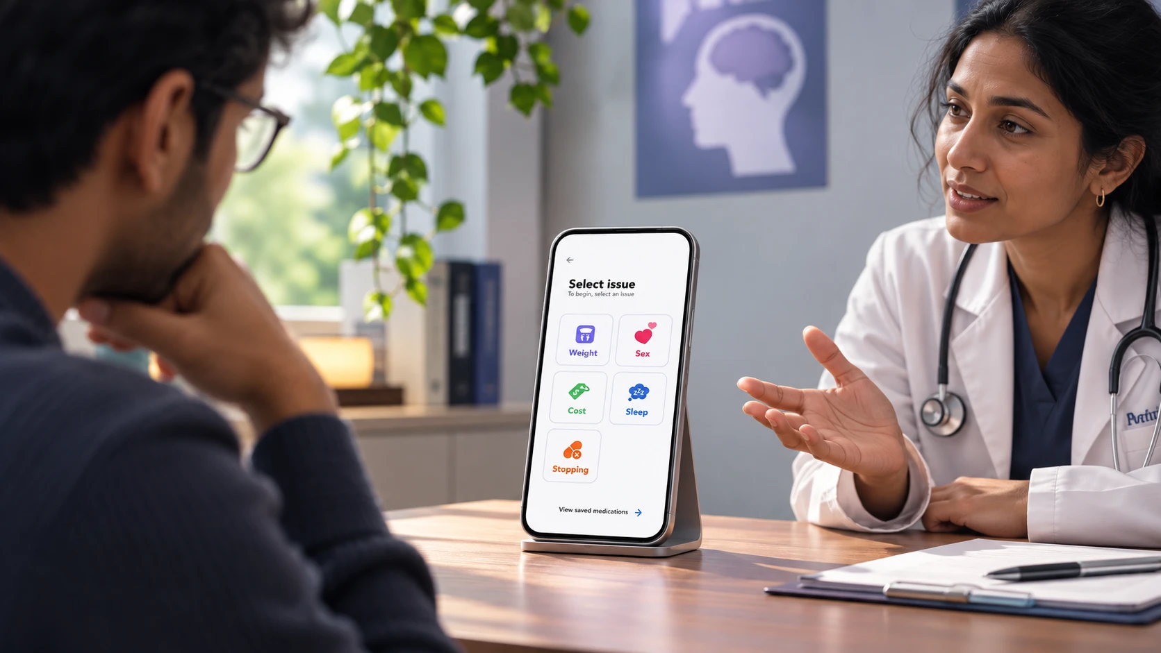
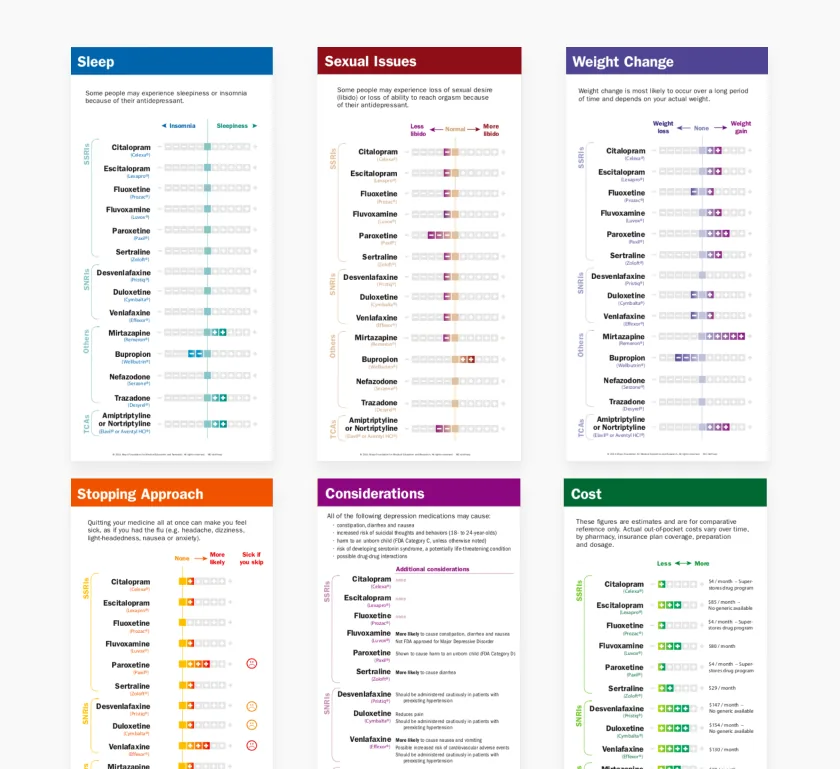
The challengePaper decision cards improved the conversation about antidepressants, but they wore out, had to be reprinted, and needed the physician and patient in the same room.
What I didI led the team through physician and patient research, turned the card ritual into four design principles, and designed a shared mobile tool for the clinic and video calls.
What happenedIn tracked testing, 97% of 23 online users and 100% of 7 offline users found the medication. Testing also exposed the problems behind the redesign.
1. Understand
Why this problem matters
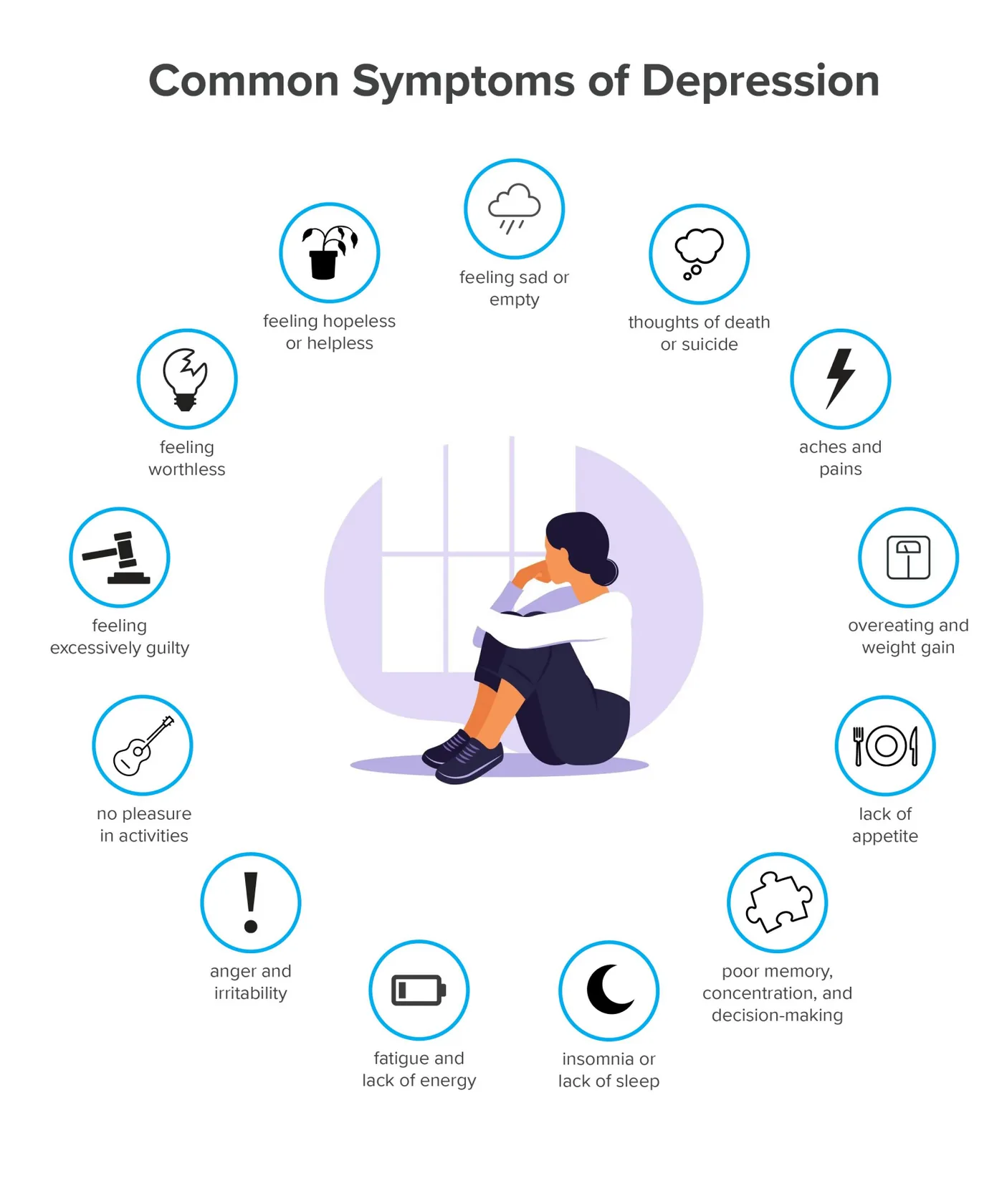
Depression affects more than 264 million people worldwide and is a leading cause of disability (WHO). Choosing an antidepressant is hard: there are many options, each person reacts differently, and patients can spend months or years searching for the right medication. Patients often abandon treatment because of unrealistic expectations, lack of efficacy or side effects, while physicians tend to focus on stated effectiveness rather than the patient's wider needs.
A published study showed that simple conversation cards improved how satisfied patients and physicians were with the discussion, and how comfortable they felt with the choice.
The real design question
The cards already worked, so the job was not to invent a new method. The problems were practical. Physicians had to sit beside the patient, and the cards lost their fresh look after a few presentations, so they had to be printed again.
How might we take the cards into a digital tool without losing the human conversation that makes them work?
How we worked
We followed a Human-Centered Design Thinking process, with testing feeding back into the design.
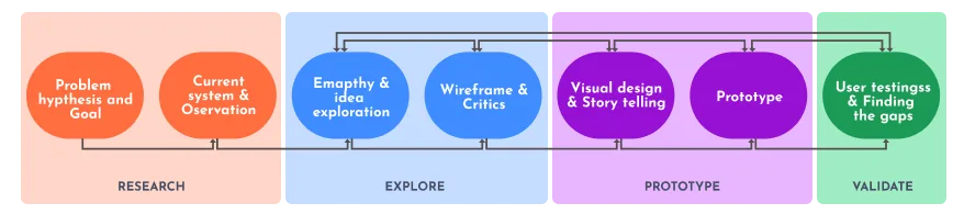
Research and validation at a glance
Listening to physicians
We held 7 detailed discussions with doctors who are experts in depression treatment. Real interview photos can't be shared here.

- Emotional attachment with the patient
- Patient history is very important
- Physicians find the relevant medicine through detailed discussion
- Different patients react differently
- Depression is a private and personal issue
What we learned: The physician is not looking up an answer. The decision comes out of the conversation.
What it changed: The product had to support that discussion, not replace it.
Listening to patients
We ran a workshop to learn about the user group, then took part in 7 semi-structured interviews with a patient and a doctor.

- "Getting more comfortable while talking with Physicians"
- "Initially worried to visit Physician"
- "Surrounding"
Watching the current experience
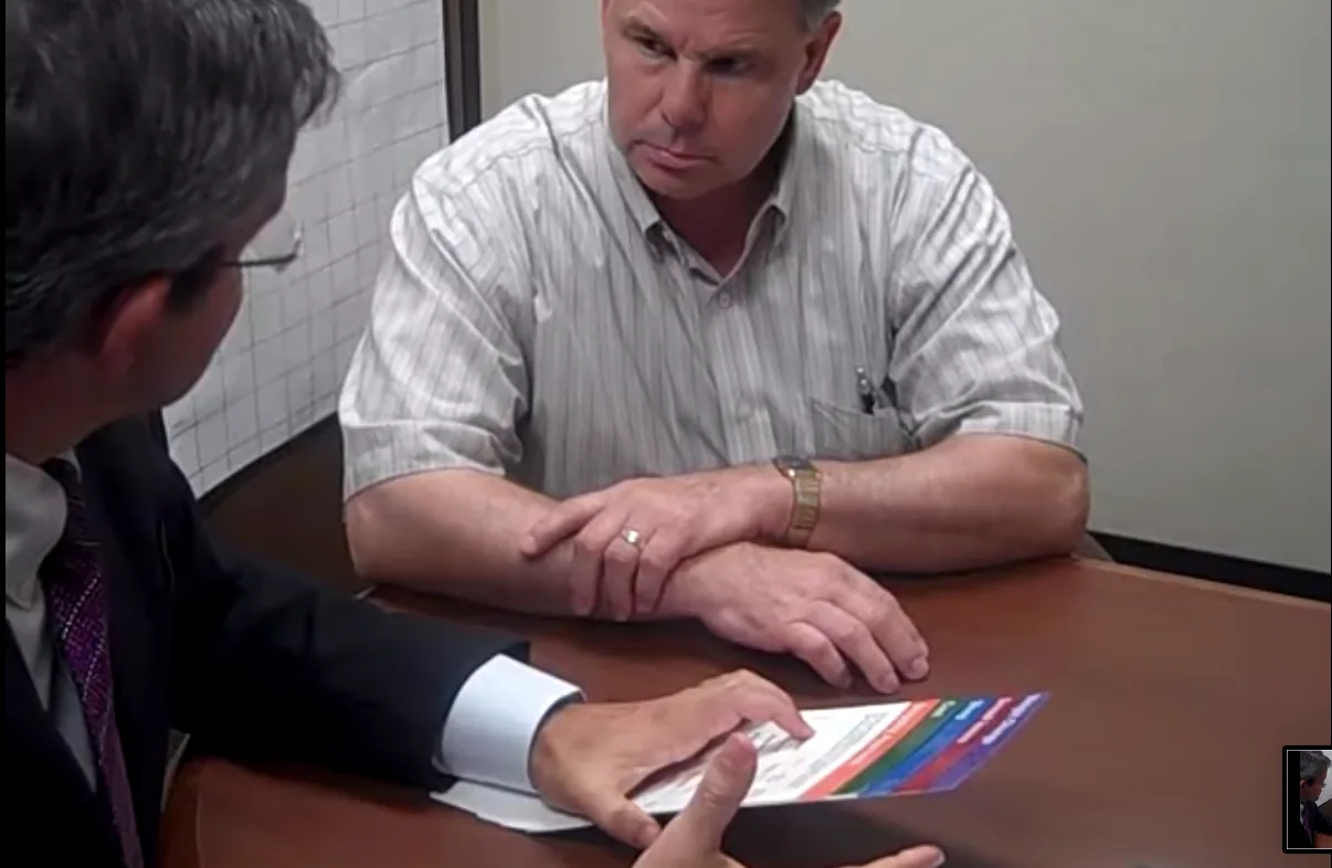
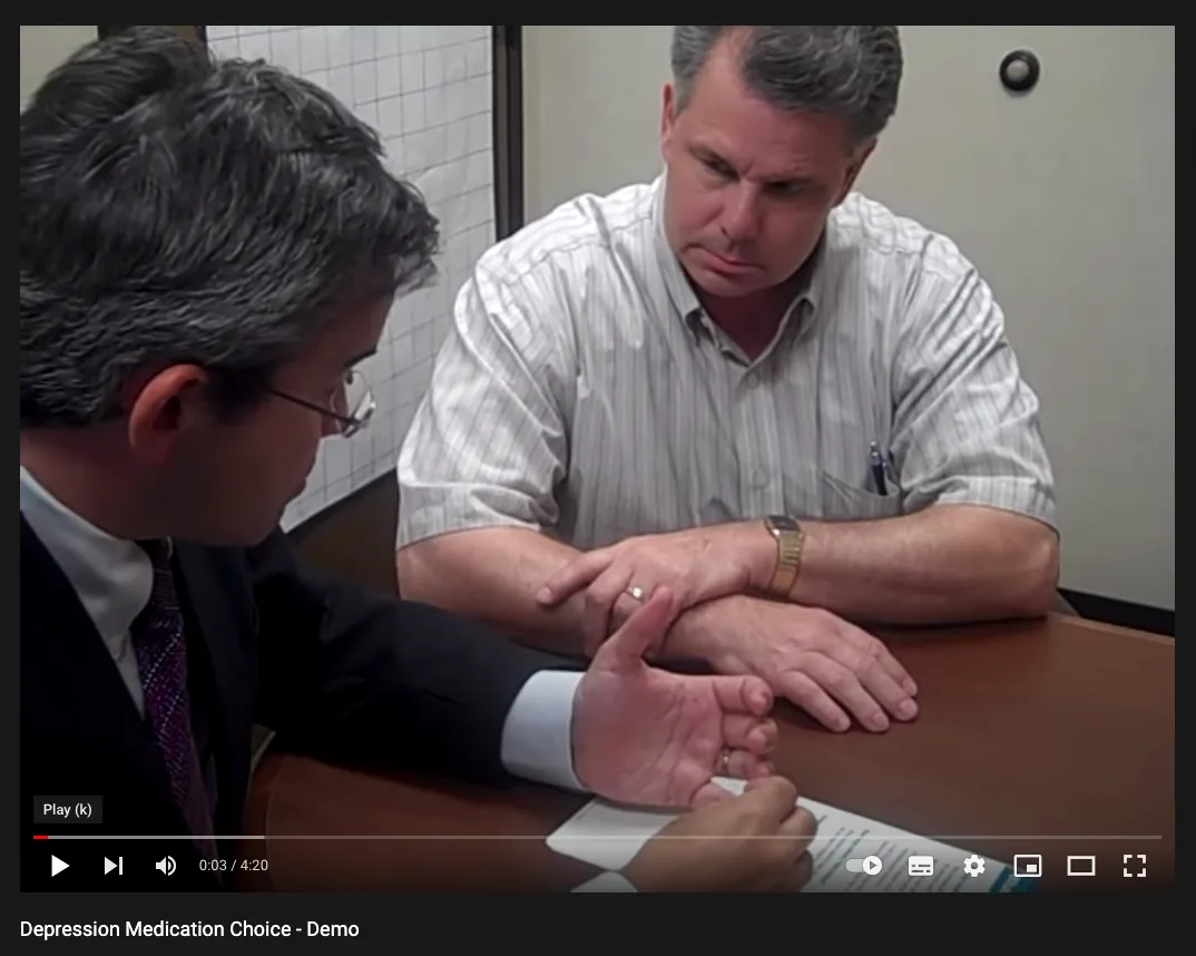
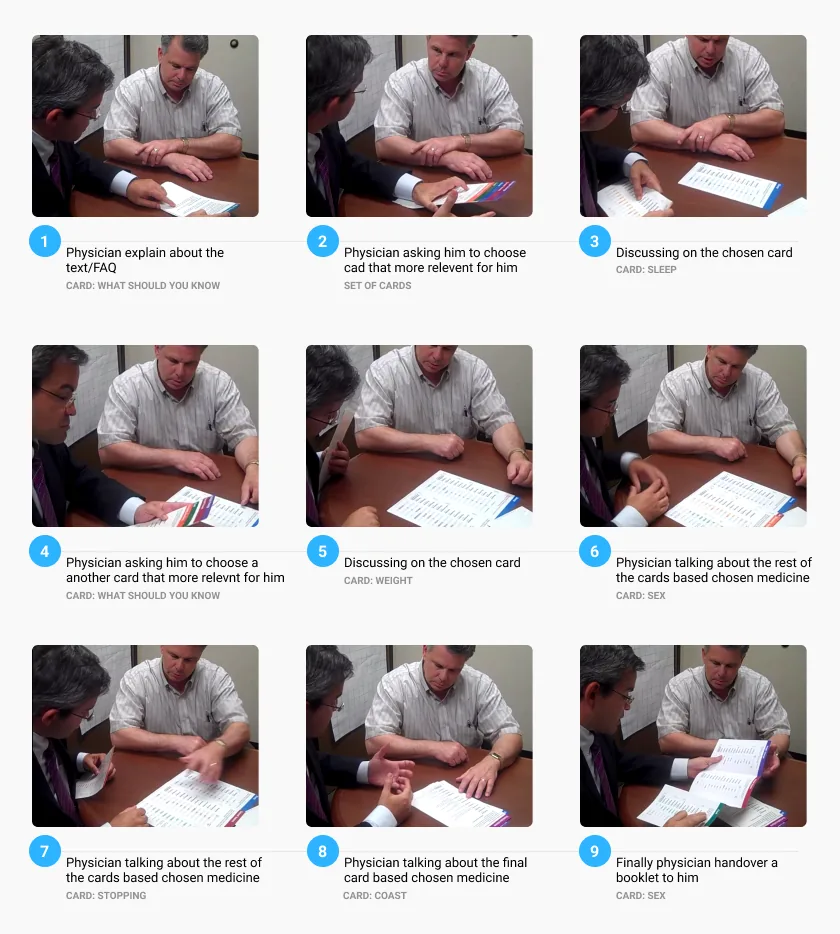
We studied how the cards work in a real consultation: the physician finds a calm, private place, explains the test, and the two move between cards together.
2. Define
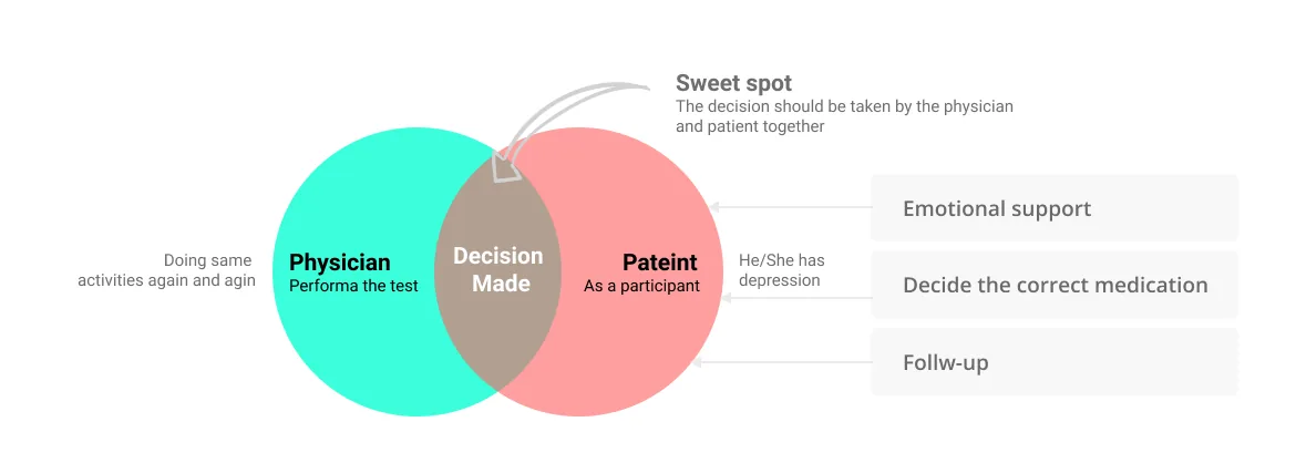
Two people in one decision
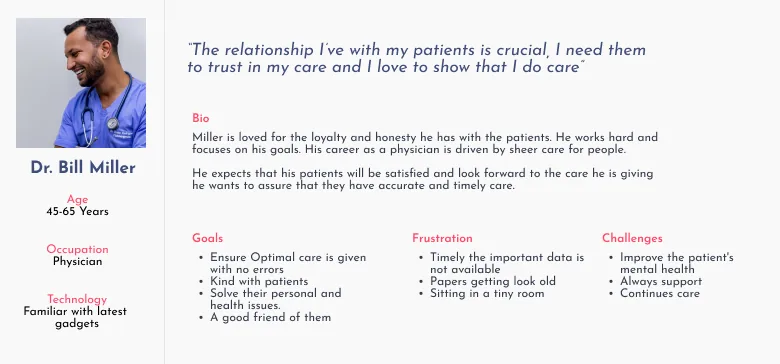
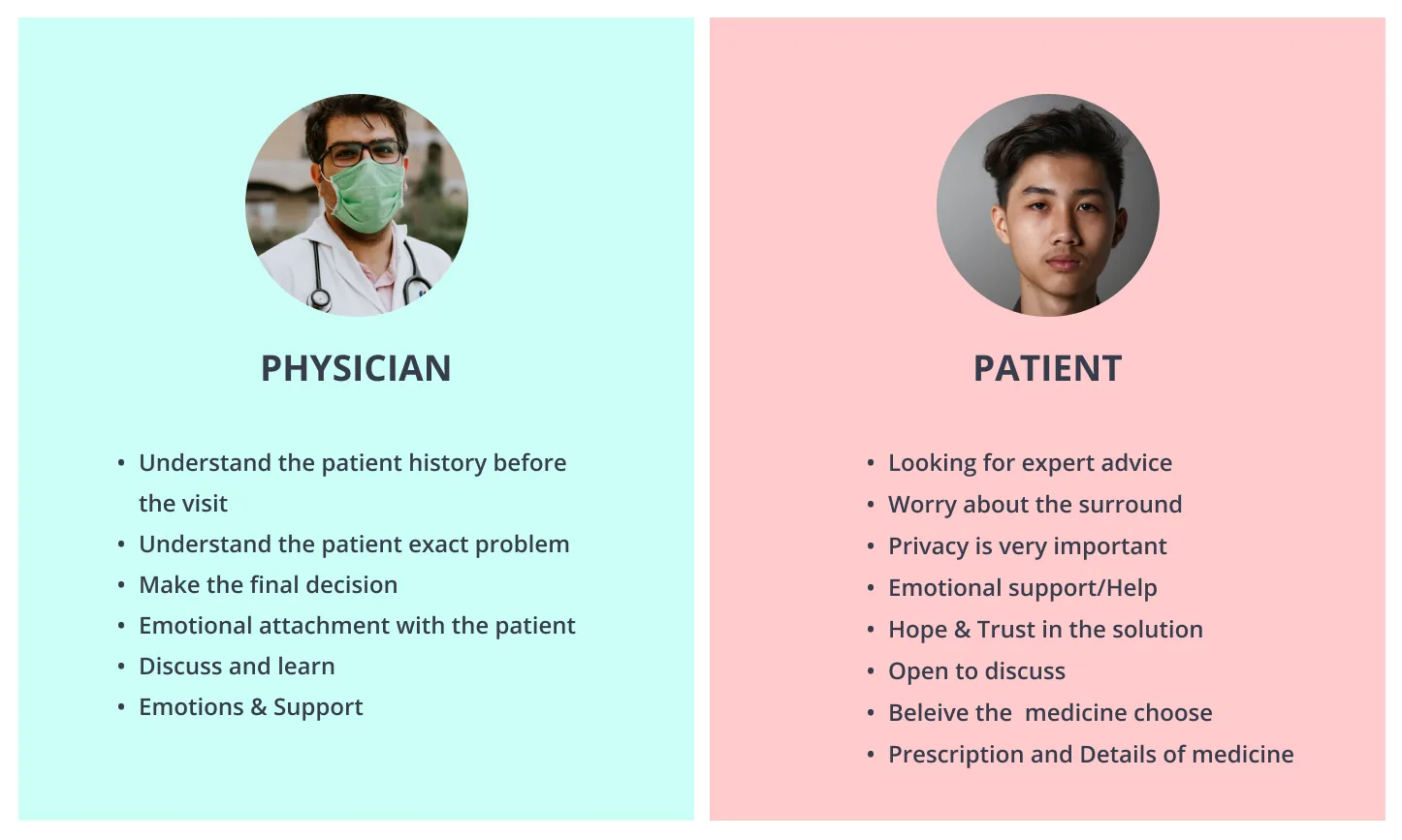
We synthesized the research into a physician persona and a shared view of what each side expects. Both need trust, privacy and facts, but they arrive with very different emotions.
Where emotion rises and falls
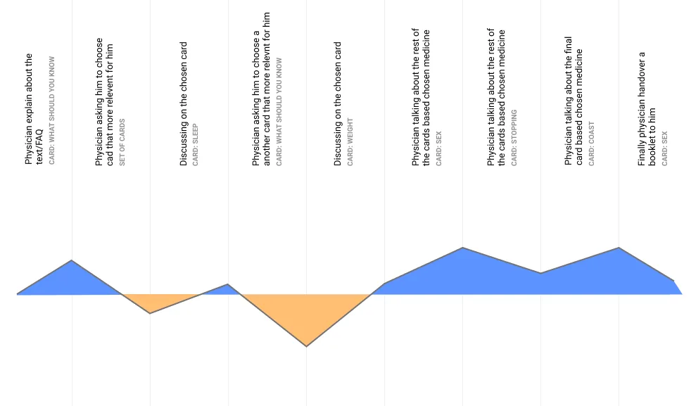
A paper consultation, card by card
Rebuilt from the emotional experience map. The hardest moment is in the middle, so that's where the interface should stay quietest.
But, different patients have different emotions.
What the paper cards do well
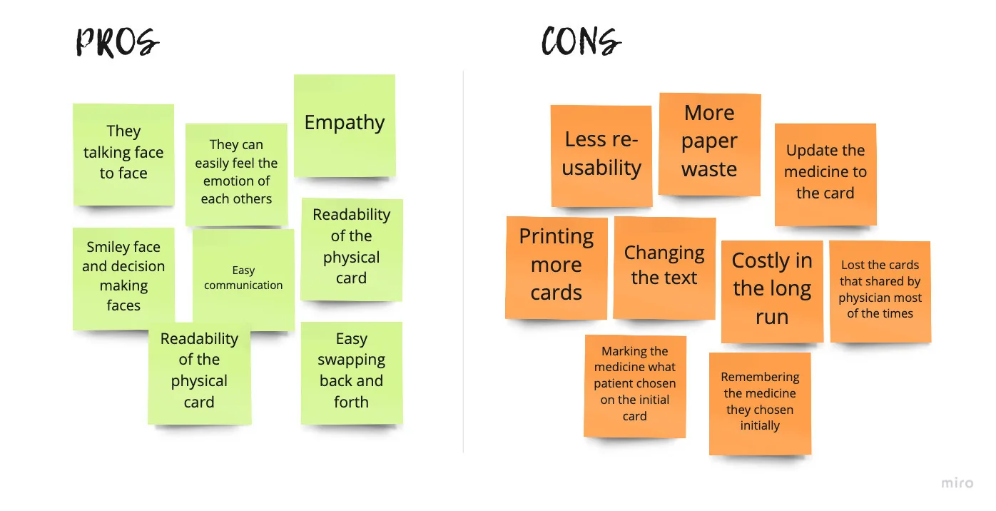
What to keep, and what to fix
| From the paper cards | Type | What the app does |
|---|---|---|
| Talking face to face, feeling each other's emotion | Keep | The conversation stays with the physician, in person or on video |
| Easy swapping back and forth | Keep | Revisit: move between issues freely |
| Readability of the physical card | Keep | Comparison stays visual, side by side |
| Printing more cards, paper waste, cost | Fix | One digital tool, nothing to reprint |
| Updating medicines, changing the text | Fix | Content can be updated in one place |
| Marking and remembering the chosen medicine | Fix | A saved shortlist stays visible |
| Cards lost after sharing | Fix | The final medicine can be saved |
Rebuilt from the pros and cons board.
What we learned: The pros were human. The cons were operational, plus one cognitive problem: remembering what was chosen.
What it changed: Emotional attachment became the primary challenge. Digitising the logistics was easy; keeping the human feeling was the hard part.
Four design principles
 Revisit
Easy to go back and forth, because people always swap the physical cards during the discussion.
 Simple
No complicated design or experience.
 Comparison
Easy comparison between the medicines they chose.
 Choose
Selecting the medicine should feel seamless.
3. Ideate
From ideas to a flow
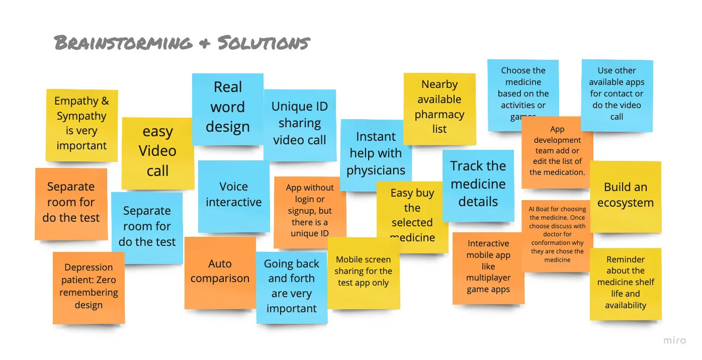
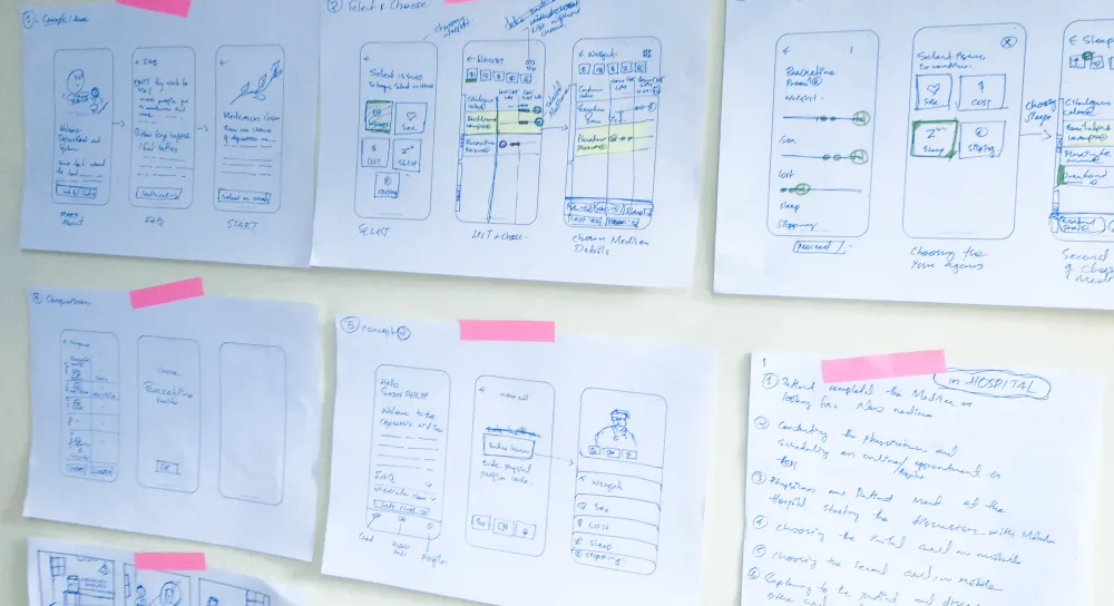
The strongest ideas from brainstorming
A selection from the brainstorming board below. The Connection ideas fed directly into the final direction.
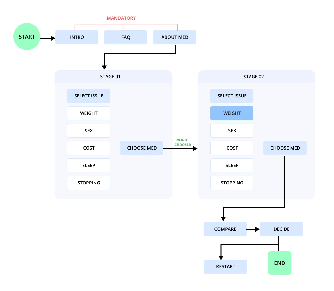
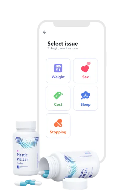
App structure
- Introduction
- FAQ
- About the app
- Weight
- Sex
- Cost
- Sleep
- Stopping
- See medicines by issue
- Choose one or more
- Shortlisted medicines
- Move between issues
- Final medicine
- Save it
- Or restart
Rebuilt from the user flow. The intro is mandatory because the test can't be done without a physician.
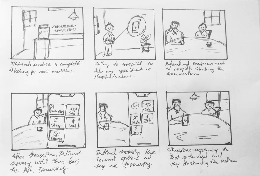
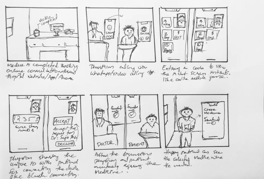
Storyboarding two situations
Depression is linked with personality traits that affect its course, so behaviour shaped our wireframes from the start. We storyboarded both situations before drawing screens.
One tool, two situations
| In hospital | Online | |
|---|---|---|
| How it starts | The patient comes in for a discussion | The patient requests an appointment |
| How they connect | Face to face | A video call the hospital arranges |
| What must stay the same | The physician guides the choice | The physician guides the choice |
Three options, one decision
We shortlisted three ideas and reviewed them with experts and 17 end users, and against technical feasibility.
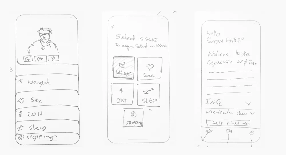
How the options compared
| Option | Idea | Outcome |
|---|---|---|
| 01 | Real-world design without a profile | Combined |
| 02 | One application, with other apps for the video call | Combined |
| 03 | Like playing a game: instant visibility for both, plus a profile | Not chosen |
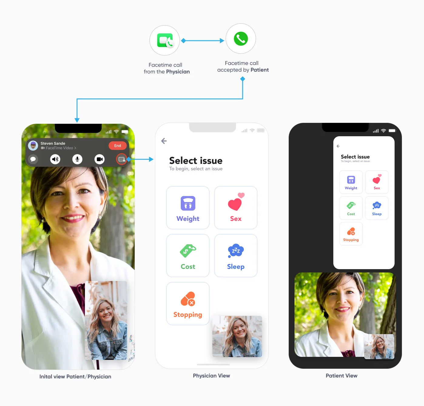
The key trade-off was the video call. Building our own would have meant patients learning something new at a vulnerable moment. An existing application such as FaceTime avoided that, so the session feels as it does in the hospital.
4. Design
Set the expectation first
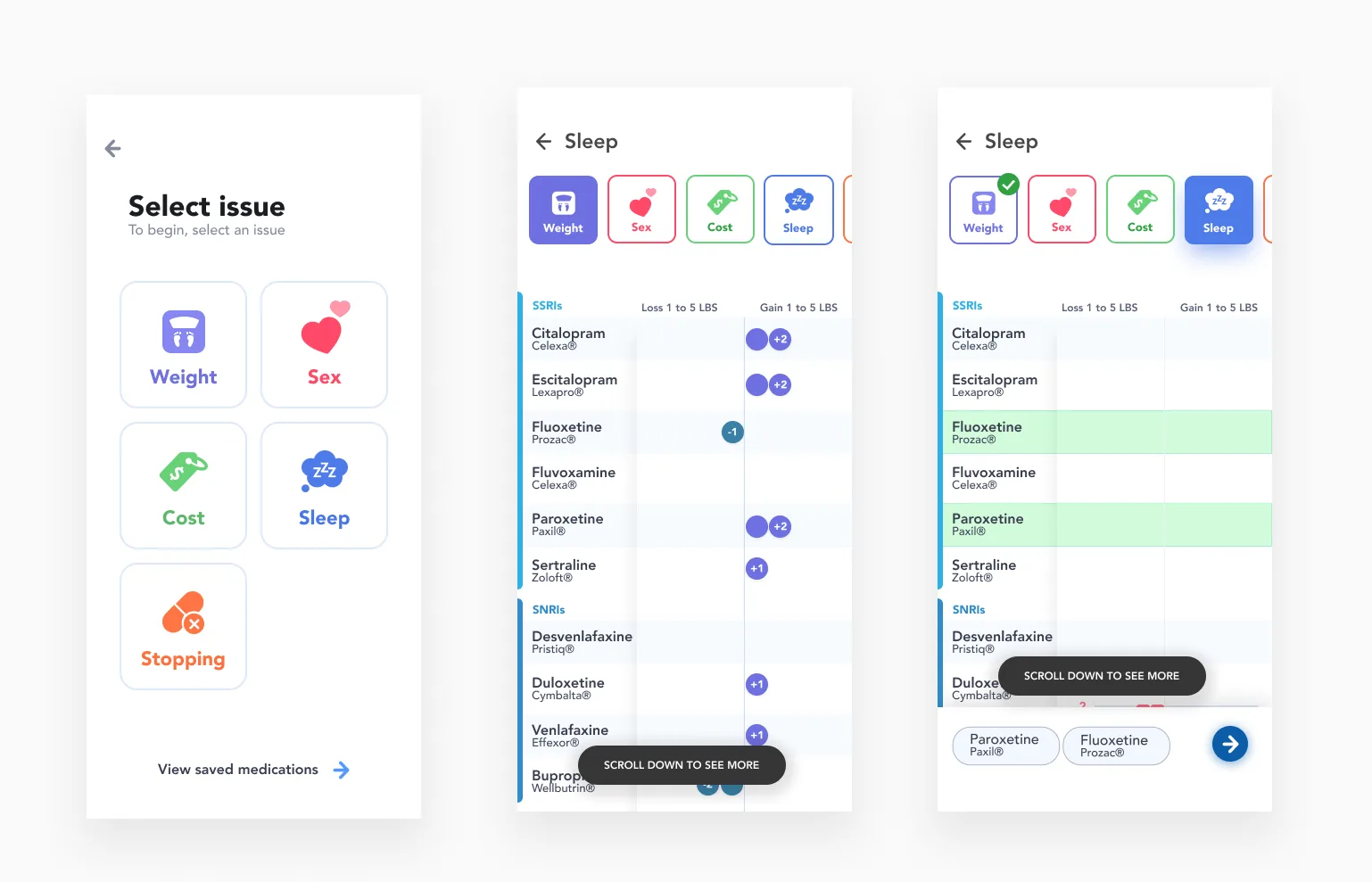
The first screen tells the patient the test can't be done without a physician, and shares the exact information before each session.
Few interactions, no distraction
I deliberately avoided decorative animation so attention stays with the two people, not the screen.
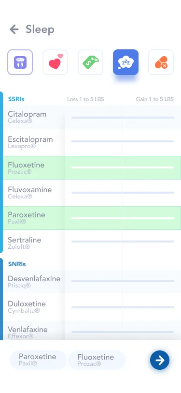
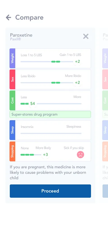
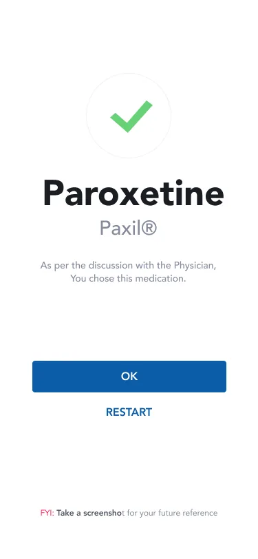
Choose, compare, finalise
5. Validate
Moderated testing
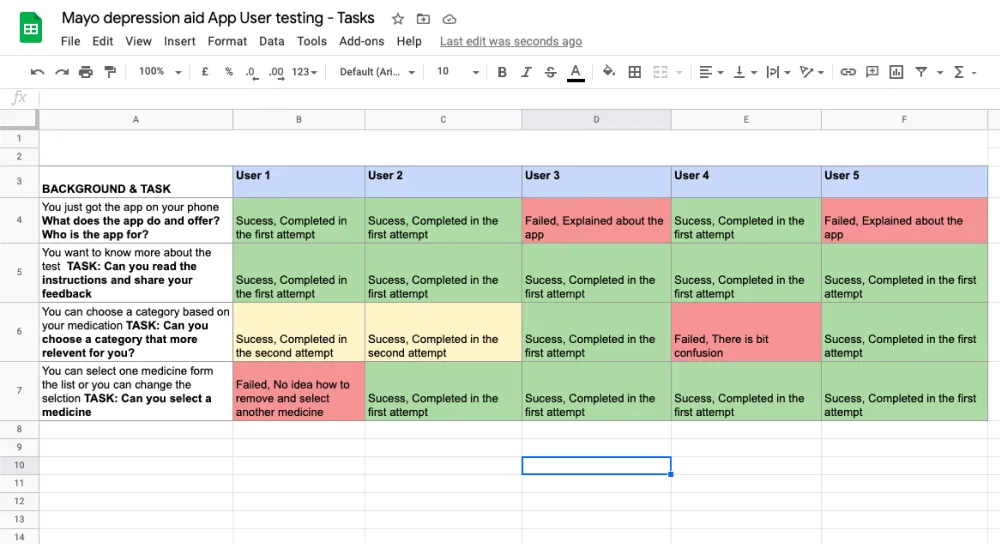
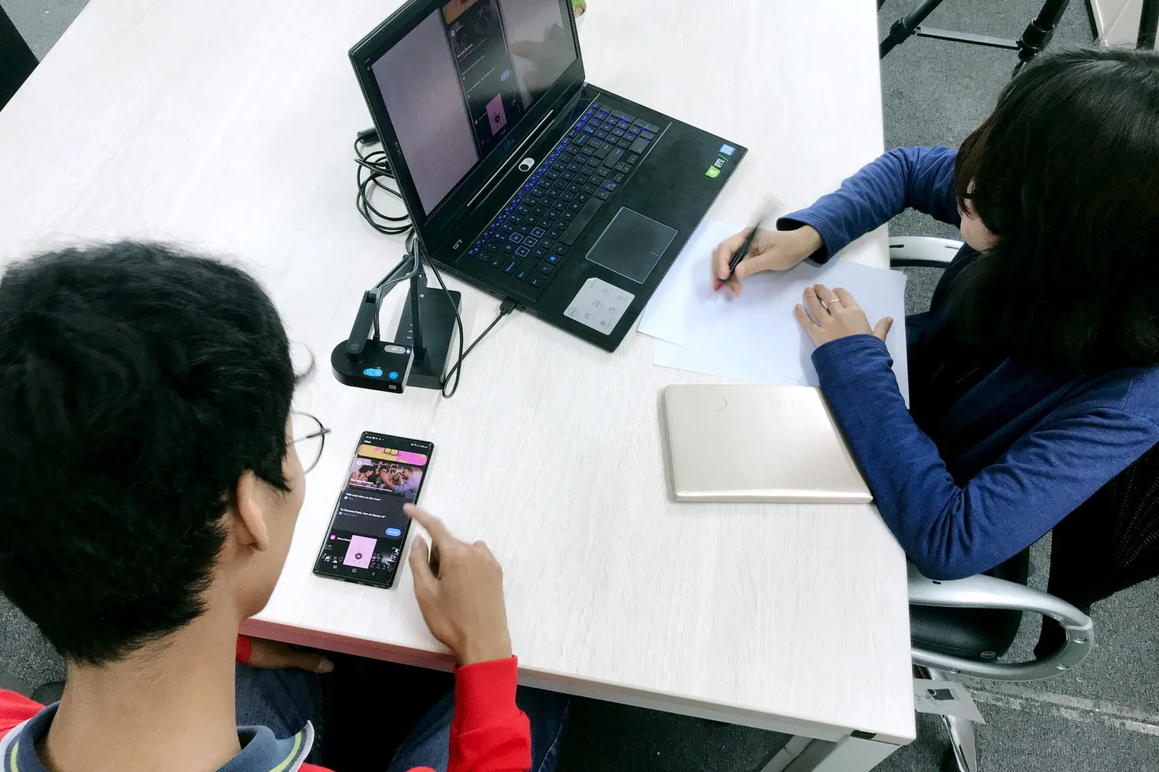
We ran remote, task-based tests with 5 doctors and patients.
Moderated results by task and user
| Task | U1 | U2 | U3 | U4 | U5 |
|---|---|---|---|---|---|
| Understand what the app is | ✓ | ✓ | ✕ | ✓ | ✕ |
| Read the instructions and give feedback | ✓ | ✓ | ✓ | ✓ | ✓ |
| Choose the most relevant category | 2nd try | 2nd try | ✓ | ✕ | ✓ |
| Select a medicine or change the selection | ✕ | ✓ | ✓ | ✓ | ✓ |
16 of 20 attempts succeeded, 2 of them on a second try.
What people struggled with
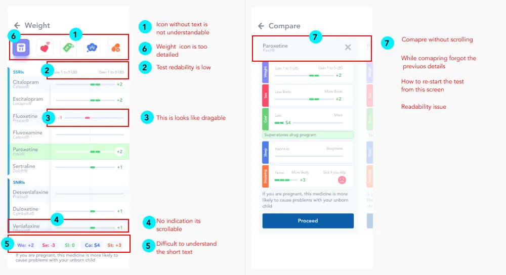
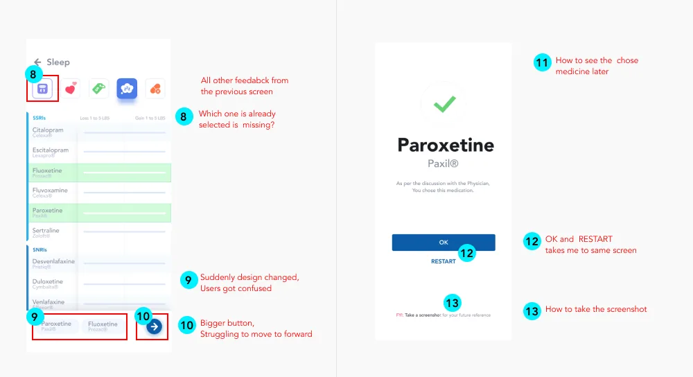
Screen-by-screen feedback was more useful than the pass rate. Comparing meant scrolling and forgetting earlier details, the design changed suddenly between screens, and OK and Restart led to the same screen.
Unmoderated testing at scale
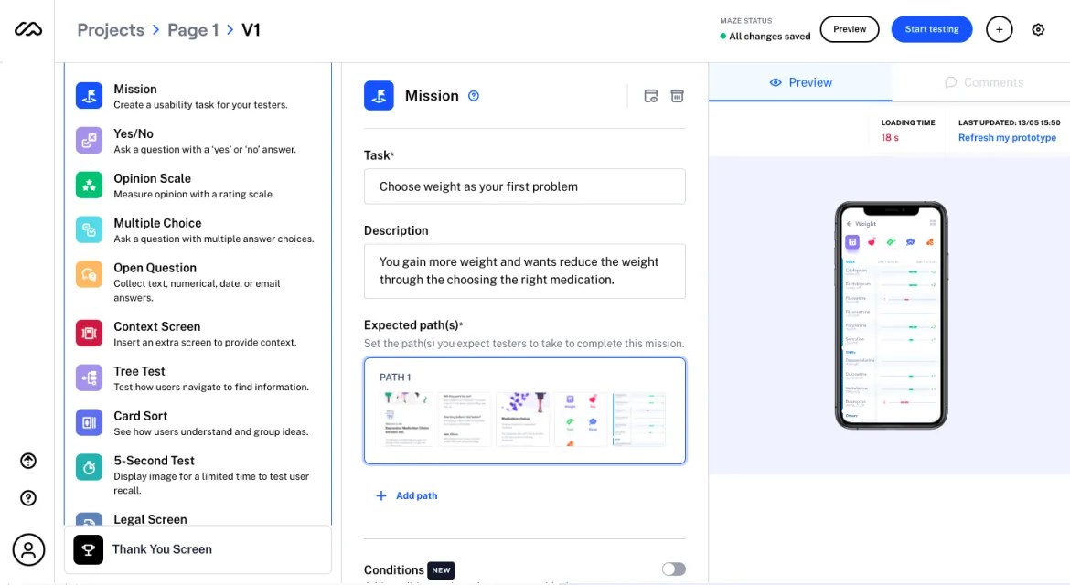
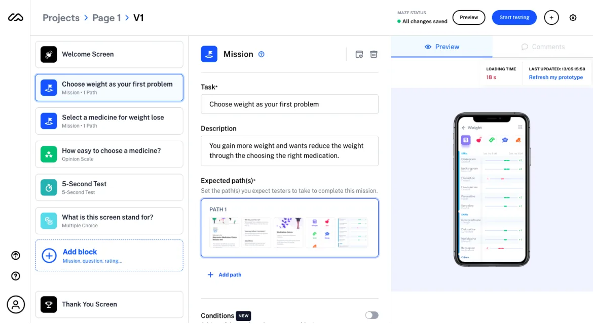
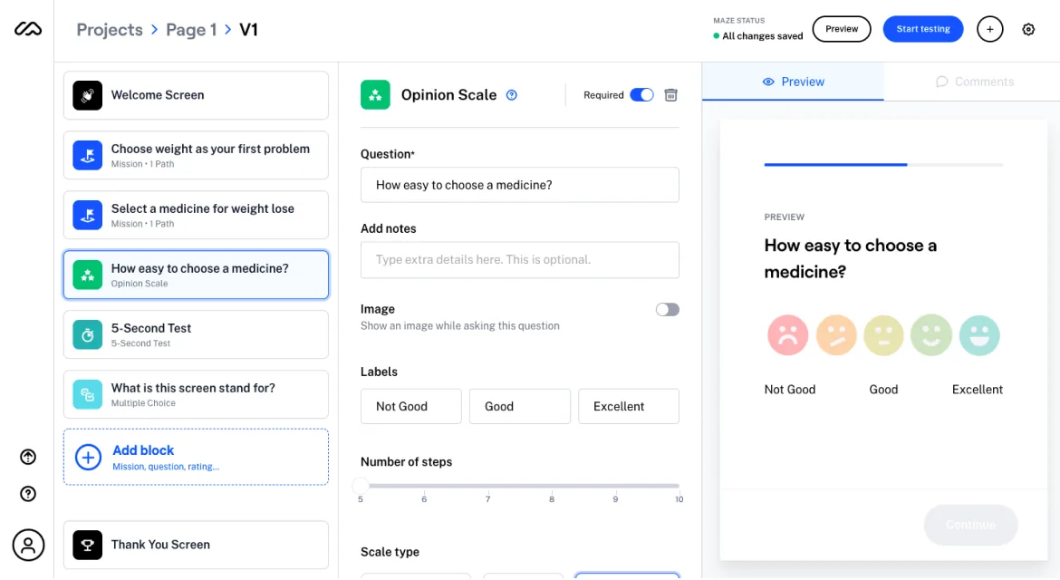
We used Maze to reach more than 20 users, combining task paths, opinion scales and a five-second test.
What changed
From feedback to change
| What people said | Design response | Status |
|---|---|---|
| Which medicine is already selected? | Selected medicines are highlighted | Designed |
| Struggling to move forward | A clearer way to proceed | Designed |
| Icons without text weren't understood | Issue tiles keep their text labels | Designed |
| The medicine name is tricky to communicate | Next action from the KPI round | Open |
6. Outcome
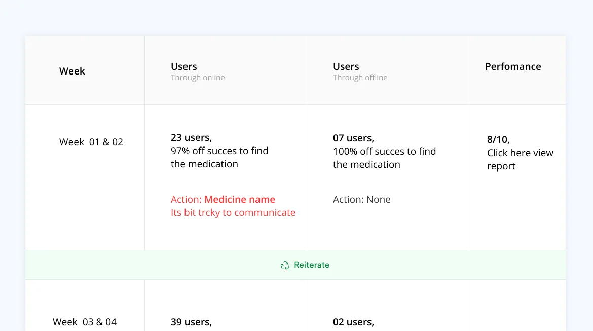
Week 1 and 2 results
| Group | Users | Found the medication | Action |
|---|---|---|---|
| Online | 23 | 97% | Medicine name is tricky to communicate |
| Offline | 7 | 100% | None |
Performance was 8/10. We reiterated, then continued into weeks 3 and 4.
What I learned
- Listening to users' stories gave the project extra mileage. Be a good listener and observer.
- Creating a strategy is the core of a UX project, especially on a short timeline.
- Remote brainstorming should be focused and result-driven, and remote research worked very well.
- Continuous usability testing is what makes the product better.
What this does not prove
These numbers show people could use the tool. They don't show whether patients stayed on treatment or felt better.
Proposed measures for the next round
| Question | Measure |
|---|---|
| Does it improve the conversation? | Patient and physician comfort with the choice, compared with paper |
| Is the medicine name clear? | Task success naming the chosen medicine |
| Does it hold up clinically? | Whether patients stay on the chosen treatment |
These are proposed measures, not results.